Nature Photographers Network
This is the preserved archive of the original Nature Photographers Network. The community continues at naturephotographers.network.
Red Sage +2 RP and RAW
‹ PreviousLandscape GalleryNext ›

Red Sage +2 RP and RAW

by Lon Overacker

Gallery: LandscapePosted January 10, 2016383 views22 comments
First, many thanks for everyone's comments, suggestions and great observations on my previous post.  I've taken the suggestions and tweaked the image.

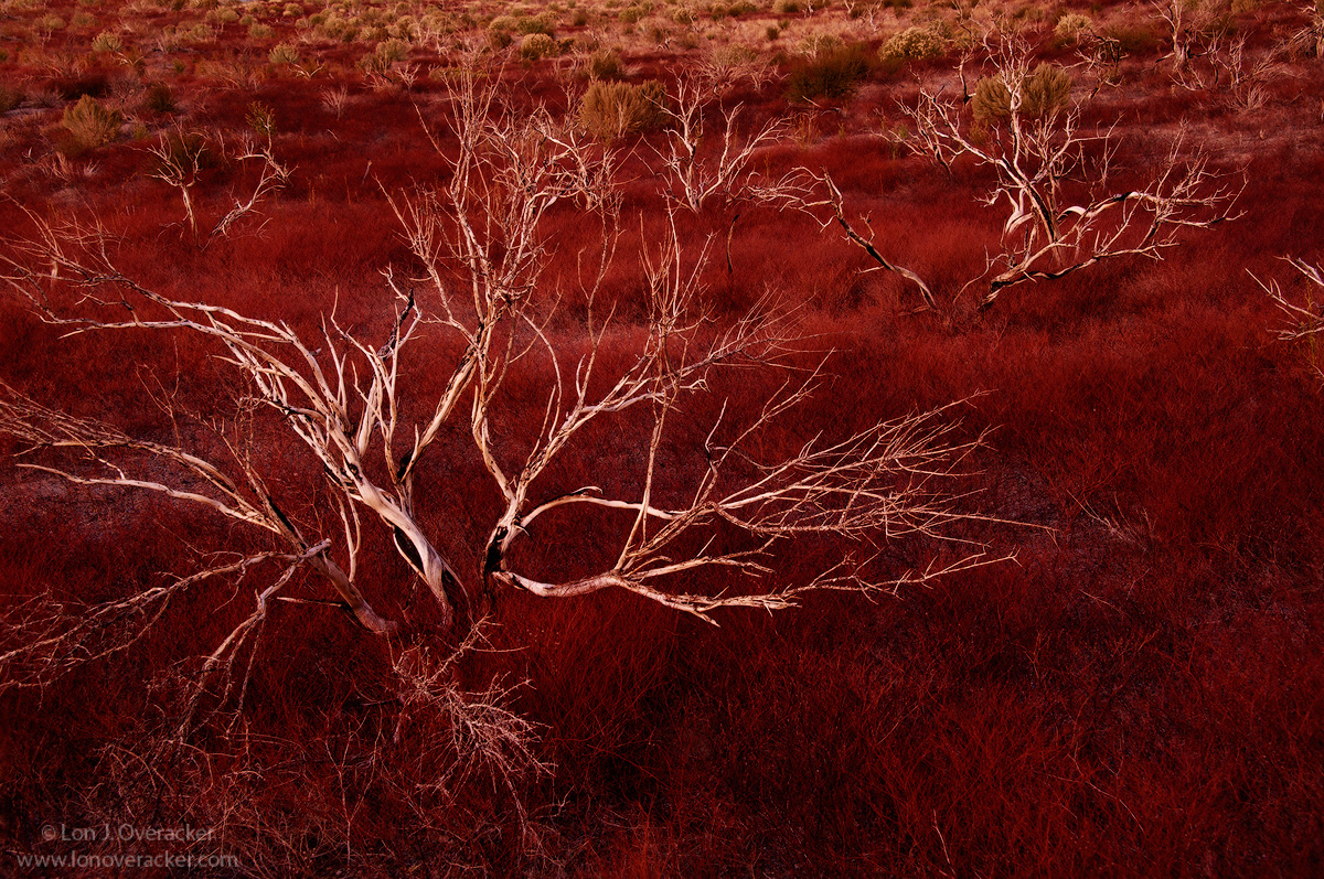
Here is something a little different.  Also from my October trip to the Eastern Sierra and Mono Lake basin.  This is along Highway 120, the road that leads to Mono Lake and the South Tufa area - the place EVERYONE goes too.  Well, I've done that many times and driven this stretch of road and have always been fascinated with this area of sage, near the slopes of the Mono Craters.  Of course a fire had burned through here several years earlier and what was left was finally enough to get me to stop.

Processing here I think is exaggerating the color here a bit, but not by too much.  Once the sun set over the Sierra, of course the colors got a boost.  But I think I'm going more for the contrast between the burnt sage and the ground cover.  I'm very curious if this works for anyone.  Your comments, critique and suggestions welcome.

Nikon D700
Nikon 28-300mm 
2-image focus stack @ f/9
Tony Kuyper's masks and actions

Thanks!

Comments

22 comments
Comment posted by Igor Doncov on January 10, 2016 at 5:02 PM
Just when I thought I understood what you do out comes an image like this. Personally I think that both the layoff and change to DSLR helped your images. This is a Guy Tal image, not a Lon Overacker image. More creative. More personal. More imaginative. Less representational.

Great job.

I like the small branch coming in from the right side. I would crop some from the bottom, though, not worrying about having to include the entire bottom branch, and play the interaction between the main tree and the smaller trees to the right.
Registered on November 22, 2014, 189 Posts, 2733 Comments
Comment posted by Preston Birdwell on January 10, 2016 at 6:56 PM
Lon,

I am really enjoying this composition. I think the mood here is wonderful. I am wondering if the red may be a tad too strong and/or slightly weak in yellow? This does work nicely as it is, and I really like the bleached look of the weathered sage.

I think all of us who have been to Mono Lake have seen this sage field, but it's the light here that makes this one special.

--P
Registered on November 1, 2003, 471 Posts, 5188 Comments
Comment posted by Mark Seaver on January 10, 2016 at 7:12 PM
Lon, this is starkly wonderful, with white stalks standing out very nicely against all of that red sage.  (Btw, years ago there was a great Ethiopian resturant in DC called the Red Sage...how's that for an irrelevant factoid???).  The one thing that you might look into is dodging the downward pointing branches of the main sage plant through a light lights mask to let them show more strongly.  That would also "fill in" a bit the lowest section of this fine view.
Registered on January 23, 2011, 1103 Posts, 17270 Comments
Comment posted by Richard Wong on January 10, 2016 at 7:36 PM
This is really interesting Lon. The white on red is not a color combination I've seen before. Great shot!
Registered on February 2, 2006, 79 Posts, 2629 Comments
Comment posted by David Schoen on January 10, 2016 at 7:42 PM
Fascinating comp of shape and color.  Different but it works.  The more I look at it, the more I like the tones.
Registered on November 6, 2006, 1213 Posts, 4587 Comments
Comment posted by gary phillips on January 10, 2016 at 9:28 PM
Pretty cool Lon.  Love the burnt sage against the very red grasses. Maybe a bit too red for me but hey, I've seen colors like that before.  Interesting.
Registered on October 24, 2013, 185 Posts, 4136 Comments
Comment posted by Alberto Patiño on January 10, 2016 at 11:47 PM
I've never been to this particular spot and when I first saw the thumbnail I thought it was a "false color" image. Then I read your description, and upon opening the full resolution image I noticed the color on the green bushes in the background! I imagine that the bark on the burnt bushes in the foreground is a neutral grey? If so, I would perhaps desaturate a bit so that the bark becomes closer to neutral, thus yielding more contrast with the ground cover, which should still be red, and perhaps with the green in the background too? Another suggestion would be to try to include more of the green background bushes. Regardless, I think that the detail is great, and the image also works as presented - it is just a different message from what I have in mind.

 
Registered on December 2, 2014, 278 Posts, 1736 Comments
Comment posted by Bill Fach on January 10, 2016 at 11:54 PM
Lon: Unique take indeed and for me a fine result. I love the contrast of the whitesage branches. They almost look skeletal. Well seen and superbly captured.>=))>
Registered on November 1, 2003, 1805 Posts, 26981 Comments
Comment posted by scott lanz on January 11, 2016 at 7:29 AM
I like the comp and contrast between the skeletonized bushes and the red groundcover, Lon. Well composed and a photogenic subject. Personally, I would back off the red. It kind of jumps off the sceen and the color dominates the image. 
Registered on November 14, 2003, 840 Posts, 12902 Comments
Comment posted by Harley Goldman on January 11, 2016 at 9:36 AM
I really like the scene. That said, it is way, way too red for my tastes. Color is a personal preference. I would clone out the branches coming in from the right.  I also think this would be really outstanding as a B&W.
Registered on November 19, 2003, 586 Posts, 11271 Comments
Comment posted by Dietrich Gloger on January 11, 2016 at 1:02 PM
Color aside, I think this is among your best compositions. There is an excellent sense of line and pattern repetition diagonally through the image that has immediate" visual logic". I noticed the branches coming in from the right, but I don't find them distracting. The color is not garish looking either, rather a very warm tone that still looks reasonable to me.
Yes, this reminds me of Guy Tal's work, but I would say it is a Lon Overacker imagelaugh
Registered on January 26, 2007, 360 Posts, 9876 Comments
Comment posted by Roel Wijtmans on January 11, 2016 at 1:15 PM
Hmmm, I didn't know they found plant life on Mars?? But seriously, this looks amazing. The colors are strong, but they are perfect for creating that otherworldly feeling that I love about this one.
Registered on September 30, 2012, 116 Posts, 2257 Comments
Comment posted by Matthew Goldberg on January 11, 2016 at 2:36 PM
I like this image a lot with the white border -- definitely something I would want to put as a piece of artwork in my living room. Cropping out the horizon and focusing burnt bushes against the red grass benefited -- you definitely served the scene well. I think if you kept the sky in there it would have taken away from the scene.  Well done!
Registered on August 24, 2015, 7 Posts, 16 Comments
Comment posted by Lon Overacker on January 11, 2016 at 7:41 PM
Thanks everyone for your comments and suggestions.  I've taken a few of them and reworked the image. Those included removing the intruding branches on the right and also selectively brightening the smaller branch near the bottom.  I tried dealing with the red.  While I agree it's pretty strong, all the time I spent tweaking it today and I ended up with almost the same rendition.  This reminded me of something Tony Kuyper once told me that has stuck with me:  "Some times you just need to take an image where IT wants to go..." TK.  Some times, just let it happen, whatever that may be for any given image.

I will tell you though that the intense red was the result of an Orton layer.  For this repost, in addition to the above changes, I removed the Orton layer.  This may be closer to reality, but now I'm afraid, this looks more like a Lon Overacker image than a Guy Tal image.....cheekyangelenlightened
Registered on November 24, 2006, 521 Posts, 19147 Comments
Comment posted by Lon Overacker on January 11, 2016 at 7:42 PM
Someone also mentioned b&w. Here's a quickly processed one.  Potential, but more work I think.
Registered on November 24, 2006, 521 Posts, 19147 Comments
Comment posted by Lon Overacker on January 11, 2016 at 7:43 PM
Lastly, here is the RAW file, with some minimal processing in ACR.  That's where I started.  You should note the cloning in the ULC.

Thank you all for your comments on this image.  It's a great learning process.
Registered on November 24, 2006, 521 Posts, 19147 Comments
Comment posted by Harley Goldman on January 11, 2016 at 7:45 PM
For my money, B&W all the way. Burn down the sage at the top and fine tune it and I think it is a winner. 
Registered on November 19, 2003, 586 Posts, 11271 Comments
Comment posted by Igor Doncov on January 11, 2016 at 9:24 PM
The original was best. 

Just as as a clarification. My words may have come out wrong and were not what I intended to say. That is the merits of one photographer vs another. What I've noticed is that we usually improve in a step wise manner. We seem to stay on a plateau for a while and there is suddenly a jump. We don't get progressively better. I decided that we actually do get better internally but seem to put it all together at one time, if that makes sense. This is so different from your usual work that it may be one of those jumps. I'm not referring to the improvement of Photoshop skills. I'm very excited for you. 
Registered on November 22, 2014, 189 Posts, 2733 Comments
Comment posted by Chris Chamberlain on January 11, 2016 at 10:15 PM
The transformation from the raw to the final result of the original post looks a little drastic. But, it looks more like contrast over pure saturation to me. I mean that I think you could achieve that much visual change from a curves adjustment. My finished tiffs always jump off the page at me compared to the raw files next to them. Personally, I like color, and think the original while somewhat bold is amazing! It does all come down to personal taste or preferance anyway. I don't think we ever really considered ourselves to be documentarians, did we? Where would life be without a little romanticism? If I were to suggest a change, it would be to reintroduce some or all of the orton, and maybe pull back on the contrast just a little. The black and white does not really do it for me. This is kind of a unique spot and taking the color out of it makes it so it could be almost anywhere.
Registered on March 13, 2007, 500 Posts, 8365 Comments
Comment posted by Dave Dillemuth on January 12, 2016 at 12:11 PM
Lon,
Fantastic image. Love both the color and B&W rendering. I actually prefer the red closer to the original post. Not a lot to add to what has already been commented. Very fine work. 
Registered on December 10, 2015, 104 Posts, 1112 Comments
Comment posted by Mark Seaver on January 12, 2016 at 2:03 PM
Wow, neat comparisons, Lon.  Showing the different versions and discussing them makes for a good learning exercise.  I'm having a hard time choosing between the original post and the first repost as my favorites.  The Orton layer on the original gives it a nice, but subtle, glow.  The redo with the extra brightness in the downward pointing branch adds some extra interest in the foreground.  It also looks like there's a bit of extra brightness in the lower right, which works well.
Registered on January 23, 2011, 1103 Posts, 17270 Comments
Comment posted by Vance Gese on January 13, 2016 at 2:53 PM
This is absolutely, jaw-dropping stunning, in my opinion, Lon.  Love your incredible composition, with the two predominant snags to left and right, set against that amazing sea of red.  While I can see cloning out the intruding branches on the right hand side, as you have done inthe repost, I would not change anything else.  The tones and patterns of the old trees enveloped in all that gorgeous red is exquisite.  Wow.
Registered on November 13, 2008, 298 Posts, 6629 Comments