Gallery: Macro & Close-upPosted January 11, 2016132 views8 comments
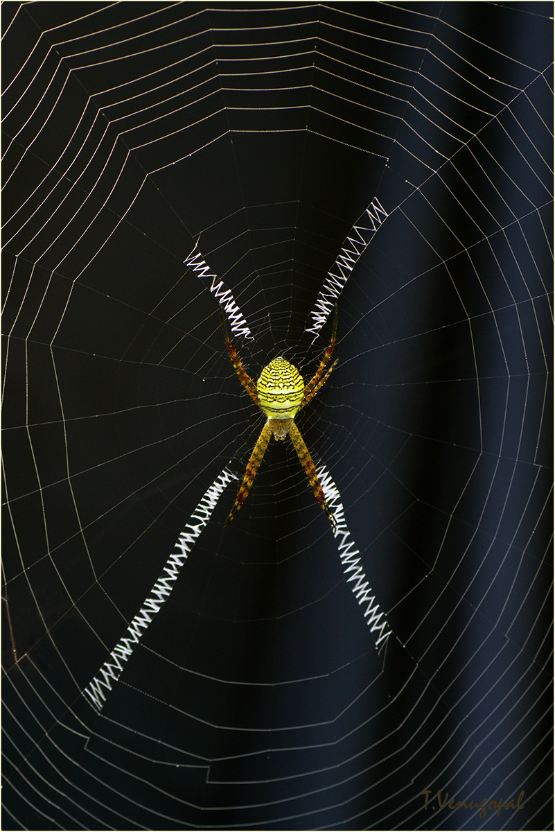
Posting vertical composition of the spider as suggested by Mark. Thanks Mark.
Requesting valuable comments and suggestions
Comments
8 comments
Comment posted by scott lanz on January 11, 2016 at 7:14 AM
No question for me, Venugopal. I greatly prefer this version. I prefer the vertical comp. I also prefer the higher contrast with a cleaner bg (less light rays), a brighter and more colorful spider body, and a brighter web.
Registered on November 14, 2003, 840 Posts, 12902 Comments
Comment posted by Dennis Plank on January 11, 2016 at 8:50 AM
I like the new composition, Venugopal. It provides more focus on the spider while still showing enough web for context.
Registered on January 28, 2008, 1767 Posts, 23192 Comments
Comment posted by Roel Wijtmans on January 11, 2016 at 1:04 PM
This version wins for me, great looking spider ánd web, well done!
Registered on September 30, 2012, 116 Posts, 2257 Comments
Comment posted by Bill Leggett on January 11, 2016 at 2:57 PM
This is excellent, Venugopal. 90% of my spider images are done in vertical format, and you nailed this. As an option, you could crop a bit off the top.
Registered on July 21, 2004, 706 Posts, 3233 Comments
Comment posted by Mark Seaver on January 11, 2016 at 4:15 PM
I like this a lot, Venugopal. Having the shape of the frame fit the shape of the spider's cross in the middle works well. The contrast here looks great also.
Registered on January 23, 2011, 1103 Posts, 17270 Comments
Comment posted by Albert Darmo on January 12, 2016 at 11:24 AM
Hi Venugopal I love the beauty of form from the balanced proportions the light and color are also well captured
Albert Darmo
Canada
Registered on November 25, 2008, 1386 Posts, 11978 Comments
Comment posted by Venugopal Thantry on January 13, 2016 at 11:30 AM
Once again big thanks to all for comments and suggestions.
Trying the option suggested by Bill
<div>
Venu</div>
Registered on May 12, 2011, 33 Posts, 144 Comments
Comment posted by mark cillo on January 30, 2016 at 8:43 AM
Great contrast with BG, the colors and detail really pop.
Registered on July 27, 2008, 143 Posts, 1483 Comments

Comments
8 commentsAlbert Darmo
Canada
Trying the option suggested by Bill <div>
Venu</div>