Nature Photographers Network
This is the preserved archive of the original Nature Photographers Network. The community continues at naturephotographers.network.
Aspen Chaos
‹ PreviousLandscape GalleryNext ›

Aspen Chaos

by Lon Overacker

Gallery: LandscapePosted January 14, 2016217 views12 comments
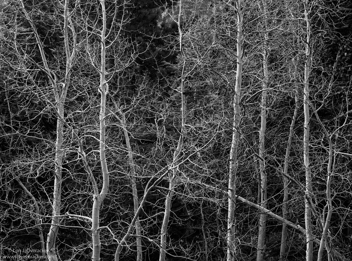
Thank you so much for the comments and suggestion on the aspen pano image.  Here are more aspens, a bit different than the others...  I don't convert to b&w often, but I always try and visualize good b&w scenarios when in the field.  And after driving by this grouping of trees several times going up and down Lundy Canyon in the Eastern Sierrra, my last morning I finally stopped.

B&W works very well in condensing a scene down to it's simple forms and contrasts.  It can take a completely random and chaotic scene and make some sense of order to it.  I tried and hope I did so here.  This is not too different from the one b&w tree image I posted from Yosemite, but there is one element here that I think makes this one work.  

Your comments, critiques and suggestions always welcomed and appreciated!

Nikon D700
Nikon 28-300mmVR @92mm
f/8 2-image stack, although I don't know why now. ;-)

Thanks!

I've got family coming in today for the next 3 days so my comments will be spotty!

 

Comments

12 comments
Comment posted by Harley Goldman on January 14, 2016 at 1:28 PM
Real nice, Lon. It has a good John Sexton feel to it.  Your title works, too. It is ordered chaos. I like it a lot.
Registered on November 19, 2003, 586 Posts, 11271 Comments
Comment posted by Igor Doncov on January 14, 2016 at 1:37 PM
Well seen and presented. This has the right degree of 'chaos' to keep it interesting. There is a nice image within this image that is a square format of the entire left side. That would be good because the subject is largely vertical. Just a thought. 
Registered on November 22, 2014, 189 Posts, 2733 Comments
Comment posted by Marylynne Diggs on January 14, 2016 at 1:47 PM
Hi Lon,
I'm not usually a fan of the "chaos" shot because it sometimes feels lacking in any composition (by definition, of course), but this one works for me.  I like the curves of the bare trees and the lone diagonal trying to mix things up a bit. 

No real nits for me, but if I were to rack my brain for any, it would be the light spots (on rock?) top center and upper right side. I might try to burn those a bit to keep the viewer focused on the trees.

ML
Registered on December 14, 2010, 122 Posts, 1034 Comments
Comment posted by Pete Bengeyfield on January 14, 2016 at 3:16 PM
Another good combination of chaos and stability. Well done.
Registered on December 2, 2003, 1247 Posts, 3439 Comments
Comment posted by Igor Hoveijn on January 14, 2016 at 4:51 PM
Beautiful light, great detail and the aspen really stand out from the background. I like the idea of this image. The total disorder of the twigs is tamed by the strong verticals. And I do like the silver linings on the left sides of the tree trunks. Without diagonals the image might become somewhat static. But for me the diagonals in this image are not quite strong enough to hold it together. Composition wise I find it a challenging subject. Reminds me of a location in my own neighbourhood, I am going to have a look. 
Registered on November 2, 2015, 18 Posts, 192 Comments
Comment posted by gary phillips on January 14, 2016 at 8:57 PM
Love the luminance of the aspens trunks here, Lon.  You should unleash your b/w self a little more often.  I like this a lot.  Not an easy comp to pull off, but you've managed it very well.  Have fun with your family.
Registered on October 24, 2013, 185 Posts, 4136 Comments
Comment posted by Dave Dillemuth on January 14, 2016 at 11:24 PM
Lon,
Beautiful B&W tree study. Contrast of the white trunks on the black background is fantastic. I find the tilted tree really adds tension and a lot of visual interest to the image.
Registered on December 10, 2015, 104 Posts, 1112 Comments
Comment posted by Alberto Patiño on January 15, 2016 at 12:21 AM
Certainly the fallen aspen adds a note that one sometimes tends to avoid in "neat" aspen forests. It does work, and I can see how color would add too much chaos, whereas B&W allows the viewer to immediately focus on the one "discordant" element. 
Registered on December 2, 2014, 278 Posts, 1736 Comments
Comment posted by Mark Seaver on January 15, 2016 at 10:33 AM
A fine b&w semi-abstract, Lon.  The white trunks stand out nicely.  That one tree leaning in near the bottom is an excellent addition.
Registered on January 23, 2011, 1103 Posts, 17270 Comments
Comment posted by Roel Wijtmans on January 15, 2016 at 11:53 AM
This is a far fetched thought, I know, but the diagonal nature of the smaller trees represent rebellion/youth to me, while the vertical older ones represent the opposite. So to me this looks like two young ones playing around a bunch of elder ones. Very nice stuff, Lon, no nits!
Registered on September 30, 2012, 116 Posts, 2257 Comments
Comment posted by Dietrich Gloger on January 15, 2016 at 2:10 PM
My kind of image. I like the very strong light/dark contrast and the dense mesh of trunks branches and twigs. The verticals provide the structure and the diagonals spice it up. My only nit is that the large version comes across as a bit soft. I think this type of image benefits from ruthless sharpening.
Registered on January 26, 2007, 360 Posts, 9876 Comments
Comment posted by Daniel Rappaport on January 15, 2016 at 9:04 PM
I have to disagree with "chaos" here. The small branches and empty areas are a really nicely balanced textured background for the graphic tree trunks - then the downed aspen so it's not too balanced.
Registered on September 9, 2009, 294 Posts, 2006 Comments