Hi all! First off, yes, I know this is a pretty unorthodox crop/comp, but there are a few reasons for it!
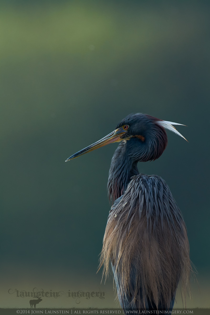
I posted a different frame of this beautiful Tricolored Heron last year, but had only done a quick edit and had not really looked through my images in detail from this sequence. I was photographing an active GBH nest in the rain, and then the incredible light as the morning sun broke through the clouds when I heard something behind me. Being in alligtor waters, I turned around quickly to find this beautiful scene. I started out with the full-frame camera but quickly realized there was some real potential with either a TC or crop body, and opted for the latter. I could not believe the incredible backlighting and the colours it was producing as the mist burned off, but sadly my very best angle for background included a sapling of some sort encroaching into the frame. I decided to shoot anyway, and while I don't regret it, that stinking tree/branch has definitely caused me some consternation in post!
The heron is perched on the top of a broken-off dead palm tree. Any comp that includes its legs also includes the top of the branch to the left. I really wanted to process this without any cleaning/cloning, but in the end had to take out the top of the branch to have any comp that kept the mood and range of tones. I could have included the heron's feet as I cloned the tree away slightly past that point, but I liked the mood and power of a tighter crop into the heron's body as presented here. The only way this scene differs from the RAW file is the top of the branch has been removed from the elk area of my watermarked logo. Because I did end up retouching the file, I also removed three brighter OOF bugs/fluffs from the background, but left the other very OOF items because it enhanced the natural feel for me.
I intentionally went a bit darker than might be considered optimal or "normal" here as the heron was backlit and the scene was dark to my eye through the viewfinder. I think this retains the mood and feel of the moment.
I would greatly appreciate your thoughts on which of the two comps presented here works best for you. I know there are only subtle differences, so it may be that neither of them work for you as this is something a bit different in terms of bird placement and negative space. The primary difference is the original post retains the natural transition back to darker tones at the top of the frame, and the second crop comes in just a little tighter from the top and bottom.
Many, many thanks for your time and feedback on this one! Please do look at the detailed version for best quality.
EDIT: I've just posted a more traditional comp incorporating the feedback I received from this post. You can find the new, more
full-view version here.
---------------------
Nikon D7100
Nikkor AF-S 500mm f/4D IF-ED
ISO 400
1/2000sec @ f/5
-1 stop underexposed from meter
Mounted on FEISOL CT-3372 Elite tripod with Acratech GV2 ballhead and Wimberley Sidekick
Cropped to app. 65% of original
Tree branch cloned from bottom left, three OOF bugs/fluffs cloned from background

Comments
10 commentsI much prefer the tighter version with less at the top. Even with the tighter version, I'd look at pulling a bit more off the top. Very nice light and concept. Too bad about the legs and the stuff at the bottom.
Thre light and colors are wonderful, and I'd love to see a variation with the rest of the heron in the frame.
For me this is indeed a masterwork with a fascinating air of serenity. Detail in the bird’s tricoloured attire is terrific! There is a lot of BG space above the bird’s head but this works well on account of the contrast produced by the brighter greenish area. I have a couple of nit picking suggestions concerning the BG and the bird’s head ‘tassels’ which may appear too bright to be true. I’d be tempted to use a curve to tone down the tassels. There are four or five BG ‘clone circles,’ the most noticeable one being in the light green area above the bird’s head. I’d be tempted to try cloning them out with soft reduced opacity brush.
David