Nature Photographers Network
This is the preserved archive of the original Nature Photographers Network. The community continues at naturephotographers.network.
Curves II
‹ PreviousLandscape GalleryNext ›

Curves II

by Dave Dillemuth

Gallery: LandscapePosted February 11, 2016232 views11 comments
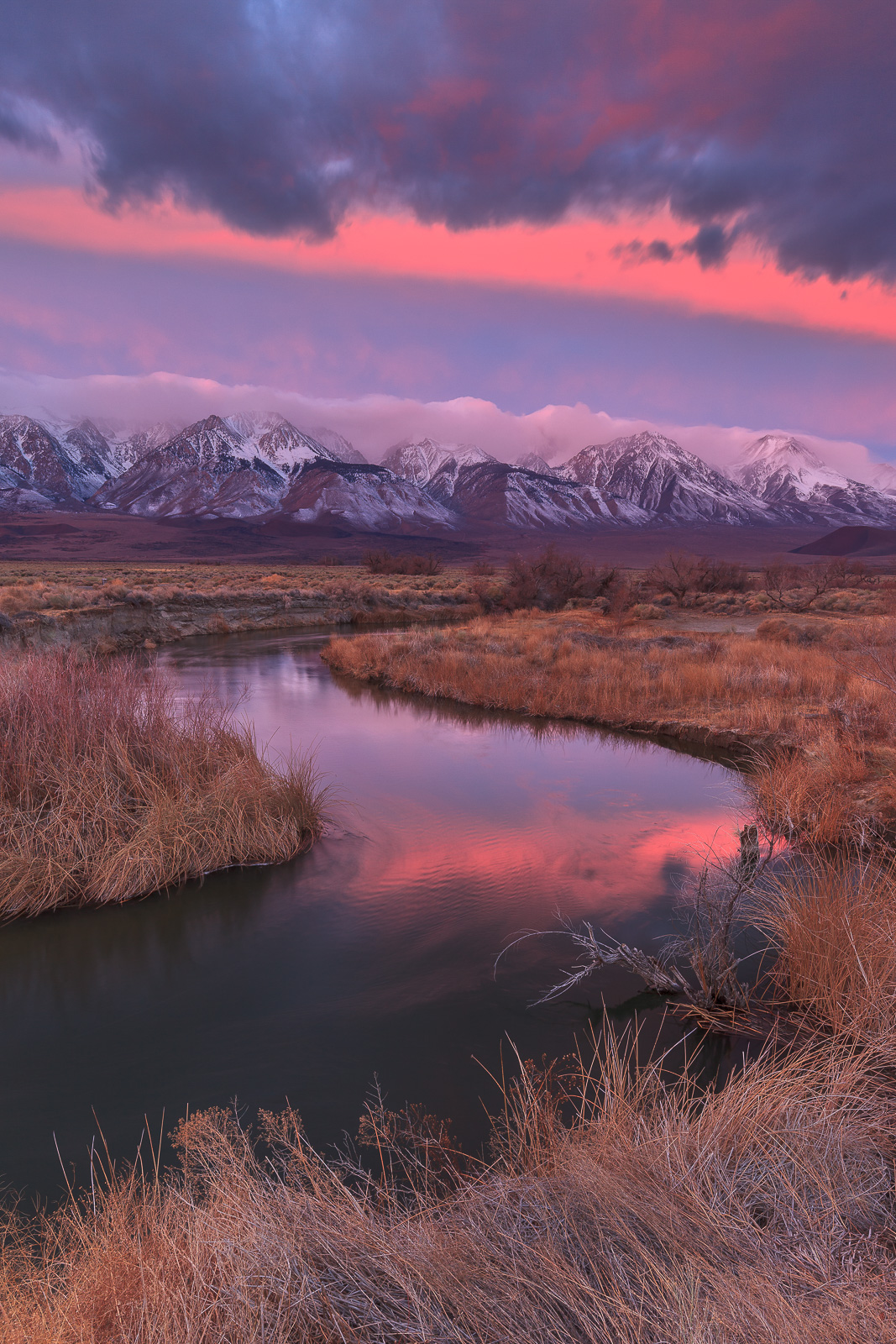
Here's a vertical taken minutes earlier than my prior post from this location. I think I prefer the horizontal comp. but not sure. Appreciate comments/suggestions. Thanks

5DII, 16-35 f/4L @ 20mm, 2 Stop GND
ISO100, f/11, 2.5 sec.

Comments

11 comments
Comment posted by Michael Lowe on February 11, 2016 at 9:21 PM
I just commented on your last post and when the page reloaded I saw this splash of color jumping out at me in the thumbnail. Another great image. Excellent comp with sweet pastel colors and warm earth tones.devil
Registered on February 11, 2004, 777 Posts, 5252 Comments
Comment posted by Brad Strong on February 12, 2016 at 8:17 AM
Dave, these are both really nice, but I like this one a little better because I can see the curve of the river better. On that note, you cut off the left edge of the curve in the river. Breaking the s curve weakens the draw me in factor IMO. I think this would be stronger shot wider and higher if possible to make the s curves the dominant subliminal draw of the image and let the great landscape fill in the details. 
Registered on October 1, 2012, 43 Posts, 302 Comments
Comment posted by Harley Goldman on February 12, 2016 at 10:11 AM
I definitely prefer this version. The curve is more pronounced and central to the image for me and more sky adds a lot. Real nice take on the Owens.
Registered on November 19, 2003, 586 Posts, 11271 Comments
Comment posted by Roel Wijtmans on February 12, 2016 at 11:19 AM
The horizontal version wins for me. Although very nice, I do think the sky is a bit too dominant in this one, and all the subtle tones in the rest of the image drown a bit in the strong sky. A more "aggressive" landscape (if that makes any sense...) would have worked with this sky. But what made your horizontal version so great was the combination of all the subtle colors and tints. So my vote goes to that one, even though this one is super nice too!
Registered on September 30, 2012, 116 Posts, 2257 Comments
Comment posted by Lon Overacker on February 12, 2016 at 11:48 AM
Dave,

I think I may have said this a while back, but you're killing it here!  This one is just as gorgeous as the rest of them!  The natural s-curve is very inviting; drawing the eye through the scene. Color is beautiful as well.

I can't favor one over the other (this or horizontal versions.)  they are both awesome, but simply portray the scene differently.

Not nits or suggestions. Simply a joy to view.

Lon
Registered on November 24, 2006, 521 Posts, 19147 Comments
Comment posted by Ed Lowe on February 12, 2016 at 1:02 PM
Decisions decisions, I can't decide which one I like better, Dave. Both are beautifully done and have a different feel to them. The prior post with the pastels is more quiet and serene while this one is a bit bolder and in your face with the saturated colors. You can't go wrong with either one.

Ed
Registered on February 7, 2004, 414 Posts, 7115 Comments
Comment posted by Nick Bristol on February 14, 2016 at 4:44 PM
Dave, This s such a beautiful place and you have captured it in some fantastic conditions. I like this one very much, but i do prefer the look and feel of the horizontal version overall.

Nick Bristol
Lone Rock, WI
Registered on February 1, 2004, 752 Posts, 14140 Comments
Comment posted by Neale Dyster on February 14, 2016 at 6:47 PM
This is the first one I saw and It's excellent, referring back though, I think I prefer the horizontal comp. Both absolute winnersdevil
Registered on February 19, 2008, 94 Posts, 738 Comments
Comment posted by Craig Moreau on February 15, 2016 at 1:28 PM
Dave, another great view of the Sierra! While I do like the horizontal, I like this one much more. The S-curve is much stronger and the sky is much stornger. I think these two elements combine to make a fantastic image. Great work!
Registered on April 21, 2015, 64 Posts, 584 Comments
Comment posted by Mark Metternich on February 16, 2016 at 11:57 AM
I love this. Very nice light and scene / composition. 

It does feel very relatively tilted to the right though. 
Registered on June 19, 2009, 276 Posts, 6240 Comments
Comment posted by John Williams on February 24, 2016 at 6:40 PM
Love everything about this Dave.devil
Registered on September 6, 2007, 221 Posts, 5985 Comments