Nature Photographers Network
This is the preserved archive of the original Nature Photographers Network. The community continues at naturephotographers.network.
Nature's jiggsaw
‹ PreviousLandscape GalleryNext ›

Nature's jiggsaw

by Roel Wijtmans

Gallery: LandscapePosted February 26, 20161,478 views16 comments
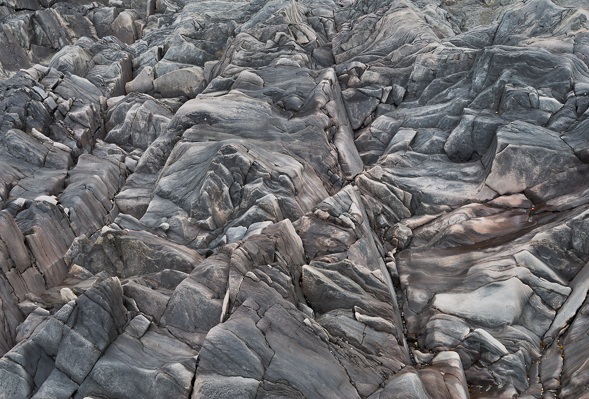
Taken on a beach in Iceland, Djupalonsandur. It had rained some time before this, and the partially dried up rocks created a nice effect. I was drawn to the almost abstract nature of this, but I don't know if others think the same?

f/16, ISO 100, 1.3 s, 35 mm.

C&C welcome, large version is included.

Roel

Comments

16 comments
Comment posted by Brad Strong on February 26, 2016 at 8:15 AM
I really like this, but I think B&W would be better if you are going for abstract as you mentioned. The touch of reds in the center is nice though. Just matters if color was part of the reason you took the image. 
Registered on October 1, 2012, 43 Posts, 302 Comments
Comment posted by Nick Bristol on February 26, 2016 at 9:46 AM
Roel, What a neat shot and kudos to you for making it. Don't know if I would have even seen this and though about making the picture. Very interesting combination of light, lines, shapes and textures. I like the reds too. Nice work!

Nick Bristol
Lone Rock, WI
Registered on February 1, 2004, 752 Posts, 14140 Comments
Comment posted by Roel Wijtmans on February 26, 2016 at 11:16 AM
Thanks for the kind words, Nick and Brad!

Brad: Yes, the subtle chance of colors was one of the things that attracted me, so I prefer a color version over a b+w. Although you have a good point of going for b+w to emphasize the abstract pattern.
Registered on September 30, 2012, 116 Posts, 2257 Comments
Comment posted by Charles Bell on February 26, 2016 at 3:08 PM
I love it.  Very good of you to see the possibilities in this.
Registered on February 21, 2016, 187 Posts, 192 Comments
Comment posted by Peter Richter on February 26, 2016 at 4:06 PM
Roel, the abstract character works perfectly for me, and the lack of a scale makes it even more interesting to my eye. The subtle colors add a lot in my opinion.

I know it is nit-picking, but I would eliminate that tiny bright spot at the bottom left. Nevertheless a striking composition and one of my favorites from your images.

Peter
Registered on November 10, 2010, 218 Posts, 2723 Comments
Comment posted by Lon Overacker on February 26, 2016 at 6:22 PM
Roel,

This is fantastic!  I had to view this for a while just to try and figure this out.  No scale, no reference points, looking down? looking up?  This is totally engaging!  Honestly, I didn't read your description ahead of time and so I was looking at this with no preconceived knowledge.  And so yes, this is totally abstract for me and I love this!  The only clue that came to me was finally spotting all the small pebbles at the bottom of the cracks in the lower R quadrant.  Without that, I'd still be trying to figure it out.

Knowing now, I can see the partially wet/dried rock.  That really adds to the mystery as well.

I'd have to see a b&w conversion, but frankly I love this color version.  The only small suggestion would be to desaturate the red so that some of the pebbles/shells? aren't little eye magnets.  Otherwise, this is just fantastic.

Lon
Registered on November 24, 2006, 521 Posts, 19147 Comments
Comment posted by Dave Dillemuth on February 26, 2016 at 11:05 PM
Roel,
Excellent image with strong graphic appeal. Comp works great and love the subtle colors. Well seen.
Registered on December 10, 2015, 104 Posts, 1112 Comments
Comment posted by Basil Greber on February 27, 2016 at 3:58 AM
This is awesome. I like the shapes and pattern, and, as you said, the abstract quality of the image. Personally, I would probably try to go with higher contrast and a bit of a vignette the emphasize the latter.
Registered on November 8, 2005, 219 Posts, 1340 Comments
Comment posted by Igor Doncov on February 27, 2016 at 10:07 AM
This is excellent Roel. Your last two have been great images. Before clicking on this I was just thinking, oh, another abstract. But this is clearly an exceptional one. Because of the large triangle this is not busy at all. This has the same appeal as a cubist painting. The richness of tones throughout all those shapes gives a very pleasant feeling. I guess I'm in the minority but I think this would look better as a B&W. Also, I find those small white pebbles scattered about to be an eye magnet and would remove them.
Registered on November 22, 2014, 189 Posts, 2733 Comments
Comment posted by Mark Metternich on February 27, 2016 at 3:12 PM
Nice abstract. 
Registered on June 19, 2009, 276 Posts, 6240 Comments
Comment posted by Albert Darmo on February 27, 2016 at 6:38 PM
Hi  Roel crying  Beautifully  composed  capturing    a  triangular   delight. cool                    the symmetry  of the lines and fine detail and  beautiful colors   and light. make for a  captivating  presentation


Albert Darmo
Canada
Registered on November 25, 2008, 1386 Posts, 11978 Comments
Comment posted by Mark Seaver on February 27, 2016 at 7:24 PM
Roel, you've got a ton of texture here and the large open triangle works very well at pulling my eyes from the bottom to the top.  The subtle wash of red add nicely.  Is that a human there near the right hand edge?  If so it makes the size of the rocks amazing.  Very well seen regardless of the scale.
Registered on January 23, 2011, 1103 Posts, 17270 Comments
Comment posted by Ed Lowe on February 27, 2016 at 7:36 PM
The thumb nail does not begin to do this justice, Roel. The large version is a visual treat as it allows me to wander around the image and savor all the shapes and details. I also like the lack of scale here. Great eye to isolate this abstract.

Ed
Registered on February 7, 2004, 414 Posts, 7115 Comments
Comment posted by Roel Wijtmans on February 28, 2016 at 2:09 AM
Thanks for all the comments and kind words, everyone!

Mark: No, there is no human in this scene, this is way, way smaller than that. I would estimate this to be like 8 meter/25 ft across horizontally. Here's another shot of the same scene, with some other rocks on top of it, which might give a better idea of the scale!
Registered on September 30, 2012, 116 Posts, 2257 Comments
Comment posted by scott lanz on February 28, 2016 at 8:47 AM
Fun, interesting image, Roel. I like the subtle colors that accent the pattern. 
Registered on November 14, 2003, 840 Posts, 12902 Comments
Comment posted by Ryan Shain on February 29, 2016 at 6:15 PM
This image  is so awesome Roel.

The lines, shapes, textures, and details make this image special, and I could get lost exploring this image for a good long while. There is a fun factor here that really keeps me interested in this one Roel.
Registered on February 20, 2007, 226 Posts, 4571 Comments