Nature Photographers Network
This is the preserved archive of the original Nature Photographers Network. The community continues at naturephotographers.network.
+RP! Teton Atmosphere 1
‹ PreviousLandscape GalleryNext ›

+RP! Teton Atmosphere 1

by Ryan Shain

Gallery: LandscapePosted February 27, 2016159 views18 comments
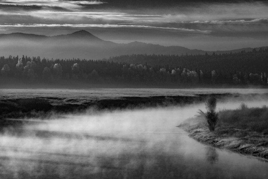
I am working on a Black and white themed project from my Grand Teton National Park trip. There is an upcoming show where I will be submitting 5 images for a wall display, and I am thinking about doing all black and white images. I was particularly moved on this trip from the wonderful atmosphere I was so very fortunate to witness. This image is the one I am on the fence on the most. What do y'all think of the conversion?

The image is captured from the same morning as my last moody Oxbow Bend post. I am looking  south east at an elevated position at Oxbow Bend.
Thank you for the thoughts, and I very much appreciate all input on this capture.

Comments

18 comments
Comment posted by Pete Bengeyfield on February 27, 2016 at 9:37 AM
I think the mist on the water is critical to the shot.  As long as you've got that, this is fine.
Registered on December 2, 2003, 1247 Posts, 3439 Comments
Comment posted by Igor Doncov on February 27, 2016 at 9:45 AM
This has to be one of my favorite images that you've made. I've fished the Henry's Fork with a rising mist like this in the mornings and the feeling is out of this world.
The composition is really virtually purple. Everything has come together for you - the clouds, the mist, and the background trees. All work in unison. Anything I say after this would improve a great image but are not necessary.

1. The composition is one of strong horizontal lines which give it a sense of peace. If the overall frame was also longer than it is now it would enhance and give this image a grander view. So if this is a crop of an original that had more information to the left or right you may want to bring that back in.

2. The bottom tree that lines up right in front of the tree behind it isn't working. That's your focus point and needs to be treated like it. I would clone out that back tree and replace it with fog.

I really like the dark sky at the very top center area because it adds just a tad more drama to that part of the image. Very nice job.

 
Registered on November 22, 2014, 189 Posts, 2733 Comments
Comment posted by Roel Wijtmans on February 27, 2016 at 10:03 AM
B+W conversion looks sweet to me! All the mist and clouds makes this a really nice photo with loads of atmosphere. I call it a homerun! If I had to pick a nit, it would be that it feels slightly cw rotated, but that is just feeling, there is nothing to base it on.
Registered on September 30, 2012, 116 Posts, 2257 Comments
Comment posted by Dave Dillemuth on February 27, 2016 at 10:49 AM
Ryan,
This is gorgeous. Comp works very well and you've got some great atmosphere with the rising mist and clouds. B&W processing looks good to my eye. Just a suggestion - I might try to play with some localized contrast adjustment in the foreground hills to make them pop a bit more.
Registered on December 10, 2015, 104 Posts, 1112 Comments
Comment posted by Lon Overacker on February 27, 2016 at 1:56 PM
Ryan,

This is fantastic!  There is so much to love about this. Of course the mist rising off the water and the gentle curve leading the eye in to the frame.  Then there's the light, bottom to top; the shadows created at the bottom; the light skimming the aspens and the light in the sky.  Then there's the layering of the mountains and an Ansel Adam's sky.  This has a lot going for it and I would hesitate including it in the show.

I don't have any nits and can only offer some thoughts on what you could do to make this even better (and this isn't to suggest this needs improvements to "fix" anything, but rather making an awesome image, that much better.)  First, you might consider playing with the contrast in the bottom section to enhance those nice, long shadows and just added contrast in general along the bottom edge; brighter whites, darker blacks.  Adjust to taste... 

I think you could also play around with contrast and exposure in the foreground mountains (as mentioned already) and even the layer of fog in front of the peak.  And we're talking about subtle tweaks, not major alterations.  Clearly the sunlight is hitting the water/mist and so naturally it's brighter there.  Just some thoughts.

Awesome, hope to see the other images you've chosen for display.  Good luck with that!

Lon
Registered on November 24, 2006, 521 Posts, 19147 Comments
Comment posted by Mark Metternich on February 27, 2016 at 3:14 PM
Excellent use of wonderful atmosphere. 
Registered on June 19, 2009, 276 Posts, 6240 Comments
Comment posted by Mark Seaver on February 27, 2016 at 7:05 PM
This is wonderfully moody, Ryan.  I like the "angled comp" with the misty river swinging right and the mountains concentrated on the left.  Without having seen the original, I'd say that b&w does well for setting the mood here.
Registered on January 23, 2011, 1103 Posts, 17270 Comments
Comment posted by Ed Lowe on February 27, 2016 at 7:21 PM
This B&W is very moody and evocative, Ryan. I simply love the mist on the water along with that sublime light striking the tops of the trees. Great drama in the sky also. It's time to get off the fence cool, you nailed a winner here.

Ed
Registered on February 7, 2004, 414 Posts, 7115 Comments
Comment posted by Aaron Feinberg on February 27, 2016 at 8:55 PM
Shit...this is good.  The comp leading my eye off the image to the right is a bummer but the lines and conditions here are pretty rad.  Might check the whites as the top end looks like it could be pushed up a bit but yea, this looks fun. 

aF
Registered on October 26, 2009, 399 Posts, 2789 Comments
Comment posted by scott lanz on February 28, 2016 at 8:34 AM
Beautiful, Ryan. I like the misty foreground and the dramatic background. Excellent processing. My only suggestion to to rotate this ccw so the mid ground appears level. 
Registered on November 14, 2003, 840 Posts, 12902 Comments
Comment posted by Nick Bristol on February 28, 2016 at 10:13 AM
Ryan, This is really nice and I do like it in b&w very much. I agree that a bit more contrast in the mid-ground trees might work nice but it looks pretty darn good as it is. I like the comp and love the conditions you captured this in. Very nice work! Nick
I'll email you a couple of pix of you hard at work in the 30 below temps sometime today. 
 
Registered on February 1, 2004, 752 Posts, 14140 Comments
Comment posted by Ryan Shain on February 28, 2016 at 11:47 AM
Thank you y'all for the very kind thoughts, and for the educated feed back to help improve this image. The print is looking great. I am super excited for this little project. devil I  have a repost with some of your ideas included, and I think it looks better.
Registered on February 20, 2007, 226 Posts, 4571 Comments
Comment posted by Albert Darmo on February 28, 2016 at 12:08 PM
Hi  Ryancrying  The repost  looks great      love every element of this  capture  of   a  awesome  moody  scene 

Albert Darmo
Canada
Registered on November 25, 2008, 1386 Posts, 11978 Comments
Comment posted by Lon Overacker on February 28, 2016 at 5:49 PM
Bingo!  No doubt the print is looking great!  Great job with the changes.
Registered on November 24, 2006, 521 Posts, 19147 Comments
Comment posted by Neale Dyster on February 28, 2016 at 6:11 PM
Ryan, the re-post improves on an already wonderful image.
Registered on February 19, 2008, 94 Posts, 738 Comments
Comment posted by Tom Falley on February 28, 2016 at 9:28 PM
Ryan:

Nice B&W image, but I would rotate counterclockwise about .75 degrees or so. The right side is further away and should recede to give additional sense of depth!

Cheers!   Tom
Registered on November 21, 2014, 189 Posts, 454 Comments
Comment posted by Harley Goldman on February 29, 2016 at 5:51 PM
Excellent image. I love the fog and the mood. This one certainly works for me and nice job on the repost.  I would agree with Tom about the rotation, it was the first thing that came to mind even though it is quite minor.
Registered on November 19, 2003, 586 Posts, 11271 Comments
Comment posted by Ryan Shain on March 6, 2016 at 10:49 AM
Thank you again for all thoughtscool on this image y'all.
Registered on February 20, 2007, 226 Posts, 4571 Comments