Nature Photographers Network
This is the preserved archive of the original Nature Photographers Network. The community continues at naturephotographers.network.
Blue and Gold
‹ PreviousLandscape GalleryNext ›

Blue and Gold

by Lon Overacker

Gallery: LandscapePosted March 5, 2016284 views16 comments
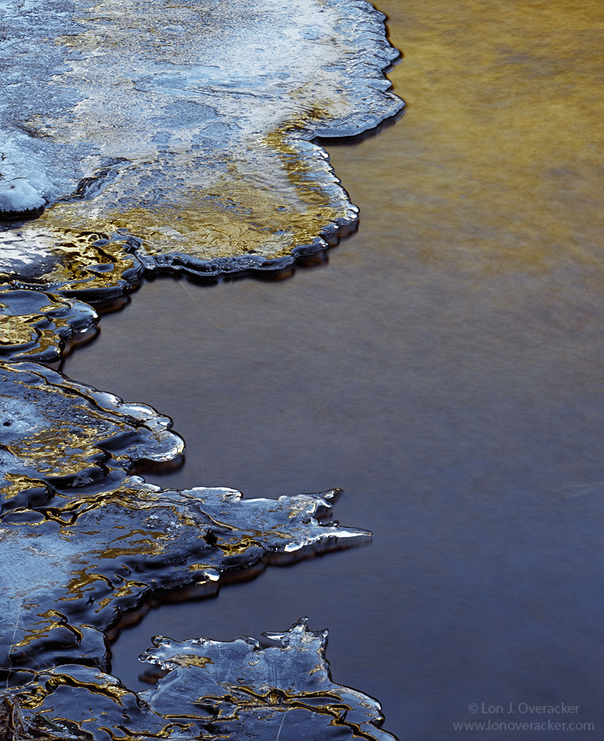
Here is another 4x5 from Yosemite.  This was captured January of last year just up river from Fern Springs along the Merced river.

Again I don't have the technicals, but I do know that some lens tilt was involved to get this image sharp from bottom to top.

As always I welcome your comments, critiques and suggestions.

Thanks!

Lon

Comments

16 comments
Comment posted by Igor Doncov on March 5, 2016 at 4:26 PM
My first impression was - what a beautiful abstract. And typically I would comment on the lines, colors, tones, shapes, and their placement in the frame. But does this say more than that. At first glance no, it's just an abstract. I gave it a rest and on the 2nd round I started to get it. 

This is is a Ying vs Yang idea. It's about peace vs aggression. Smoothness vs roughness. War vs Peace. War is in the peace area and peace has entered its counterparts domain. Is there a balance here between the two or is this an image of aggression. I believe that the interest lies in the tension between these two opposites. I think that's the crux of this image. 

This is excellent. 
Registered on November 22, 2014, 189 Posts, 2733 Comments
Comment posted by Dave Dillemuth on March 5, 2016 at 5:08 PM
Beautiful abstract. I love the juxtaposition of the sharp lines of the ice with the smooth water. The large version shows excellent details. The mix of cool and warm tones adds a lot of appeal. To that end, I think I might coax some more blue out of the ice. A matter of personal preference but I'd could see bumping up the overall sat slightly.
Registered on December 10, 2015, 104 Posts, 1112 Comments
Comment posted by Harley Goldman on March 5, 2016 at 6:11 PM
This is a beauty, Lon.  Nice balance, color and use of negative space. No suggestions from me. 
Registered on November 19, 2003, 586 Posts, 11271 Comments
Comment posted by David Schoen on March 5, 2016 at 6:56 PM
The digital image has yet capture in the same way. Maybe it is the Velvia.  With a large film image, one has far fewer restrictions than I have encountered using 35mm. Of course any mistake you make is amplified that much more.  The abstractness in this image is very pleasing. Terrific color and form.  The ice in the water really pick up some amazing tonality.
Registered on November 6, 2006, 1213 Posts, 4587 Comments
Comment posted by Roel Wijtmans on March 6, 2016 at 3:22 AM
Way cool! I love how the ice looks like metal in stead! Combine that with water with the right exposure time to get just enough detail in it, and I call it a winner! Colors are gorgeous too.
Registered on September 30, 2012, 116 Posts, 2257 Comments
Comment posted by Albert Darmo on March 6, 2016 at 11:10 AM

Hi  Lon crying   I think  David's  comment  echoed  my  thoughts perfectly.cool  i too love the  spectacular  color  and the abstract qualities  of this  very fine imagelaugh

Albert Darmo
Canada
Registered on November 25, 2008, 1386 Posts, 11978 Comments
Comment posted by Ryan Shain on March 6, 2016 at 11:25 AM
Hi Lon,

I love everything about this image. The way you have chosen to compose the image with eh ice framing the water works so well for myself. The ruggedness of the ice works so well with the softness of the water. Also, the cool and warm tones are just beautiful together. All the elements just work in this capture.

A beautifully crafted intimate image Lon, devil
Registered on February 20, 2007, 226 Posts, 4571 Comments
Comment posted by Eva McDermott on March 6, 2016 at 1:02 PM
Wonderful abstract Lon.  I like that there is really no sense of scale until you look closely at the ice.  I also like the visual balance ....and what is not to like about the blue and gold color combination.
Registered on January 4, 2009, 1015 Posts, 13229 Comments
Comment posted by Lon Overacker on March 6, 2016 at 2:13 PM
Thank you all for your comments and reactions, I appreciate it very much.

@Igor - great analogy with the Yin and Yang.  Honestly I hadn't thought of that.  I personally wouldn't go so far as War and Peace though, but certainly  opposites are in play here and I think many of the comments reflect that.

I almost hate admitting this on the air, so to speak.  But in reflecting upon myself and my photography, I'm not an emotional photographer.  I'm not trying to portray an emotion and frankly sometimes photography is an escape of my personal emotional state.  I don't think though that I try and transmit or convey that in my photography.

Having said that, I'm well aware of mood, atmosphere, metaphors and all kinds of things when I'm out there.  But mostly I'm simply trying to see things that appeal to my eye, composition, balance, extracting order from chaos, light, etc.  But in my reality, my left and right brains don't communicate very much when I'm photographing.

Thanks all!
Registered on November 24, 2006, 521 Posts, 19147 Comments
Comment posted by Preston Birdwell on March 6, 2016 at 2:19 PM
You nailed this, Lon. I like it very much. The balance of color and shapes work very well. No nits, here.

--P
Registered on November 1, 2003, 471 Posts, 5188 Comments
Comment posted by Dennis Plank on March 6, 2016 at 7:36 PM
I love all the curves formed by the ice edge, Lon, and the gold highlights are really cool.  A gorgeous image.

devil

 
Registered on January 28, 2008, 1767 Posts, 23192 Comments
Comment posted by Pete Bengeyfield on March 7, 2016 at 12:43 AM
Very nice.  The line between textured and smooth really makes this one.  Well seen!
Registered on December 2, 2003, 1247 Posts, 3439 Comments
Comment posted by scott lanz on March 8, 2016 at 8:49 PM
Very nice, Lon. Love the comp and the subject. 
Registered on November 14, 2003, 840 Posts, 12902 Comments
Comment posted by Mark Metternich on March 9, 2016 at 5:12 PM
Sweet shot Lon.  Love it.

Like the other, I wonder if blue could be pulled up a touch in "Color" blend mode...  But that is just my eye...

 
Registered on June 19, 2009, 276 Posts, 6240 Comments
Comment posted by Kah Kit Yoong on March 10, 2016 at 5:41 AM
Love the crisp edges contrasting with the smoothness elsewhere and the colour palette too of course.
Registered on September 27, 2006, 636 Posts, 10682 Comments
Comment posted by Doug Koepsel on March 13, 2016 at 12:05 PM
The shadow does a nice job of separating the ice colors and textures from the smoother water.  The glow on the upper water is nice. I might be inclined to crop off the top 15% to rid the less featured and brighter ice and leave the more colorful, detailed ice for the viewer.  Nice image with a contrast in sides.
Registered on April 1, 2010, 196 Posts, 1592 Comments