Nature Photographers Network
This is the preserved archive of the original Nature Photographers Network. The community continues at naturephotographers.network.
Shadow Dancers +alts
‹ PreviousLandscape GalleryNext ›

Shadow Dancers +alts

by Lon Overacker

Gallery: LandscapePosted March 12, 2016247 views16 comments
Thanks everyone for your comments on my previous entry!  I still have many more 4x5's that I can share, but I want to move forward to this past January from, guess where, Yosemite.

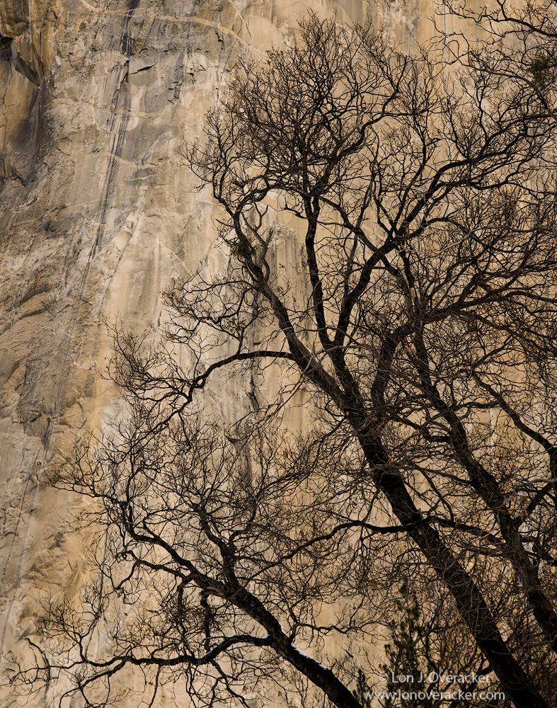
I had the title in mind the minute I began processing, but it's not really accurate because this is a silhouette and technically no shadows.  But if one sits back in your chair and let any detail in the trees fade away, this looks like shadow play on the granite wall of El Capitan.  At least that's what I see.  I purposefully didn't want any detail in the trunks and branches - if anything, I don't think the detail in the trees is important here.

I captured a series of images and I'm now torn as to which one I like best.  Wrather than post more in the coming days, I'm just going to include two additional images and let you help me decide.  Only two different frames here, but include on b&w conversion.

Would love to hear your comments, critiques and suggestions.

Nikon D800E
Tamron 24-135mm @ f16
Tony Kuyper's masks and actions.

Thanks!

Comments

16 comments
Comment posted by Lon Overacker on March 12, 2016 at 2:05 PM
Here is 2nd color version, different color balance.
Registered on November 24, 2006, 521 Posts, 19147 Comments
Comment posted by Lon Overacker on March 12, 2016 at 2:06 PM
and a b&w for good measure.

Thanks for any comments!
Registered on November 24, 2006, 521 Posts, 19147 Comments
Comment posted by scott lanz on March 12, 2016 at 9:55 PM
Hi Lon. I prefer the more neutral (to me) color of the original color post. The colors look very natural and pleasing. I like how some gray comes through the color. Terrific image.  
Registered on November 14, 2003, 840 Posts, 12902 Comments
Comment posted by Harley Goldman on March 13, 2016 at 9:33 AM
I prefer the B&W, then the second post. The B&W takes it down to the basic elements and I see more of the tree structure that way.  For me, the color tends to draw my attention more to the wall and away from the tree.  Really minor, but I might be inclined to clone out the very top right branch portions that extend up and out of the frame, to provide a little top space. I do like the uncropped look of the first one, Another nice Lon tree. 
Registered on November 19, 2003, 586 Posts, 11271 Comments
Comment posted by Jeffrey Sipress on March 13, 2016 at 12:28 PM
Lon, I prefer the original one.  A simple concept, well executed and enjoyable.


Registered on February 17, 2004, 236 Posts, 1197 Comments
Comment posted by Roel Wijtmans on March 13, 2016 at 12:53 PM
My winner would be your original. The more muted colors work better for me, and I just think that version does the beautiful granite wall the most justice. Second in line would be your second post, because the b+w version removes that amazing golden color, which is such a major part of this kind of photos. Your original is a very beautiful shot, and I would stick with that one.
Registered on September 30, 2012, 116 Posts, 2257 Comments
Comment posted by Dave Dillemuth on March 13, 2016 at 3:11 PM
Lon,
This is very nice. I too prefer the first rendering. Too me the second is a bit too warm and you lose some of those nice gray tones in El Cap. B&W is fine as well but I believe the colors are too nice to not include.
Registered on December 10, 2015, 104 Posts, 1112 Comments
Comment posted by Nick Bristol on March 13, 2016 at 6:13 PM
This looks great!! I like this comp very much and the first one works the very best for me. I like this very much!

Nick Bristol
Lone Rock, WI
 
Registered on February 1, 2004, 752 Posts, 14140 Comments
Comment posted by Vance Gese on March 13, 2016 at 11:57 PM
Fantastic, Lon.  The pattern of these trees against the glow on the rock face is a wonderful, stunning visual experience.  Your framing and composition could not be better.  I prefer the first post with the warms and grays of the rock, followed by the black and white for its pure joy of design.  Either would make a captivating print, as well as a fine addition to that book on Yosemite I hope you will someday consider doing.  Phenomenal work.
Registered on November 13, 2008, 298 Posts, 6629 Comments
Comment posted by David Schoen on March 14, 2016 at 1:38 PM
I think I like the original best because the colors are a little more sedate. I also like the way the upper left-hand corner with some of the darker tones mirrors the darker tones of the trees. Very nice.
Registered on November 6, 2006, 1213 Posts, 4587 Comments
Comment posted by Craig Moreau on March 14, 2016 at 2:16 PM
Lon, my preference is for the first image, then the b&w. I don't love the color balance of the second color image, it kills the beautiful grays of Yosemite granite. I think there's exactly the right amount of detail in the trees. Great, great work!
Registered on April 21, 2015, 64 Posts, 584 Comments
Comment posted by Lon Overacker on March 14, 2016 at 8:52 PM
Thanks everyone for your comments!  Pretty clear consensus about the warmer 2nd image.  I agree!  I'll probably reprocess that one.  Thanks for the feedback!
Registered on November 24, 2006, 521 Posts, 19147 Comments
Comment posted by Albert Darmo on March 15, 2016 at 9:26 PM
Hi  Loncrying   I too prefer the original version,   beautifully composed to capture the   beautiful   forms of these  amazing trees


Albert Darmo
Canada
Registered on November 25, 2008, 1386 Posts, 11978 Comments
Comment posted by Albert Darmo on March 27, 2016 at 10:40 PM
Hi  Loncrying  Congrats  on a well deserved WPdevildevildevil

Albert Darmo
Canada
Registered on November 25, 2008, 1386 Posts, 11978 Comments
Comment posted by Ingrid Vekemans on March 28, 2016 at 2:16 PM
It's a gorgeous image, Lon, congratulations!
Grt, Ingrid.
Registered on August 2, 2010, 138 Posts, 780 Comments
Comment posted by Preston Birdwell on March 30, 2016 at 6:14 PM
Lon, I like the warmer color version and the B&W.

Just a note about the 'wall': This is about the middle third of the 'Nose' of El Capitan. The dark overhang near the top edge is known as the "Great Roof".

Real nice images, sir, and congratulations on the EP!

--P
Registered on November 1, 2003, 471 Posts, 5188 Comments