Nature Photographers Network
This is the preserved archive of the original Nature Photographers Network. The community continues at naturephotographers.network.
Falling Waters
‹ PreviousLandscape GalleryNext ›

Falling Waters

by Nick Bristol

Gallery: LandscapePosted March 20, 2016257 views18 comments
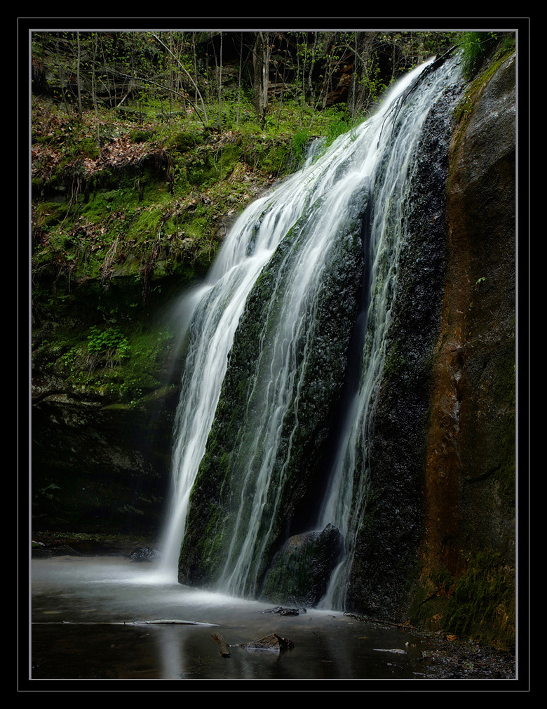
This is a falls that I often go to in the spring and I will be doing that again soon. It's only about 15 miles from my home and always a great place to hike around for awhile, and it is always at it's best in the spring. We just had over 2" of rain so thinking it might look pretty good this week now. I posted a tighter comp of this which didn't show the whole falls here before but now thinking I like this view a little more. Thanks for any thoughts you might have on it. Nick
Larger version included. 5D3, 35mm, F/16, 1.3 sec with cpl.

Comments

18 comments
Comment posted by Dan Kearl on March 20, 2016 at 9:46 PM
It has your trademark quality processing and terrific light. SS is subjective, I might like a tad slower...
Registered on September 2, 2013, 209 Posts, 1514 Comments
Comment posted by Kah Kit Yoong on March 21, 2016 at 3:22 AM
The three strips of flow and that matching mossy trail create quite a bit of interest compositionally. I quite like the shutter speed myself.
Registered on September 27, 2006, 636 Posts, 10682 Comments
Comment posted by David Schoen on March 21, 2016 at 12:44 PM
Very nice view of the falls.  Would be more dramatic with more water.  In this image I could see a tad more detail on the right side towards the bottom but only a tiny bit.
Registered on November 6, 2006, 1213 Posts, 4587 Comments
Comment posted by Bill Chambers on March 21, 2016 at 1:26 PM
This is sweet.  You hit the perfect shutter speed, which is important to me as a viewer, and the greenery adds a great splash of color.  Well done.
Registered on April 10, 2005, 753 Posts, 21216 Comments
Comment posted by Roel Wijtmans on March 21, 2016 at 1:34 PM
Lovely small waterfall, with those three separate "falls" and the brown stripe. While grand places are spectacular, it is often more intimate places like these that attract the most, I agree with you on that. Maybe brighten upp some of the darkest rocks a little? But not too much, that would not be beneficial.
Registered on September 30, 2012, 116 Posts, 2257 Comments
Comment posted by Richard Teller on March 21, 2016 at 5:13 PM
I like the SS, the composition and pov. I do a ageree with another comment that just a bit more detail in the darker parts of the rock.
Registered on August 23, 2010, 1162 Posts, 6692 Comments
Comment posted by Preston Birdwell on March 21, 2016 at 6:52 PM
This is nicely framed. I like the soft light, and the color and tones look very natural. I am curious as to why you used a polarizer? I think that without it, the reflection would have been a little stronger. In any event, I think this worked out well for you.

--P
Registered on November 1, 2003, 471 Posts, 5188 Comments
Comment posted by Nick Bristol on March 21, 2016 at 7:28 PM
Thanks to all of you for your comments on this one. I appreciate your suggestions as well and will work on a version with the darkest shadows lightened just a bit and do a repost here.
Preston, Thanks! I thought there was just a little to much reflected light on the wet rock and wanted to try and tone it down a bit if I could and the same for the water. I only dialed in the polarizer a small amount but thought it helped. I was also thinking if the reflections were brighter in the water they might be a distraction going out of the bottom of the frame. Thanks much, Nick
Registered on February 1, 2004, 752 Posts, 14140 Comments
Comment posted by Nick Bristol on March 22, 2016 at 9:23 AM
This one has the darkest shadow areas brought out a little more as suggested by a few. Thanks much! Appreciate the help. Nick
Clicking on the image seems to give a better detail view.
Registered on February 1, 2004, 752 Posts, 14140 Comments
Comment posted by Roel Wijtmans on March 22, 2016 at 12:54 PM
Repo is a very nice improvement for me, nice job!
Registered on September 30, 2012, 116 Posts, 2257 Comments
Comment posted by Lon Overacker on March 22, 2016 at 1:27 PM
Nick,

Excellent capture of these falls.  Actually, I think less is more in many cases; the lower flow gives the scene a little more gentle and quiet feeling to this.  The repost works very nicely; excellent processing.

I'm guessing, short of wading out in to the water.. your angle and vantage points were limited? If it were possible, it would be nice to have a more straight on view for some even more intimate images of the cascades.  I'm sure though it meant getting wet. ;-)

Lon
Registered on November 24, 2006, 521 Posts, 19147 Comments
Comment posted by Nick Bristol on March 22, 2016 at 4:22 PM
Roel and Lon, Thanks much!
Lon, I had high rubber boots on and could pretty much get to where I wanted to be. I did shoot a few different comps and overall this was probably the most pleasing for me. A little to much clutter around so was kind of selective about the comps. Thanks guys! Nick
Registered on February 1, 2004, 752 Posts, 14140 Comments
Comment posted by Harley Goldman on March 22, 2016 at 5:54 PM
Nice falls and nicely done image. I like the repost, but I would be inclined to back way off the cyan.
Registered on November 19, 2003, 586 Posts, 11271 Comments
Comment posted by Igor Doncov on March 22, 2016 at 7:57 PM
This is a very nice image, Nick. I like the original more because it had a dark, mysterious, wood enchanting look to it which is partly gone. Especially with that black frame. The middle fall is particularly attractive to me as is the bottom of the falls. I would play with the dark vs white theme you have chosen. Issues? They're really minor. I don't particularly like the brown vertical stripd on the right. I would darken it. The diagonal sapling catches your eye a bit. There's almost a dark velvet look to the image. I like it very much.
Registered on November 22, 2014, 189 Posts, 2733 Comments
Comment posted by Harry Lichtman on March 23, 2016 at 4:32 PM
Definitely a beautiful fall.  I think more flow might make it really impressive.  I might try to bring out more of the colors in the dark portions of the rock, maybe by using the highlight/shadow tool judiciously and slightly adjusting the color balance.  Might not make much of a difference, looks pretty darn good as is.  Too much water, and you will loose the soothing nature of the falls and it will become more of a beast - but that would make for some cool shots too.
Registered on September 17, 2010, 304 Posts, 3507 Comments
Comment posted by Nick Bristol on March 23, 2016 at 4:38 PM
Harley, Igor and Harry, Thanks guys for your thoughts and suggestions. Very much appreciated! Cheers, Nick
Registered on February 1, 2004, 752 Posts, 14140 Comments
Comment posted by Vance Gese on March 27, 2016 at 5:58 PM
A wonderful, peaceful image of these falls, Nick.  Love the composition, with the nice lines of the falls, the moss, and that rusty rock on the right hand side, all working nicely with the subtle horizontal bands of the rock.  Look forward to seeing images of these falls from this spring.
Registered on November 13, 2008, 298 Posts, 6629 Comments
Comment posted by Nick Bristol on April 9, 2016 at 10:03 AM
Hi Vance, Thanks a lot for your comment and sorry I didn't notice it sooner. I was at this location again but had a very hard time coming up with much. There was an awful lot of clutter around and I just couldn't get much to work out. I will be trying again before long. I did make a few shots but not sure I will even process them. Thanks, Nick
Registered on February 1, 2004, 752 Posts, 14140 Comments