
Nature Photographers Network
This is the preserved archive of the original Nature Photographers Network. The community continues at naturephotographers.network.
Angles (+repost)
‹ PreviousLandscape GalleryNext ›

Angles (+repost)

by Vance Gese

Gallery: LandscapePosted March 26, 20161,724 views16 comments

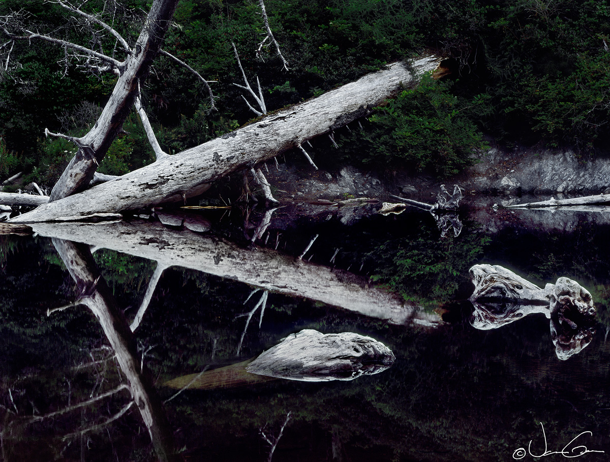
Made this image in July of 2014 along Cedar Creek which flows into the sea at Ruby Beach of Olympic National Park.   Wanted to emphasize the angles and lines and forms of these sun bleached snags, so the background has been darkened a bit more than usual.  Would appreciate your thoughts, suggestions, comments on this image.  A black and white version is posted below.

4x5, 210mm, no filters, Provia 100F.  Flatbed scan, Tony Kuyper's masks and others used in processing.


Larger, detail image attached as well.


Thanks.

Comments

16 comments
Comment posted by Vance Gese on March 26, 2016 at 2:36 PM
Black and white version.  Converted to b/w in Photoshop.
Registered on November 13, 2008, 298 Posts, 6629 Comments
Comment posted by Preston Birdwell on March 26, 2016 at 5:00 PM
Very graphic and symmetrical. I think I prefer the color version because the green in the background fir trees help to give more depth and adds a splash of color. The tones on the bleached wood look great. My only nit, albeit a minor one, is the light brown portion of the sunken log. You did a great job handling the processing in this, Vance.

--P
Registered on November 1, 2003, 471 Posts, 5188 Comments
Comment posted by Neale Dyster on March 26, 2016 at 8:17 PM
Great reflection shot, I prefer the colour version.
Registered on February 19, 2008, 94 Posts, 738 Comments
Comment posted by scott lanz on March 26, 2016 at 9:33 PM
Very cool, Vance. One more vote for the color version. 
Registered on November 14, 2003, 840 Posts, 12902 Comments
Comment posted by Roel Wijtmans on March 27, 2016 at 2:12 AM
Easy choice for me, color version wins because I really like the extra that those greens give. This is a really great find, and the comp is perfect. It shows that you carefully composed so the two wooden structures in the water don't interfere with the reflection of the log. Sweet photo!
Registered on September 30, 2012, 116 Posts, 2257 Comments
Comment posted by Eva McDermott on March 27, 2016 at 9:18 AM
I prefer the color version since it has mor depth.  The sunken logs on the right look like sea monsters.
Registered on January 4, 2009, 1015 Posts, 13229 Comments
Comment posted by Albert Darmo on March 27, 2016 at 9:15 PM
Hi  Vance crying Love the symmetry of the log's and their  reflection. on the water.   nature is a great artist..      i also prefer the color version


Albert Darmo
Canada
Registered on November 25, 2008, 1386 Posts, 11978 Comments
Comment posted by Lon Overacker on March 27, 2016 at 9:19 PM
Vance,

Graphics, angles and contrast - are three reasons I'll be different and say I'm leaning b&w.  Yes, the greens add something, but for me, the color doesn't contribute anything to the strength of the image.  And if I had a nit with the color version it would be that I see a bit of purple/magenta in the darker midtones  - especially along the shore and reflection.  For me anyway, the high contrast and graphic nature of this is just naturally suited for b&w.  at least that's my story.

Lon
Registered on November 24, 2006, 521 Posts, 19147 Comments
Comment posted by Bill Chambers on March 28, 2016 at 9:51 AM
Love the geometry of this image, as well as the reflection.  Excellent composition.  This is the type of image that really draws my attention and admiration because it is well seen as well as well made.
Registered on April 10, 2005, 753 Posts, 21216 Comments
Comment posted by Bill Chambers on March 28, 2016 at 9:53 AM
I just noticed you posted a B&W version as well.  Most would consider this to be a natural choice for B&W but I prefer the subtlety of the color version.  Just my .02.
Registered on April 10, 2005, 753 Posts, 21216 Comments
Comment posted by Dave Dillemuth on March 28, 2016 at 11:12 AM
I like this one. Very intriguing and creative image. Strongly abstract - reminds me of a Rorschach ink blot. This image is well suited and I think I prefer the B&W.
Registered on December 10, 2015, 104 Posts, 1112 Comments
Comment posted by Harley Goldman on March 28, 2016 at 5:25 PM
Great graphic quality and cool image. I am usually a B&W guy, but I prefer the color. The background blocks up quite a bit. The color differential makes the background more distinct for me. You might be able to tweak the B&W by brightening the green channel to eliminate that issue?
Registered on November 19, 2003, 586 Posts, 11271 Comments
Comment posted by Harry Lichtman on March 28, 2016 at 6:34 PM
Very cool image.  Both images work very well, but I would agree with Lon about the magenta color cast.  Maybe an adjustment here would make a little more natural.  I prefer the detail in the green trees and reflection of the color version - maybe it would be possible to bring out those details and tones in teh BW version.  The frame has been filled beautifully.  Eye catching.
Registered on September 17, 2010, 304 Posts, 3507 Comments
Comment posted by gary phillips on March 29, 2016 at 3:10 PM
When I saw the thumbnail, I thought what a perfect b/w subject. Then when I opened the image to find color, I thought that's cool, the greens really do add to the background.  Then I scrolled down and there was the b/w which will always be my favorite.  Beautiful and thoughtful work as always Vance.
Registered on October 24, 2013, 185 Posts, 4136 Comments
Comment posted by Vance Gese on March 30, 2016 at 8:02 PM
Hey, thanks everyone for all the feedback on this image.  Your comments are always extremely helpful.  I seem to favor the color image as well.

Lon and others, thanks for pointing out the magenta color cast in the background rocks.  Have attached a repost with those corrections.
Harley, thanks for the idea on the bw version.  I will try tweeking the green channel.

Thanks again.
Registered on November 13, 2008, 298 Posts, 6629 Comments
Comment posted by Wayne Jones on March 30, 2016 at 9:59 PM
I like the dominance of the forms in this image, and that facet is enhanced by the bold, high contrast treatment.  To me it has sort of a vintage look.  The black & white version is also visually bold, but seems to be missing some of the detail in the foliage, which appeals to me in the color version.  You did well making sense of this scene.  I was about to say that I would prefer a bit of space on the left side, but I see now that the other logs in the background on the left would probably have detracted from the strenght of the "double arrow" form of the two diagonal logs.
Registered on April 18, 2007, 953 Posts, 6435 Comments