Nature Photographers Network
This is the preserved archive of the original Nature Photographers Network. The community continues at naturephotographers.network.
Foothills-Two Oaks + rp
‹ PreviousLandscape GalleryNext ›

Foothills-Two Oaks + rp

by Preston Birdwell

Gallery: LandscapePosted April 18, 2016225 views14 comments
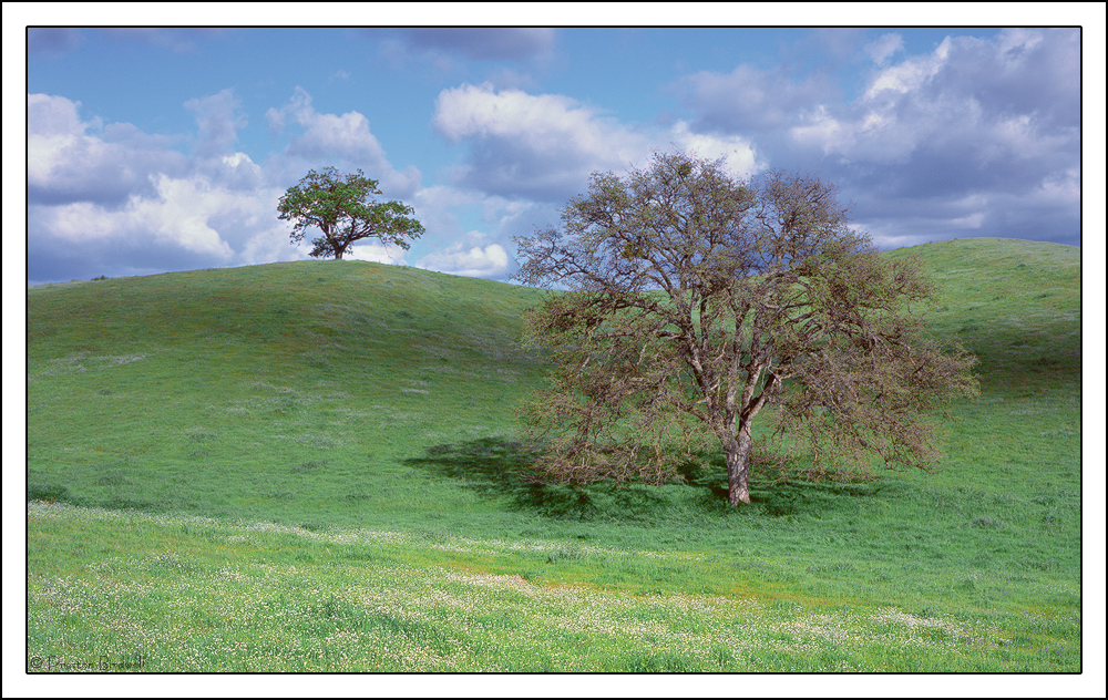
This is another from my archive that I reworked as a pano from a 6x4.5 cm transparency. Since it is Spring in the Sierra Foothills, I thought I would post it.

Mamiya 645E
Mamiya 150mm
Provia 100F
Selected TK's Luminosity masks and Vibrance and Saturation masks

Please see the large version. Thanks!

Your thoughts are always appreciated. cool

--P

Comments

14 comments
Comment posted by D.A. Edwards on April 18, 2016 at 3:40 PM
Very evocative, Preston, although perhaps the grasses are a tad bluer in hue than I am used to seeing. Don't blink because spring feels like it's going to be a short one... pushing 90 degrees today!
Registered on October 8, 2014, 226 Posts, 1187 Comments
Comment posted by Dave Dillemuth on April 18, 2016 at 7:17 PM
IMO, nothing prettier than stately, sweeping oaks in fresh green Sierra foothills. This is very nice take. The comp is well balanced with the near/far trees and hillside. Processing looks very natural - although I see Dave's comment on the green hue. Might be worth playing around with the color a bit. Only other suggestion would be to consider bumping up the contrast in the sky to get a bit more definition around those nice puffy clouds.
Registered on December 10, 2015, 104 Posts, 1112 Comments
Comment posted by Harley Goldman on April 18, 2016 at 11:05 PM
Beautiful rolling oak scene. The grasses do look a touch blue, might be worth experimenting with it. Nice grab from the archives. 
Registered on November 19, 2003, 586 Posts, 11271 Comments
Comment posted by Roel Wijtmans on April 19, 2016 at 11:14 AM
I think it could use a bit more warmth, other than that this is really graceful. I don't really know exactly what it is, but something gives this photo a bit of a surreal feeling, and I really like that. Very nice tree, can't go wrong with a subject like that. Great job!
Registered on September 30, 2012, 116 Posts, 2257 Comments
Comment posted by Preston Birdwell on April 19, 2016 at 4:36 PM
Thank you for your comments and suggestions, everyone!

Here is a tweaked version. The 1600px version is on my Website. I warmed the hillside, darkened the blue in the sky a bit, and reduced the blue in the hillside.

Your thoughts are always appreciated. cool

--P
Registered on November 1, 2003, 471 Posts, 5188 Comments
Comment posted by Richard Teller on April 20, 2016 at 12:21 PM
I really like everything about this image. I has a very nice peaceful feeling about it. Just a fine image.
Registered on August 23, 2010, 1162 Posts, 6692 Comments
Comment posted by gary phillips on April 20, 2016 at 7:45 PM
Really nice Preston.  I think the repost has eliminated the blue hue in the grasses.  I love this one. Keep digging if you can come up with more of these.
Registered on October 24, 2013, 185 Posts, 4136 Comments
Comment posted by Kah Kit Yoong on April 20, 2016 at 9:22 PM
A very pretty and idyllic scene Preston which makes me want to be there. There's some magenta in the clouds and top of the foreground tree which doesn't look quite right for me.
Registered on September 27, 2006, 636 Posts, 10682 Comments
Comment posted by Lon Overacker on April 21, 2016 at 1:52 AM
Hey Preston,

I thought the original look pretty awesome, but now that I see the repost - 20-20 hindsight says the feedback you received on the color and blue specifically was good advide.  The repost is beautiful!  I love the natural color throughout and you can't go wrong with spring in Gold country.  Well done sir.

Lon
Registered on November 24, 2006, 521 Posts, 19147 Comments
Comment posted by Mark Seaver on April 21, 2016 at 8:40 AM
The blue/green combo here is wonderful, Preston.  The near/far trees are positioned classically, adding a fine sense of depth as well as two great shapes.  The shadowed clouds look a bit purple.  In comparing the original with the repost, I'm liking the extra contrast that the darker greens in the original provide.
Registered on January 23, 2011, 1103 Posts, 17270 Comments
Comment posted by Harry Lichtman on April 22, 2016 at 9:59 AM
I think the boost in contrast/clarity really helped the image.  I especially light that cloud shadow in the upper hils as it helps define the topography for me.  Beautiful spring shot.  Looks like a nice time to be out west.
Registered on September 17, 2010, 304 Posts, 3507 Comments
Comment posted by Jean C Cajolet on April 22, 2016 at 11:12 PM
It's lovely image by the composition, colors and the sky. It's like that nothing is missing and everything must be there. Beautiful!
Registered on April 28, 2014, 53 Posts, 532 Comments
Comment posted by Eva McDermott on April 24, 2016 at 9:29 AM
Your repost is spot on Preston.  I also like your composition with the near and far trees.
Registered on January 4, 2009, 1015 Posts, 13229 Comments
Comment posted by Navin Sarma on April 29, 2016 at 11:02 AM
This is awesome Preston. Love the soft quality to this. The composition is simple but sophisticated. Makes me feel like I'm in a dream.
Registered on July 17, 2011, 233 Posts, 1373 Comments