Nature Photographers Network
This is the preserved archive of the original Nature Photographers Network. The community continues at naturephotographers.network.
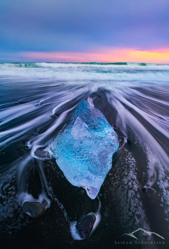
Repost : Ice Torpedo
‹ PreviousLandscape GalleryNext ›

Repost : Ice Torpedo

by Sairam Sundaresan

Gallery: LandscapePosted April 30, 2016145 views18 comments
Sorry for the spam folks, here's a corrected version based on all the feedback from the group. I wasn't sure if folks would see it as the original post has trickled down quite a bit. 

I've uploaded the other images here for reference as well. 

 

Comments

18 comments
Comment posted by Sairam Sundaresan on April 30, 2016 at 2:47 AM
Here're the original and the modified repost for reference. The main picture above is the latest iteration 
Registered on March 14, 2013, 100 Posts, 643 Comments
Comment posted by Sairam Sundaresan on April 30, 2016 at 2:48 AM
Repost 1 :
Registered on March 14, 2013, 100 Posts, 643 Comments
Comment posted by Kah Kit Yoong on April 30, 2016 at 8:08 AM
Looking much better. That's a very nice looking piece of ice by the way. The warm colours on the horizon looked a bit 'recovered', not sure whether you might be able to reprocess from RAW for a more natural result, depending on your histogram.
Registered on September 27, 2006, 636 Posts, 10682 Comments
Comment posted by Doug Koepsel on April 30, 2016 at 10:55 AM
The reposts are improved with the reduced lavender/magenta/purple of the foreground waters.  There seems to be a distortion that causes the horizon waterline to be curved.  I like the comp with the strong diamond shaped piece of ice.
Registered on April 1, 2010, 196 Posts, 1592 Comments
Comment posted by Pete Bengeyfield on April 30, 2016 at 12:36 PM
Very nice.  You brought out the blues i the ice, and the detail in the surf very well.  I rally like this..
Registered on December 2, 2003, 1247 Posts, 3439 Comments
Comment posted by gary phillips on April 30, 2016 at 12:49 PM
This is just a special image, Sairam.  I think you could present any of these iterations successfully.  I like them all.  
Registered on October 24, 2013, 185 Posts, 4136 Comments
Comment posted by Marylynne Diggs on April 30, 2016 at 2:02 PM
The more I look at this one, the more I like it Sairam.  I think it's partly the purple and the whole Prince thing laugh.  Ocean formerly known as iceberg?  Perhaps.
Registered on December 14, 2010, 122 Posts, 1034 Comments
Comment posted by Igor Doncov on April 30, 2016 at 2:43 PM
I think the original presentation may have been better as an artistic impression. There the ice is treated as a different and separate object through color. It had a surrealistic look to it. An artistic expression. Now it's starting to look more realistic but it's not truly realistic at all. I guess my feeling is that if you're going to get creative like that then go all the way: purple sky with purple water. Why not?
Registered on November 22, 2014, 189 Posts, 2733 Comments
Comment posted by Preston Birdwell on April 30, 2016 at 3:05 PM
I think the first image in the re-post looks the best. It could be just me, but the horizon appears to have a slight clockwise tilt. I am a little on the fence with magenta in the water on the right side of the berg--perhaps reduce it just a bit? The composition is quite nice, and the mood is very dramatic.

--P
Registered on November 1, 2003, 471 Posts, 5188 Comments
Comment posted by Dan Kearl on April 30, 2016 at 3:19 PM
I prefer the first one. I also think the horizon needs a bit of CCW rotation.
Registered on September 2, 2013, 209 Posts, 1514 Comments
Comment posted by Basil Greber on April 30, 2016 at 8:16 PM
I like the rework better than the original. I would probably darken the sky a bit more to make it less of a stark contrast to the dark sand beach.
Registered on November 8, 2005, 219 Posts, 1340 Comments
Comment posted by Harley Goldman on April 30, 2016 at 10:26 PM
Repost 1 works, but the magenta water is not really doing it for me. 
Registered on November 19, 2003, 586 Posts, 11271 Comments
Comment posted by Sairam Sundaresan on May 1, 2016 at 1:06 AM
Thanks all! Appreciate the awesome critique!
Registered on March 14, 2013, 100 Posts, 643 Comments
Comment posted by Roel Wijtmans on May 1, 2016 at 2:04 AM
A big improvement I would say! Love it!
Registered on September 30, 2012, 116 Posts, 2257 Comments
Comment posted by Mark Seaver on May 1, 2016 at 10:46 AM
The colors look much more realistic here, Sairam.  The focus on the iceberg surrounded by the lines of flowing water make this very dynamic as well as dramatic.
Registered on January 23, 2011, 1103 Posts, 17270 Comments
Comment posted by Lon Overacker on May 1, 2016 at 1:21 PM
Much better Sairam, including the slight crop.
Registered on November 24, 2006, 521 Posts, 19147 Comments
Comment posted by Aaron Feinberg on May 1, 2016 at 6:54 PM
So good!  nICE work sir.

aF
Registered on October 26, 2009, 399 Posts, 2789 Comments
Comment posted by John Williams on May 4, 2016 at 11:30 PM
Beautiful chunk of ice! First repost for me Sairam, but I too would take the magenta back out of the foreground water.
Registered on September 6, 2007, 221 Posts, 5985 Comments