Gallery: LandscapePosted May 5, 20161,511 views8 comments
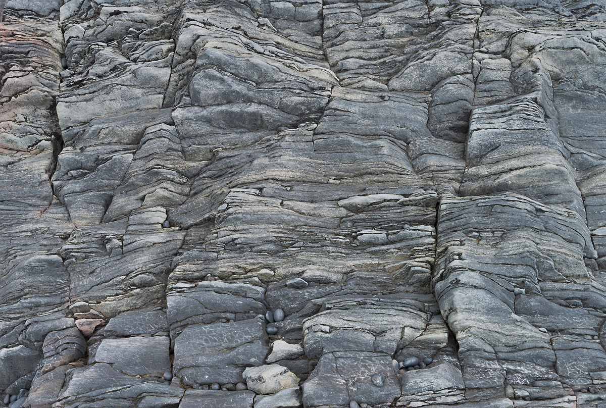
Taken very close to the other "nature's jiggsaw" post from some time back. A nice rock formation in Iceland.
f/16, ISO 100, 1.3 s, 35 mm.
C&C welcome, large version is included.
Roel
Comments
8 comments
Comment posted by Preston Birdwell on May 5, 2016 at 6:42 PM
I like the concept, here, Roel, but I think it looks a little flat--it could use a bump in contrast and perhaps some tweaking of saturation to pop the color a bit. I like the textures and the detail.
--P
Registered on November 1, 2003, 471 Posts, 5188 Comments
Comment posted by Harley Goldman on May 5, 2016 at 6:58 PM
I like Preston's suggestions and would be curious to see it bumped.
Registered on November 19, 2003, 586 Posts, 11271 Comments
Comment posted by Dave Dillemuth on May 5, 2016 at 10:04 PM
I like this. Has a pleasing monochromatic, graphic look. I agree with the suggestions to play around with increasing the mid-tone contrast and bumping up the saturation. I would also play with the temp to see what a cooler rendering would look like.
Registered on December 10, 2015, 104 Posts, 1112 Comments
Comment posted by gary phillips on May 6, 2016 at 12:34 AM
That's an interesting wall, Roel. I really like the smaller round stones tucked in among the ledges and holes. I like the suggestions to play with mids and maybe pop it a bit. Well seen.
Registered on October 24, 2013, 185 Posts, 4136 Comments
Comment posted by Mark Seaver on May 8, 2016 at 1:53 PM
Yes, indeed, this is a great collection of shapes and textures, Roel. There's a fine balance with the transitions from lots of small cracks and layers in the upper left to the larger, smoother textures in the lower right. The textures and subtle colors look great. Just for fun, I wonder how this would look if you really pushed the contrast hard to make it much more abstract. I'm not sure that would be better, just different.
Registered on January 23, 2011, 1103 Posts, 17270 Comments
Comment posted by Ryan Shain on May 10, 2016 at 11:02 PM
Hi Roel,
I am digging the the shapes, lines and textures in this fine image. The study of rock shape and form is top notch in this capture.
I had a thought for you. Have you tried to really push contrast, clarity or structure, whites, black, and anything else you can think pof to see what you come up with? Heck maybe even a black and white conversion could be cool.
Registered on February 20, 2007, 226 Posts, 4571 Comments
Comment posted by Peter Richter on May 14, 2016 at 1:42 AM
Roel, your framing of this abstract intimate scene is spot on to my eye. I especially enjoy the three dimensional feel to it. The image was obviously taken under diffused lighting conditions, and the subtlety in your presentation fits in well in my opinion. You convey your personal experience of this moment in a convincing way to me.
Peter
Registered on November 10, 2010, 218 Posts, 2723 Comments
Comment posted by Ian Wolfenden on May 26, 2016 at 2:25 PM
While it would certainly be interesting to see how greater contrast worked ( and you may already have rejected that idea ) this works for me as is. A perfectly seen abstraction from this rock formation - the rocks seeming to move like waves over the depths.
Registered on May 18, 2007, 1108 Posts, 7647 Comments

Comments
8 comments--P
I am digging the the shapes, lines and textures in this fine image. The study of rock shape and form is top notch in this capture.
I had a thought for you. Have you tried to really push contrast, clarity or structure, whites, black, and anything else you can think pof to see what you come up with? Heck maybe even a black and white conversion could be cool.
Peter