Gallery: AvianPosted May 15, 201655 views7 comments
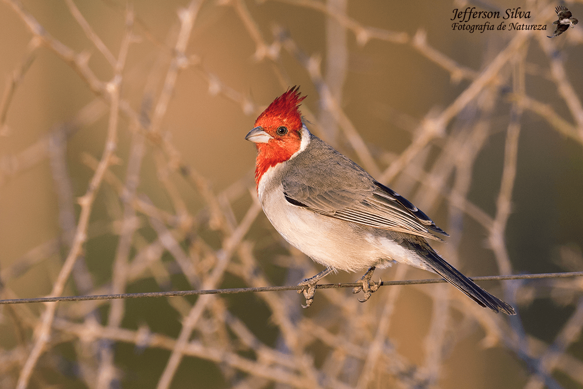
Does the background work for you?
Canon 7D II, Canon 500mm f/4
f/8, 1/200, ISO 400, -0.33
Comments
7 comments
Comment posted by Kurt Bowman on May 15, 2016 at 6:00 PM
This one stands out well against what could have been a very busy BG. I think your choices made the BG not too distracting. Love the colors on this bird and nice techs. Good work Jefferson!
Registered on June 19, 2008, 1005 Posts, 8028 Comments
Comment posted by Dennis Plank on May 15, 2016 at 6:03 PM
Hi Jefferson: The bg is a bit of a distraction in this one and the bird looks a bit bright on my screen. I think I'd reduce the overall brightness slightly and then try blurring and/or desaturating the bg a bit. I've also had good results by reducing the exposure of the bg with respect to the subject by about 1/3 stop. It's usually not very noticeable, but it helps make the subject stand out a bit more.
Excellent detail in the bird, and the bg is interesting. It's just going to take some playing to get the balance right.
Registered on January 28, 2008, 1767 Posts, 23192 Comments
Comment posted by John Tobias on May 15, 2016 at 7:41 PM
The BG is busy, but not too distracting IMHO. I do think the cardinal is too bright and could use some adjustment.
I like the pose and details in the bird. Thanks for sharing.
Registered on September 12, 2009, 2120 Posts, 6455 Comments
Comment posted by Barb Pflaum on May 15, 2016 at 10:05 PM
Great sharpness and detail in the Cardinal. I like the color of the bg and I don't think the bg is too distracting.
Registered on January 14, 2009, 316 Posts, 2724 Comments
Comment posted by Jim DeWitt on May 16, 2016 at 12:17 PM
I'm good with the background. Nice light. Very good detail in the bird.
Registered on August 28, 2006, 1240 Posts, 8506 Comments
Comment posted by David Schoen on May 16, 2016 at 2:26 PM
There is a big difference between the large detailed view at the smaller view on my monitor which is calibrated. The colors and the larger view are fine and don't really need to be changed however in the smaller views they appear to be too bright. The background is a little distracting but more so in smaller venues that the larger view where it pops appropriately.
Registered on November 6, 2006, 1213 Posts, 4587 Comments
Comment posted by Jefferson Silva on May 16, 2016 at 8:52 PM
Thanks guys for your comments.
David, that's weird, because I have uploaded just one photo. If there is any difference, that's due to some resize performed by the site, not due to any difference between two files.
Registered on December 18, 2012, 162 Posts, 975 Comments

Comments
7 commentsExcellent detail in the bird, and the bg is interesting. It's just going to take some playing to get the balance right.
I like the pose and details in the bird. Thanks for sharing.
David, that's weird, because I have uploaded just one photo. If there is any difference, that's due to some resize performed by the site, not due to any difference between two files.