Nature Photographers Network
This is the preserved archive of the original Nature Photographers Network. The community continues at naturephotographers.network.
Got Away
‹ PreviousLandscape GalleryNext ›

Got Away

by John Williams

Gallery: LandscapePosted June 18, 20163,971 views14 comments
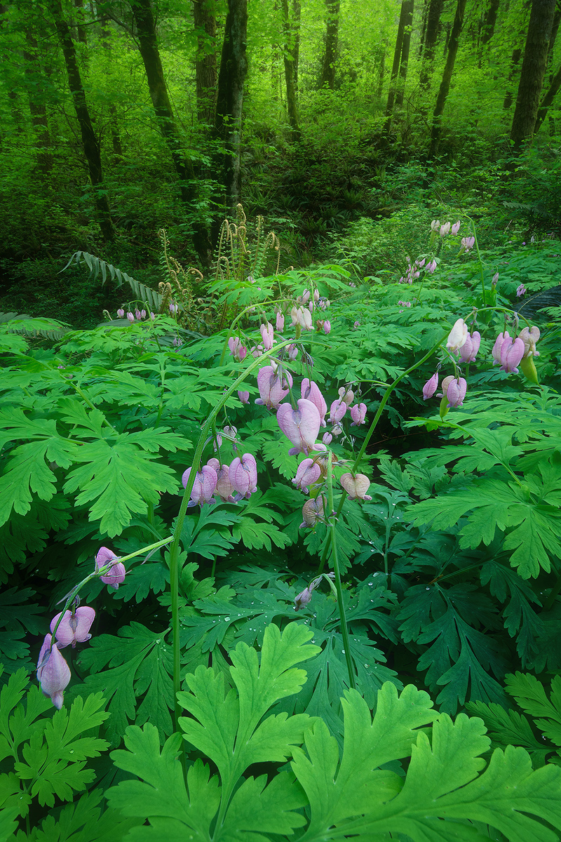
My heart bleeds for this one. (I know, sad punnery.) I used three images for depth of field here, but somehow I did not get the closest elements in this image in sharp focus; mostly the closest flowers, and to a lesser extent the leaves at the bottom of the image. Frustratingly I'm not sure how I missed. I'm guessing it was an autofocus issue. Sometimes it misses on these close elements, but I always take two or three series to try and avoid a misfire. Somehow that didn't work here. What I didn't do (learning for the future here), was to take a manually focused shot of the closest stuff. I thought about not posting due to the issue (only post your best stuff, right? wrong?), but I'm rather fond of this one so I differentially sharpened it in Photoshop and am posting it anyway.

I love this location. Every year we ride through here on the Columbia Gorge Explorer Tour, and I always wish I had my full camera gear and more time; it's such a beautiful tunnel of green. This year I finally went by foot and with the gear. I'll have to do it again and try to mend the error of my ways in the future.

I'd love your thoughts. Since I'm going back anyway, I can use the suggestions to shoot the best I can.

Comments

14 comments
Comment posted by Richard Sandor on June 18, 2016 at 6:57 PM
John: regardless of your own critique, this is an exceptional image. Initially, I was attracted to the pink flowers and then the bright green foliage which acted as a leading line going into the wooded area. The variety of green tones, the splash of pink and the composition are most pleasing. This photo really says Spring. Congrats! Richard
Registered on January 12, 2014, 453 Posts, 1625 Comments
Comment posted by scott lanz on June 18, 2016 at 7:09 PM
Beautiful image, John. The bleeding hearts make a sweet foreground. The flowers look perfectly fine to me as far as detail/sharpness goes. The leaves at the far bottom are a bit soft, but it's not an issue for me at all. My only question concerns the color of the flowers. They look lavender in your photo (versus pink), and I've never seen bleedings hearts this color, but they certainly stand out beautifully from the greenery. 
Registered on November 14, 2003, 840 Posts, 12902 Comments
Comment posted by Vance Gese on June 18, 2016 at 7:26 PM
Love this, John.  The prominent foreground I think is outstanding, even with the slight softness.  The green and the shapes of the leaves grab the viewer and pull the viewer into the frame with the beautiful colors and lines of the flowers.  The background is the perfect backdrop to the flowers and green.  A superb image in my opinion; the softness of the foreground might be an issue with a large print.
Registered on November 13, 2008, 298 Posts, 6629 Comments
Comment posted by Bill Leggett on June 18, 2016 at 7:47 PM
This comp works very nicely, John, the flowers accented by the lush greenery come together in the frame well.  Details are nice in the big version.
Registered on July 21, 2004, 706 Posts, 3233 Comments
Comment posted by gary phillips on June 18, 2016 at 8:54 PM
I always view the large image before I read anything about the image.  I want my first impression to be untainted by anything.  After enjoying the image, I was somewhat surprised by your description.  I am hardly ever totally happy with my images and think there is always something that could have been better. I know the caliber of your work and think this is totally an awesome image and technically very well done. Like Scott, I thought the almost imperceptible softness of the fore leaves hardly an issue.  I think the flowers and, for me the very sharp drops of water and the wonderful light make the image.  Only a diehard photog would even notice the slight softness there.  Overall, I wouldn't sell myself short on this one, John.  I love it.
Registered on October 24, 2013, 185 Posts, 4136 Comments
Comment posted by Peter Richter on June 19, 2016 at 2:33 AM
A convincing composition for me, that really draws me in.

If you are thinking of a print, cropping the bottom with the slightly blurred elements might help without doing harm to the overall impression in my opinion. By the way, I even think of cropping from the top the brightest areas of the background, that might help me to focus on the delicate flowers and still add some depth.

Peter
Registered on November 10, 2010, 218 Posts, 2723 Comments
Comment posted by Harley Goldman on June 19, 2016 at 9:50 AM
Beautiful image and the slight softness does not detract from it in the slightest for me. Sweet! Print it big. 
Registered on November 19, 2003, 586 Posts, 11271 Comments
Comment posted by Dan Kearl on June 19, 2016 at 10:48 AM
Look sharp enough for me... attractive comp and flowers. I might have tilted the lens a tad to get a bit more of the background...
As an aside, we should do a ride, I rode over 5000 miles last year....
Registered on September 2, 2013, 209 Posts, 1514 Comments
Comment posted by Tom Falley on June 19, 2016 at 11:01 AM
John:

Thanks for sharing your story about this one. We all learn from such information. Determining the correct number of images for stacking can be an issue, then with images such as this, subject motion between exposures  and on and on.

Good vision!
Registered on November 21, 2014, 189 Posts, 454 Comments
Comment posted by Daniel Rappaport on June 20, 2016 at 11:27 AM
Beautiful image, very well composed. The flowers are clear and strong.  One thing I've found (almost to my dismay at times) is that nobody cares about perfect sharpness except us, but people consistently "get" a well composed image. 
Registered on September 9, 2009, 294 Posts, 2006 Comments
Comment posted by Sairam Sundaresan on June 20, 2016 at 5:37 PM
The large version is a real treat, and the pink stands out beautifully against the vibrant greens. Nice layered comp too. Well scene (bad punnery right back at ya), John :)
Registered on March 14, 2013, 100 Posts, 643 Comments
Comment posted by Harry Lichtman on June 21, 2016 at 10:08 AM
Beautiful scene, the contrast in colors really pop off the screen.  I this situation, it can be difficult to see which element is closest to the lens for focusing.  My method is to look at the scene alongside the camera and make a mental note of the leaf or flower that is closest - I might even use my finger and point to it, then look through the viewfinder or Live View at the same time to make sure I'm hitting the spot.  Maybe focus using Live View, then just turn the man focus ring in small increments without even looking at anything on the camera - several shots can be rattled off within seconds to prevent wind from disturbing and making the blend more difficult.  The general anesthetics of the image greatly over ride the small technical glitch to the general viewer, I would think.
Registered on September 17, 2010, 304 Posts, 3507 Comments
Comment posted by Mark Seaver on June 21, 2016 at 11:10 AM
This is a spectacular look, John.  Love the all the greens and your emphasis on the leaf shapes plus flowers in the foreground.  Definitely worth a redo to get everything sharp.  I could see an alternative to this with less forest at the top.  As a major macro stacker, have you checked your individual images.  My stacking software sometimes substitutes softer areas for sharp when the soft area is brighter in a subsequent image.
Registered on January 23, 2011, 1103 Posts, 17270 Comments
Comment posted by Ryan Shain on June 22, 2016 at 2:32 PM
Hi John,

First off, the overall feeling this image brings to me of an uplifting nature as the greens are wonderfully lush. The purplish flowers add just enough color to create the needed separation between the foreground and background greenery. The vertical dark tress add some nice depth and interest as well. I am really digging this image overall, and it makes me feel alive. 

I have read some of th other comments about the immediate softness in the foreground leaves, and I think that could be a hindrance in large print as others have mentioned. A slight crop could eliminate the issue, but I am ot sure how you feel abut the balance in that presentation.

 
Registered on February 20, 2007, 226 Posts, 4571 Comments