Nature Photographers Network
This is the preserved archive of the original Nature Photographers Network. The community continues at naturephotographers.network.
No Ice Cream
‹ PreviousPOP Photos GalleryNext ›

No Ice Cream

by Philip Hodgkins

Gallery: POP PhotosPosted July 17, 20168,137 views7 comments
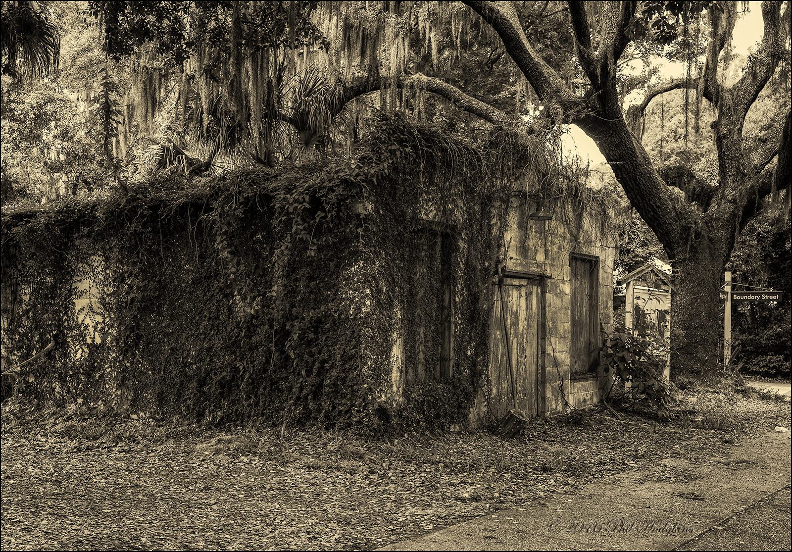
It looks like a long abandoned country store. One side (not visible) had a very faded Sealtest Ice Cream sign. I suspect it has been abandoned since the '50s. It appears structurally sound, made of concrete blocks, but over run with vines and weeds. This is in Bluffton, SC, not far from Hilton Head. That area of SC has been booming for the last twenty years, and residential development has moved around and beyond this building for several miles.

Thanks for looking. Be sure to look at the large picture for the best viewing.

Camera Info:    Nikon D750, monopod
Lens:    VR 16-35mm f/4G
Focal Length:    35mm
Focus Mode:    AF-C
AF-Area Mode:    Single
VR:    ON
Aperture:    f/11
Shutter Speed:    1/13s
Exposure Mode:    Aperture Priority
Exposure Comp.:    0EV
Metering:    Matrix
ISO Sensitivity:    ISO 400
73% of full frame
PP in LRCC 2015, PSCC 2015.5, Silver Efex Pro, Camera Rw filter

Comments

7 comments
Comment posted by Harley Goldman on July 18, 2016 at 5:47 PM
Cool old building and like the treatment with the toning. Works real well here. I might be inclined to clone out the street sign, should that be something you would be comfortable doing. I find it a bit of jarring modernity (if that is a word). 
Registered on November 19, 2003, 586 Posts, 11271 Comments
Comment posted by Floyd Hopper on July 18, 2016 at 7:41 PM
Very nice.  I like the sepia tone.
Registered on May 1, 2009, 652 Posts, 762 Comments
Comment posted by Philip Hodgkins on July 18, 2016 at 11:11 PM
Harley, that is exactly why I left it in—the "jarring modernity". cool
Registered on July 24, 2006, 2741 Posts, 12349 Comments
Comment posted by Richard Sandor on July 19, 2016 at 10:03 AM
Phil: looks like the home of the Wicked Witch and the sepia treatment amplifies the air of desertedness/spookyiness.  Since you mentioned the image was cropped, I would like to see one (if possible) with less foreground and more tree. Richard
Registered on January 12, 2014, 453 Posts, 1625 Comments
Comment posted by Eva McDermott on July 24, 2016 at 4:28 PM
Hi Phil - I love the sepia toning and wonderful detail in the larger version.
Registered on January 4, 2009, 1015 Posts, 13229 Comments
Comment posted by Preston Birdwell on August 3, 2016 at 3:55 PM
This works for me. I like the toning. It looks just right for the subject. I do agree with Harley about removing the sign and its post. A very moody, and slightly spooky image, Phil.
--P
Registered on November 1, 2003, 471 Posts, 5188 Comments
Comment posted by Patrick O'Healy on August 6, 2016 at 2:27 PM
Phil,
Really cool photo.  I love the sepia processing.  I really like to shoot old buildings.  The more decrepit the better. 
Registered on March 13, 2011, 326 Posts, 1679 Comments