Gallery: Weekly ChallengePosted October 13, 201639 views3 comments
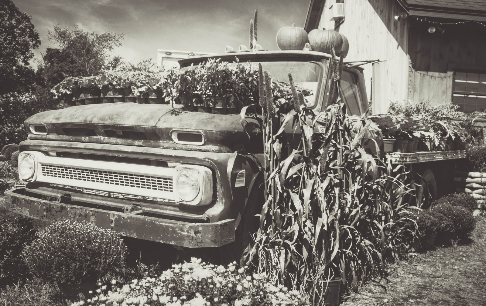
I just loved this old truck being used as a plant display at Colby Farmstand in Newbury, MA.
Nikon D3200
18-300mm f/3.5-6.3 lens
ISO 100, f/16.0, 1/40, 21.0mm
Comments
3 comments
Comment posted by Dennis Plank on October 13, 2016 at 7:20 PM
Very well photographed, Kayla. I like the monotone treatment you used.
Registered on January 28, 2008, 1767 Posts, 23192 Comments
Comment posted by Mark Seaver on October 14, 2016 at 12:25 PM
I agree about how neat this "display" is. The old truck makes a great platform and your b&w treatment sure shows off the wide variety of shapes and textures. Were this mine, I'd tone down the brights a bit to pull some detail out of the truck's grill area, but that's my taste, not yours.
Registered on January 23, 2011, 1103 Posts, 17270 Comments
Comment posted by Mike Ramy on October 15, 2016 at 4:59 PM
Kayla,
Well seen and I too agree about this being a cool display. You had some very harsh light to work with and you handled it fairly well. I agree the image is to bright with some hot spots that draw the viewers attention, the grill of the truck and the side of the building are the most obvious. If you use Topaz extensions, applying a filter or two from there would help, if not try a bit of contrast. The B & W conversion appears flat on my monitor and would also be helped with some additional work in processing. The key to good B & W is the tonal range quality between the whites, grays and blacks. A good example of this can be found on your own web-site on the client log-in page. The image of the little boy at the Easter Egg Hunt and the one playing with the trucks in the sand are both excellent examples of good tonal range. When you compare them to this image, I think you can see the difference. Two other points that pop out at me concerning this image are: 1) It is tilted and needs some CCW rotation to correct. If it was intentionally tilted for artistic expression, it does not work IMO but that is just a matter of taste and others will surely disagree. However, when you have objects or an horizon in an image that are distracting when tilted it does not work. In this case it is the building and the roof line in the upper right corner is your key point that should be straight, 2) In the upper center of the image just above the cab of the display truck is the top back of a delivery truck that seems totally out of place for the wonderful mood that this image projects. It can easily be cloned out in this case and improve the overall image IMO.
I hope my thoughts on this image are helpful and give you another perspective to consider. When I first started at NPN, my images were critiqued with a fine tooth comb and I often thought these observations were to nit picky to matter, but has my work improved, I came to realize how important they were. The smallest details can make the difference between a good image and a great image.
Your web-site seems to be fairly new but is off to a great start. Web-sites take a lot of work but are the best tool you have to represent your work to clients and to make that all important 'First Impression'.
Welcome to NPN and don't hesitate to take advantage of and learn from all the talented and helpful members here. I sure did and I can honestly can say that joining NPN has been the single most helpful aspect of my photography endeavors.
Looking forward to seeing more of your work . . .
Registered on June 16, 2012, 567 Posts, 2809 Comments

Comments
3 commentsWell seen and I too agree about this being a cool display. You had some very harsh light to work with and you handled it fairly well. I agree the image is to bright with some hot spots that draw the viewers attention, the grill of the truck and the side of the building are the most obvious. If you use Topaz extensions, applying a filter or two from there would help, if not try a bit of contrast. The B & W conversion appears flat on my monitor and would also be helped with some additional work in processing. The key to good B & W is the tonal range quality between the whites, grays and blacks. A good example of this can be found on your own web-site on the client log-in page. The image of the little boy at the Easter Egg Hunt and the one playing with the trucks in the sand are both excellent examples of good tonal range. When you compare them to this image, I think you can see the difference. Two other points that pop out at me concerning this image are: 1) It is tilted and needs some CCW rotation to correct. If it was intentionally tilted for artistic expression, it does not work IMO but that is just a matter of taste and others will surely disagree. However, when you have objects or an horizon in an image that are distracting when tilted it does not work. In this case it is the building and the roof line in the upper right corner is your key point that should be straight, 2) In the upper center of the image just above the cab of the display truck is the top back of a delivery truck that seems totally out of place for the wonderful mood that this image projects. It can easily be cloned out in this case and improve the overall image IMO.
I hope my thoughts on this image are helpful and give you another perspective to consider. When I first started at NPN, my images were critiqued with a fine tooth comb and I often thought these observations were to nit picky to matter, but has my work improved, I came to realize how important they were. The smallest details can make the difference between a good image and a great image.
Your web-site seems to be fairly new but is off to a great start. Web-sites take a lot of work but are the best tool you have to represent your work to clients and to make that all important 'First Impression'.
Welcome to NPN and don't hesitate to take advantage of and learn from all the talented and helpful members here. I sure did and I can honestly can say that joining NPN has been the single most helpful aspect of my photography endeavors.
Looking forward to seeing more of your work . . .