Gallery: LandscapePosted October 19, 2016194 views11 comments
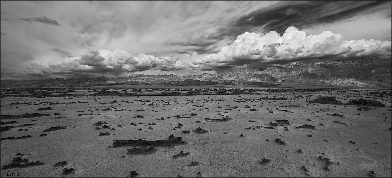
Another image taken from West Side road in DV, cropped to pano. D600, 14-24 @ 14, f18, iso 200. Suggestions and other comments welcome. Being a pano, the larger image makes much better viewing.
Comments
11 comments
Comment posted by Harley Goldman on October 19, 2016 at 10:41 AM
A beautiful classic (and wonderfully stark) image. I love images of wide open spaces and this one works quite well. Very minor, but to my eye, it looks like a little bit of lens distortion? Perhaps flatten the horizon slightly? But like I said, very minor and it could also just be the lay of the land. I like this a lot.
Registered on November 19, 2003, 586 Posts, 11271 Comments
Comment posted by Nick Bristol on October 19, 2016 at 11:06 AM
Scott, I like this a lot too. The desolate open land topped off by those fantastic clouds works wonderfully in black and white. I especially enjoyed looking at the large version. Nice work!!
Nick Bristol
Lone Rock, WI.
Registered on February 1, 2004, 752 Posts, 14140 Comments
Comment posted by Igor Doncov on October 19, 2016 at 1:10 PM
The large view is definitely the way to go. The clouds, sky, and mountains are spectacular. I would make this an even longer pano by cropping the bottom to just above the large log. That would emphasize the clouds more, which are the best part of this image. A great image either way, however.
Registered on November 22, 2014, 189 Posts, 2733 Comments
Comment posted by Peter Richter on October 19, 2016 at 3:14 PM
There are stunning dynamics for me in your image, Scott. The clouds with their rich contrasts draw my attention and lead me into the depth of the scene.
I think of increasing the contrast in the foreground and especially brightening the midtones a bit in order to balance it with the sky. That is just my personal opinion of course and the composition is convincing as presented for me.
Peter
Registered on November 10, 2010, 218 Posts, 2723 Comments
Comment posted by Ian Wolfenden on October 19, 2016 at 5:43 PM
This works superbly for me, Scott. The balance of foreground, hills and sky is perfect, with the conversion also beautifully balanced and varied in tones..
Registered on May 18, 2007, 1108 Posts, 7647 Comments
Comment posted by Richard Teller on October 19, 2016 at 7:12 PM
The B&W works really well for this image. The dramatic sky makes the image for me. Also the great depth of the image.
Registered on August 23, 2010, 1162 Posts, 6692 Comments
Comment posted by Tony Kuyper on October 19, 2016 at 11:39 PM
Really liking the comp and textures. Black and white is a good choice. Some of the grays in the foreground and clouds could maybe use a bit more contrast for to bring out additional drama.
Registered on November 1, 2003, 364 Posts, 22328 Comments
Comment posted by Michael Lowe on October 20, 2016 at 9:32 AM
The large version feels like I'm standing there. That sky is awesome.
Registered on February 11, 2004, 777 Posts, 5252 Comments
Comment posted by Ed Lowe on October 21, 2016 at 1:43 PM
Wow, the thumbnail certainly does not do this justice, Scott. I love the expansive feel of this desert landscape along with that drama laden sky. Beautifully done.
Ed
Registered on February 7, 2004, 414 Posts, 7115 Comments
Comment posted by gary phillips on October 21, 2016 at 5:40 PM
Awesome drama in the sky, Scott. I agree with Harley there might be a bit of distortion, but it could be the pano at 14mm, just has to have some. Energetic b/w and a nice representation of Death Valley.
Registered on October 24, 2013, 185 Posts, 4136 Comments
Comment posted by Bill Fach on October 22, 2016 at 7:55 AM
Scott: For me the clouds are the main attraction so I would crop pretty aggressively from the bottom as Igor suggested. I like the FG but don't think it is worthy of 50% of the frame. A touch more contrast there would also suit me a bit better. >=))>
Registered on November 1, 2003, 1805 Posts, 26981 Comments

Comments
11 commentsNick Bristol
Lone Rock, WI.
I think of increasing the contrast in the foreground and especially brightening the midtones a bit in order to balance it with the sky. That is just my personal opinion of course and the composition is convincing as presented for me.
Peter
Ed