Gallery: LandscapePosted November 19, 2016210 views13 comments
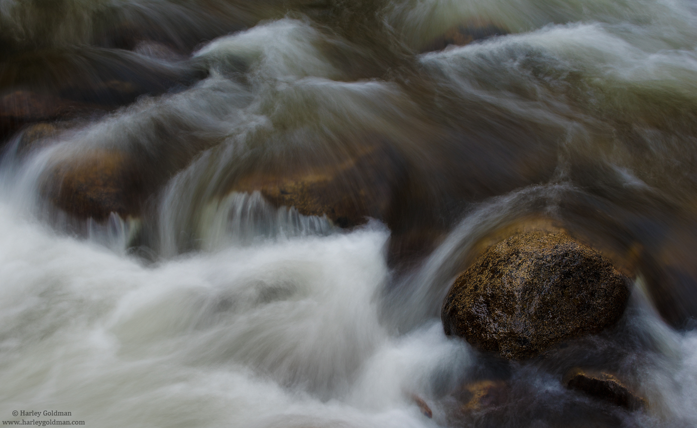
Some frenetic water coming down Bridalveil creek.
Nikon D810, 70-200mm
Comments
13 comments
Comment posted by Lon Overacker on November 19, 2016 at 5:37 PM
Love me some water flow and texture images. This one is excellent Harley. It's also almost a little unconventional. what I mean is that the flow appears to run in two different directions; more left to right up top, then more up and down in the middle and bottom. This makes for a somewhat unique capture. I love the texture of the water here too.
I have just two subjective thoughts. It's slightly on the dark side to me (both on NPN and your website - they look the same on both.) It's certainly not underexposed and the contrasts are right on, I think it could just be a tad brighter. Also, and it's interesting as well that you post this after the discussion with Igor on the green color in the water. This is a great example of how I see the greens in the Merced as well. Having said that, I might pull down the green saturation a tad and make it less prominent - but by no means changing or removing the green tints in the water. Hope that makes sense.
Compositionally, I really like the anchor of the rock on the right, then supported by the other submerged one. Good eye isolating this little gem.
Lon
Registered on November 24, 2006, 521 Posts, 19147 Comments
Comment posted by gary phillips on November 19, 2016 at 6:12 PM
Nice work Harley. I like what you came away with from Yosemite this last trip. Not necessarily my kind of images, but they are growing on me. Nice eye to find something coherent in the chaos.
Registered on October 24, 2013, 185 Posts, 4136 Comments
Comment posted by Michael Lowe on November 19, 2016 at 7:07 PM
I like this. Nice placement of the rocks and the swirling water adds a lot of interest. Only small nit is I feel the water could be a little brighter.
Registered on February 11, 2004, 777 Posts, 5252 Comments
Comment posted by Dave Dillemuth on November 19, 2016 at 7:18 PM
Very nice, Harley. The various directions of water flow add a lot of interest. The SS selection is perfect - the water has lots of texture while retaining a dynamic feel. I agree on brightening the image a tad. If it were mine I might also play with cooling the temperature a bit as well.
Registered on December 10, 2015, 104 Posts, 1112 Comments
Comment posted by Igor Doncov on November 19, 2016 at 9:56 PM
I really appreciate how you can see through the water to the rock below in the middle. I think you captured that really well. One of the great pleasures when wadding in the Sierras is to push forward upstream and see the water flowing over such areas. It's always a memorizing experience when you feel so glad to be alive. I really like ths composition. The image does seem to dark but that's up to interpretation. Vance's waterfall is still darker yet it works. It would be nice if it were lighter and still not lose texture in the water. Great job. BTW, did all 3 of you concentrate on water compositions that weekend?
Registered on November 22, 2014, 189 Posts, 2733 Comments
Comment posted by Mark Seaver on November 20, 2016 at 9:19 AM
Your description, frenetic, is perfect here, Harley. I like the good sense of flow in the water while retaining some details. I do wonder about dodging some of the flow streaks in the upper center and right to pull a bit more attention.
Registered on January 23, 2011, 1103 Posts, 17270 Comments
Comment posted by scott lanz on November 20, 2016 at 10:02 AM
Your title says it all, Harley. Well timed for lots of lines and detail in the water, and I like the brownish/gold colors in the rocks.
Registered on November 14, 2003, 840 Posts, 12902 Comments
Comment posted by Paul Breitkreuz on November 20, 2016 at 10:21 AM
WOW, some more neat water stuff. This composition works perfectly for me, Harley. I could see more contrast/saturation in the water especially. Basically vibrancy. The water seems a bit flat.
Maybe just my old Velvia thoughts overriding a more subdued look. All easy stuff to play with as the majority of the scene is buffed already.......
Registered on February 25, 2006, 525 Posts, 8448 Comments
Comment posted by Preston Birdwell on November 20, 2016 at 11:31 AM
Very nice, sir! I like how the water changes direction. The contrast and color look spot-on, but I agree with Lon that it is a tad on the dark side. I like the hints of blue and green in the water. Works for me.
--P
Registered on November 1, 2003, 471 Posts, 5188 Comments
Comment posted by Reno DiTullio on November 20, 2016 at 11:32 AM
Nicely seen and processed, Harley, seems a tad dark but not a deal breaker Lots to shoot along Bridalveil Creek, was in the valley last week and spent lots of time along the creek, hopefully something good will come of the time; if not, any time in Yosemite is well spent.
Registered on November 14, 2003, 130 Posts, 1644 Comments
Comment posted by Jim Jirka on November 20, 2016 at 3:57 PM
Great name, great image.Flowing texture is perfect to convey the rush.
Registered on November 1, 2003, 254 Posts, 1620 Comments
Comment posted by John Williams on November 20, 2016 at 5:43 PM
Essential to see the large version of this Harley; it's great. I too like the water flowing in different directions.
Registered on September 6, 2007, 221 Posts, 5985 Comments
Comment posted by Alberto Patiño on November 24, 2016 at 12:31 AM
I find the understated colors very appealing. Although both are beautiful, I prefer this one to "Liquid Gold".
Registered on December 2, 2014, 278 Posts, 1736 Comments

Comments
13 commentsI have just two subjective thoughts. It's slightly on the dark side to me (both on NPN and your website - they look the same on both.) It's certainly not underexposed and the contrasts are right on, I think it could just be a tad brighter. Also, and it's interesting as well that you post this after the discussion with Igor on the green color in the water. This is a great example of how I see the greens in the Merced as well. Having said that, I might pull down the green saturation a tad and make it less prominent - but by no means changing or removing the green tints in the water. Hope that makes sense.
Compositionally, I really like the anchor of the rock on the right, then supported by the other submerged one. Good eye isolating this little gem.
Lon
Maybe just my old Velvia thoughts overriding a more subdued look. All easy stuff to play with as the majority of the scene is buffed already.......
--P