Nature Photographers Network
This is the preserved archive of the original Nature Photographers Network. The community continues at naturephotographers.network.
Final Curtain 2
‹ PreviousLandscape GalleryNext ›

Final Curtain 2

by scott lanz

Gallery: LandscapePosted November 24, 2016212 views12 comments
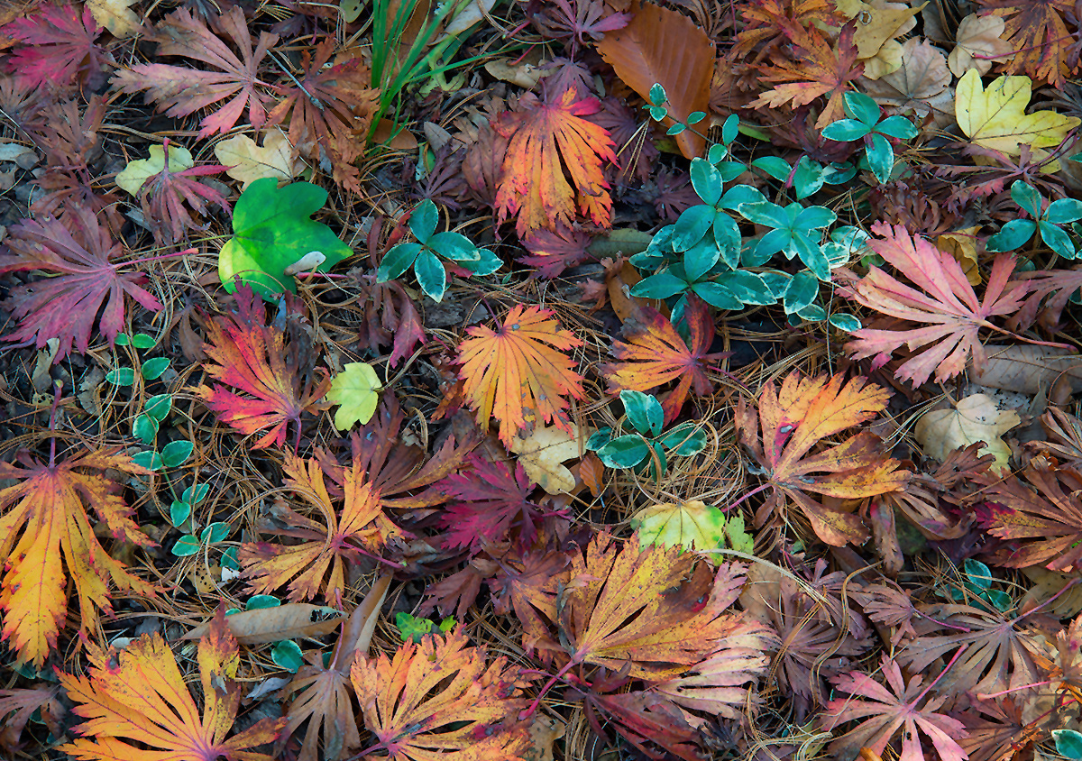
Leafscapes seem to be appropriate in either here or in flora. I posted one in flora a couple weeks ago. This one is a different image shot the same day. The one in flora was pretty arranged; this one was less so, but I still assisted mother nature a bit when I shot this. Fellows Riverside Gardens, Mill Creek Park, Youngstown. D600, 24-85 @ 85, f22, .6, iso 200, tripod, etc. Suggestions and other comments welcome.

Happy Thanksgiving to all! crying

Comments

12 comments
Comment posted by Preston Birdwell on November 24, 2016 at 10:46 AM
Nice arrangement of the leaves, and I like the green plants peeking through the reds. The cyan looks a little heavy in the greens, so you might consider pulling it back somewhat. I like the various textures and the soft light.
--P
Registered on November 1, 2003, 471 Posts, 5188 Comments
Comment posted by Bill Fach on November 24, 2016 at 11:35 AM
Scott: Looks great to me. I like the full spectrum of colors especially. All the disparate textures in the large version are real treats. Most excellent.>=))>
Registered on November 1, 2003, 1805 Posts, 26981 Comments
Comment posted by Nick Bristol on November 24, 2016 at 11:39 AM
Scott, This is very nice! You really came up with a great group of leaves with wonderful colors, shapes and textures. I like this a lot. Excellent work with this composition and the large version looks fantastic!

Nick Bristol
Lone Rock, WI.
Registered on February 1, 2004, 752 Posts, 14140 Comments
Comment posted by Igor Doncov on November 24, 2016 at 11:57 AM
These maple leaves are certainly prettier than the ones I'm finding locally. There is just enough order in this composition to not look too busy. I think it might be interesting to reverse the color emphasis here: to desaturate the greens and saturate the warm tones. I feel that the cyan greens are dominating the best part of the image, which are the maple leaves. This has a nice tapestry look to it.
Registered on November 22, 2014, 189 Posts, 2733 Comments
Comment posted by Dave Dillemuth on November 24, 2016 at 12:48 PM
Beautiful, intimate scene. The arrangement of elements are well-balanced and a lovely mix of colors. I like the saturated rendering as-is - processing looks good to me.
Registered on December 10, 2015, 104 Posts, 1112 Comments
Comment posted by Ed Lowe on November 24, 2016 at 1:12 PM
This is a sweet arrangement of fallen autumn leaves, Scott. The lighting is gorgeous as is the color palette. My only suggestions are the already mentioned slight cyan cast and cloning out the green leaf in the LRC; both easy fixes. I am going to have to look down more often and hopefully I will find something this nice.

Ed
Registered on February 7, 2004, 414 Posts, 7115 Comments
Comment posted by Harley Goldman on November 24, 2016 at 4:36 PM
Very nice leafscape. I am finding the saturation quite a bit heavy for my tastes, but that is very much a personal preference. Nice arrangement. Mother nature gets the goal, Scott gets the assist. 
Registered on November 19, 2003, 586 Posts, 11271 Comments
Comment posted by Mark Seaver on November 25, 2016 at 10:11 AM
The mix of colors and live plus fallen leaves looks great, Scott.  I like how those orange leaves angle up from the bottom and then mingle with the blue/green leaves of the vine.  Well seen.
Registered on January 23, 2011, 1103 Posts, 17270 Comments
Comment posted by Brian Schrayer on November 25, 2016 at 11:03 AM
Nice color and arrangement in the leaves.  The composition keeps my eyes moving throughout the frame.  Nicely done!
Registered on May 28, 2004, 114 Posts, 2890 Comments
Comment posted by Lon Overacker on November 25, 2016 at 1:32 PM
Scott,

Wonderful collection of colors.  Certainly there is room for color/saturation adjustments - but only because of subjective and personal taste.  We all see things a tad differently, and I'm liking what I see.  The only adjustment I would make is reducing the sat in the lone green leaf. Other than that, perhaps a slight burn of the LRC area.  BTW, never would have guess you assisted mother nature... all looks quite natural. ;-)

Oh, and you have numerous crop options too.  I find these difficult in that regard because I'm not sure if it's the broader view that I like, or a tighter crop within the scene.  I'll be posting an example of this soon.

Lon
Registered on November 24, 2006, 521 Posts, 19147 Comments
Comment posted by David Schoen on November 27, 2016 at 5:30 PM
Very nice colors shapes and textures in this image.  Certainly something we don't see in the West Coast.  Nicely seen.
Registered on November 6, 2006, 1213 Posts, 4587 Comments
Comment posted by Paul Breitkreuz on November 28, 2016 at 9:02 AM
Absolutely excellent, Scott. I really like the collection variety here and the contrasting color array is truly wonderful. No offer of change from me at all, just enjoying this one......laugh
Registered on February 25, 2006, 525 Posts, 8448 Comments