Nature Photographers Network
This is the preserved archive of the original Nature Photographers Network. The community continues at naturephotographers.network.
River Tiger
‹ PreviousLandscape GalleryNext ›

River Tiger

by Brian Schrayer

Gallery: LandscapePosted December 1, 20163,243 views9 comments
How about a change of pace from the images that I have been posting?  Every once in a while I pull out my creative license and go to town.  sad

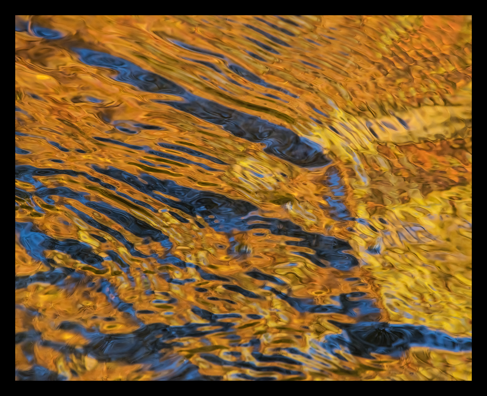
This is an abstract taken along the Middle Prong of the Little River in the Tremont area of GSMNP on my recent trip in late October. 

I like the warm / cool contrast in the water as well as the repeating diagonal lines that reminded me of a tiger's stripes. 

As I have stated previously I usually strive for naturally vibrant processing.  However, due to the abstract nature of this image I pushed the processing a bit beyond what I ordinarily would.  With that said this is a straight reflection shot and all the color is natural and is due to reflected light from the blue sky and some fall color on the hillside. 

I would just like to take a moment to say how deeply saddened I am by the destruction caused by the recent fires in the Chimney Tops area which spread to Gatlinburg & Pigeon Forge.  The loss of life and property is tragic and the loss of natural resources in areas of GSMNP is devastating. 

All comments and critiques are welcome.

Capture Info:
300 mm
f/8 @ 1/80 sec
ISO 1600 (necessary since the river was in shade and I wanted to get sufficient DOF and freeze the movement in the water.  I really needed even a bit more DOF, but was hesitant to push the ISO too far). 

Processing:
TK's luminosity masks and focused vibrance masks and his "make it glow" secret sauce action.

Comments

9 comments
Comment posted by Ken Smith on December 2, 2016 at 12:10 PM
Like streets of gold.   I see in your gallery you are not completely immune from dipping now and then into the abstract for a photo.  Here is a jewel of a find... stunning blend of golds and dark blues.   
Registered on September 5, 2008, 449 Posts, 2444 Comments
Comment posted by Lon Overacker on December 2, 2016 at 12:28 PM
Brian,

Very surprised no one has commented yet. ;-(  This is a fabulous abstract reflection; love the colors and also the make up the design.  I know this will put a bad taste in everyone's mouth... but my impression here is of tiers - ie. like from an open-pit gravel mine?  Or maybe a better analogy would be terrace farming in Peru... ;-)

My only minor nit is this seems a bit soft around the edges, but mostly at the bottom.  Tough choices on the DOF, aperture, SS and iso.  But I think you had a good compromise.

As far as processing goes, this looks terrific. I don't think you pushed too far at all.  My philosophy is to make an image look the best it can be, and still remain as natural and believable as possible.  It's always tough call and easily gone overboard, but you've hit it just right.

Lon
 
Registered on November 24, 2006, 521 Posts, 19147 Comments
Comment posted by Igor Doncov on December 2, 2016 at 1:35 PM
I didn't realize how fine an image this from the small icon. If I had I would have commented earlier. I noticed from you gallery that you have been experimenting with this idea for quite some time. This is really the best of them all. Going abstract was perfect because the overall design is very suggestive to the viewer, who can make many associations with this. Unlike many ripple abstracts that have geometric designs this has a very strongly defined compositions with many shapes of varying hues of warm and cold. Which is to say - it's lovely. I could look at this for a long time and not lose interest. There is one small suggestion. There's a small elliptic thingy that has saturn rings that keeps jumping out at me, middle center left. It's probably just me because there are many ellipses throughout the image which I seem to be immune to. Once you see it it won't let go.
Registered on November 22, 2014, 189 Posts, 2733 Comments
Comment posted by Preston Birdwell on December 2, 2016 at 5:30 PM
This is a wonderful abstract. Given the mood and the look you wanted, I think this is great fit. I love the gold blue. These kinds of images do involve compromises in therms of exposure, but I think you did very well. The large version is a must-see.

Being a retired fire fighter, and having been on some of California's big fires where injury, loss of life, and natural and cultural resources were lost, I too grieved for those affected by the fires in the South East.
--P
 
Registered on November 1, 2003, 471 Posts, 5188 Comments
Comment posted by Mark James Ford on December 3, 2016 at 7:25 AM
Hi Brian, an excellent image! I think the PP is spot on here. I think you got the compromise about right with DOF/SS - Lots to look at in this wonderful abstract! 
Registered on January 16, 2015, 60 Posts, 430 Comments
Comment posted by Ed Lowe on December 3, 2016 at 4:30 PM
This lovely abstract must be viewed large to really appreciate all the details and combination of warm and cool colors, Brian. IMO your processing looks very natural; not to saturated. As you mentioned it would have been nice to get a bit more DOF, but this still worked out very nicely. Great eye to spot this.

Ed
Registered on February 7, 2004, 414 Posts, 7115 Comments
Comment posted by Paul Breitkreuz on December 3, 2016 at 5:12 PM
Excellent abstract, Brian. Colorful and off the charts in WOW factor. I personally like the one water arch or rib from the ULHC to the LRHC, seems to add to and break up the flat area overall.

btw: Thank you for your comment on "Joshua Tree Swirl". I agree with your comment about the fisheye look. I think I've used that achieved perspective only once or twice in the past. However, like your abstract here after many years of doing "standard" appearing landscapes I've embraced seeking out other looks overall, hence that out of the norm posting from me......enlightened
Registered on February 25, 2006, 525 Posts, 8448 Comments
Comment posted by Nick Bristol on December 3, 2016 at 7:13 PM
Brian, This is pretty impressive abstract work. I love what you captured here as it is a fantastic combination of reflected light, color and water. Very cool work on this and very fun to view.

Nick Bristol
Lone Rock, WI.

 
Registered on February 1, 2004, 752 Posts, 14140 Comments
Comment posted by Mark Seaver on December 5, 2016 at 7:15 AM
The blue/gold combo is quite striking, Brian.  I also like the angled striping effect.  In a tight view like this dof vs ss is almost always a challenge.
Registered on January 23, 2011, 1103 Posts, 17270 Comments