Gallery: LandscapePosted December 3, 20161,197 views15 comments
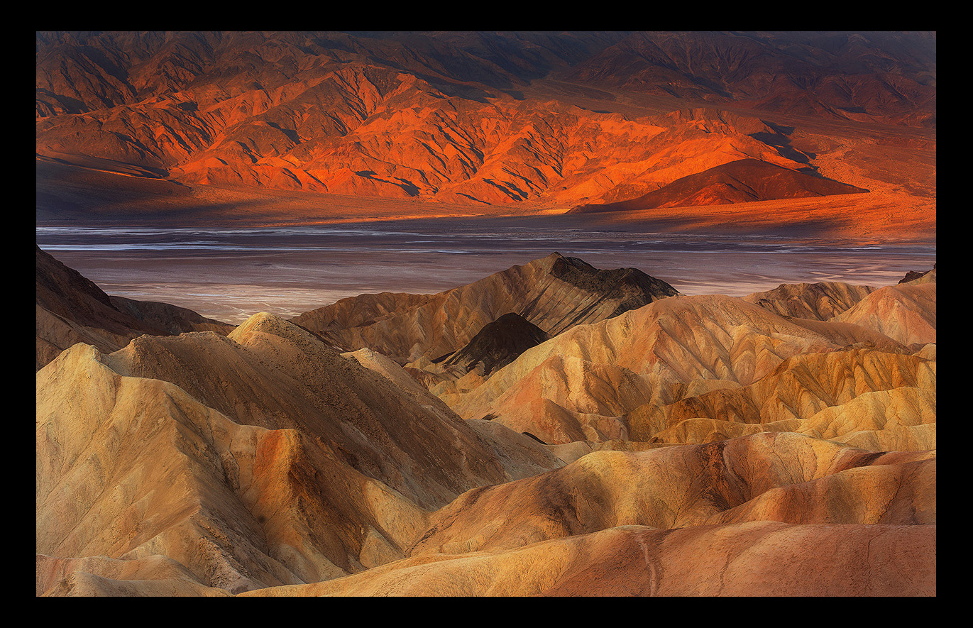
Morning sun filters through cloud cover over Zabrisky Point and the Bad Water Basin.
D7100,
70-200, f/4
Thanks
Chris
Comments
15 comments
Comment posted by Stephen Stanton on December 3, 2016 at 1:18 PM
A beautiful image, Chris. You've caught some great details especially in the foreground. The background might be a little too bloody for me though. The Bad Water streaks add a nice separation to the two parts of the image. Good balance in the comp and the post processing. I think it is very well done.
Registered on March 1, 2015, 54 Posts, 453 Comments
Comment posted by Paul Breitkreuz on December 3, 2016 at 1:20 PM
A wonderful take here, Chris. I would just back-off the red saturation and it should make a neat print then.
Registered on February 25, 2006, 525 Posts, 8448 Comments
Comment posted by Lon Overacker on December 3, 2016 at 2:45 PM
Chris,
Love this! There is always the potential for great light play, color, etc. from this popular spot, which I suppose is one of the reasons it's so popular! (duh.) I love the soft light and rich tones of the foreground formations. And to me, I like the color/sat up top. I don't think it's to far off. I also think the little slices of blue just up this a notch. Excellent job crafting landscape view.
Lon
Registered on November 24, 2006, 521 Posts, 19147 Comments
Comment posted by Ed Lowe on December 3, 2016 at 3:15 PM
The details and textures are amazing as are the layers of color in the large version, Chris. I find the earth tones of the FG dunes are very striking and the warm light on those in the BG finish everything off beautifully. Gorgeous image and a great color combination IMO.
Ed
Registered on February 7, 2004, 414 Posts, 7115 Comments
Comment posted by Brian Schrayer on December 3, 2016 at 3:55 PM
This is stunning, Chris. I like the warm light on the ridges and the contrasting shadows at the top of the frame provide nice counterpoint. This is a visual feast!
Registered on May 28, 2004, 114 Posts, 2890 Comments
Comment posted by Harley Goldman on December 3, 2016 at 4:44 PM
Real fine take on a classic spot. The reds are a bit saturated for my tastes, but that is an individual preference.
Registered on November 19, 2003, 586 Posts, 11271 Comments
Comment posted by Nick Bristol on December 3, 2016 at 7:18 PM
Wow! What a beautiful scene to sit back and enjoy. I like this alot, Chris. Large version is very impressive. Wonderful work.
Nick Bristol
Lone Rock, WI.
Registered on February 1, 2004, 752 Posts, 14140 Comments
Comment posted by Dave Dillemuth on December 3, 2016 at 8:02 PM
This is an excellent take on this frequently shot vantage point. Some may feel the saturation is a bit high but I think it works really well. Beautiful imagery.
Registered on December 10, 2015, 104 Posts, 1112 Comments
Comment posted by Igor Doncov on December 4, 2016 at 2:15 PM
I've never seen Zabriskie quite like this. I guess Zabriskie itself has cloud shade. It's a really beautiful image and the black frame works well. I have a feeling that if you desaturated those mountains the image would lose some of it's impact. A very creative image that's well done. I like it.
Registered on November 22, 2014, 189 Posts, 2733 Comments
Comment posted by Chris Chamberlain on December 4, 2016 at 2:21 PM
Thanks guys! I agree, it does have a little extra pop. But not much, maybe 10%. I also agree with Igor about it losing a lot of impact without it. For me and my taste anyway.
Registered on March 13, 2007, 500 Posts, 8365 Comments
Comment posted by Sairam Sundaresan on December 4, 2016 at 2:25 PM
This is a very interesting image, Chris. I like the idea of having a light dark light arrangment in the scene allowing the eye to wander back and forth between the foreground and background. The reds in the back are a bit intense. You could consider toning them down a bit. Lovely work :)
Registered on March 14, 2013, 100 Posts, 643 Comments
Comment posted by Preston Birdwell on December 4, 2016 at 2:35 PM
This is real nice, Chris. It is a wonderful landscape. I do think the reds in the sunlit background are little too strong, but that is minor. This is well crafted, and shows off DV very well.
--P
Registered on November 1, 2003, 471 Posts, 5188 Comments
Comment posted by Mark Seaver on December 5, 2016 at 7:17 AM
You caught some neat lighting here, Chris. The color change bottom to top is very striking while the lighting emphasizes the two sets of hill beautifully. This is a great take on an oft visited site.
Registered on January 23, 2011, 1103 Posts, 17270 Comments
Comment posted by Bill Chambers on December 5, 2016 at 9:34 AM
The colors in the FG hills is exquisite. This is one of those images you can just sit and stare at for ages.
Registered on April 10, 2005, 753 Posts, 21216 Comments
Comment posted by Harry Lichtman on December 7, 2016 at 6:46 AM
Pretty sweet shot, the repetition of forms and textures is very nice. The separation of cool tones between the red rock and the FG hills works well.
Registered on September 17, 2010, 304 Posts, 3507 Comments

Comments
15 commentsLove this! There is always the potential for great light play, color, etc. from this popular spot, which I suppose is one of the reasons it's so popular! (duh.) I love the soft light and rich tones of the foreground formations. And to me, I like the color/sat up top. I don't think it's to far off. I also think the little slices of blue just up this a notch. Excellent job crafting landscape view.
Lon
Ed
Nick Bristol
Lone Rock, WI.
--P