Nature Photographers Network
This is the preserved archive of the original Nature Photographers Network. The community continues at naturephotographers.network.
So. Sister & Sparks +3
‹ PreviousLandscape GalleryNext ›

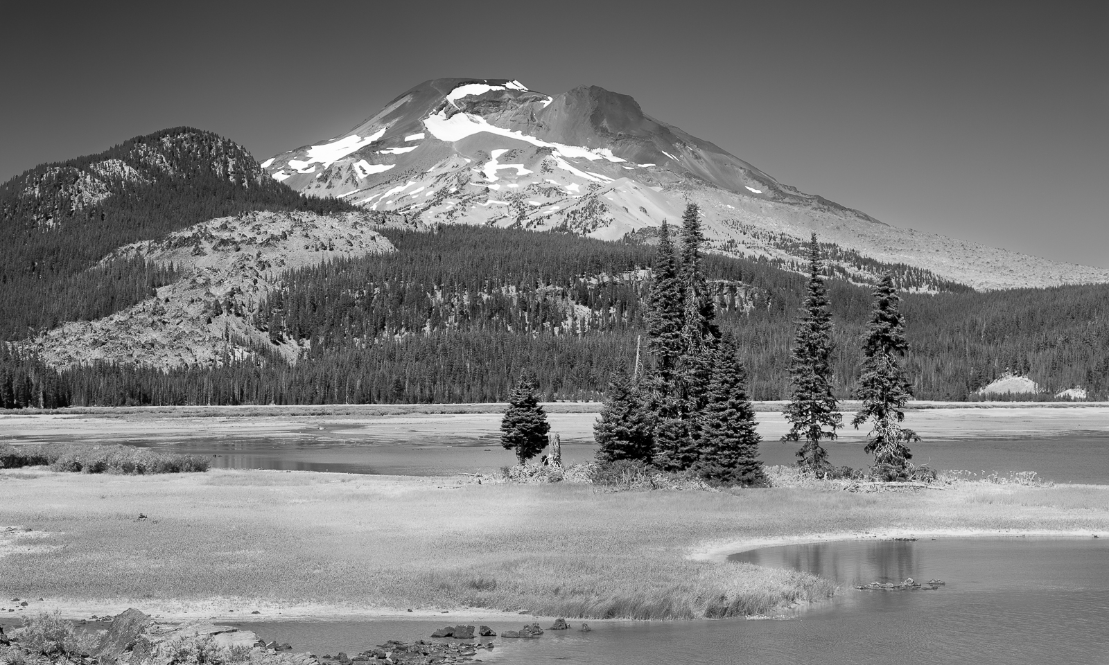
So. Sister & Sparks +3

by Marylynne Diggs

Gallery: LandscapePosted December 3, 20161,889 views15 comments
Hi Folks,
Here is a picture of South Sister from Sparks Lake.  This was a mid-summer day tourist trip more than anything, but I did get a few interesting images. 

Canon 5Dm3 with 24-105mm at 70mm
ISO 125, f/8, 1/160s
Silver Efex with some pre and post Nik work in LR

As usual, I'm eager for comments, feedback, suggestions, and yawns of ennui.
ML

Comments

15 comments
Comment posted by Lon Overacker on December 4, 2016 at 1:17 PM
Marylynne,

A fine b&w landscape.  In fact, I'm guessing the b&w is more effective than color, given the "mid-summer day" conditions and light. So I think you made a good choice here. I really like the grouping of pines to create the near-far composition.  You did well including just enough sky for comfort, but since there's no clouds you don't need any more sky.

As far as processing, hard to suggest anything different than what you have. I suppose you could selective burn down some areas, like the shoreline beneath the group of trees.  the only nit I have really is the outcropping at the bottom left.  It's one of those times when I either want to see more of it, or none at all.  Although I really like the s-curve of the shoreline at the bottom, the outcropping takes away from it.  Cropping the bottom might work, but you'd lose the gentle curve.

Lon
Registered on November 24, 2006, 521 Posts, 19147 Comments
Comment posted by Preston Birdwell on December 4, 2016 at 2:07 PM
I like this, Marylynne. It has a nice alpine feel. I do think the mid-tone contrast could be boosted a bit. Also, the light on the summit of the mountain looks darker than the slopes below it. Since you used Nik, I am guessing you used some control points to darken the sky, which also caused the slight darkening of the summit.

I am a big proponent of TK's masks and I suggest that you check them out. Tony has extensive tutorials for using them in Photo Shop. I actually find them easier to use and more effective than the Nik Control points.
--P
Registered on November 1, 2003, 471 Posts, 5188 Comments
Comment posted by Sairam Sundaresan on December 4, 2016 at 2:40 PM
This is a really nice B&W, Marylynne. I agree with Preston's points. This can certainly use some mid-tone contrast. The B&W is a great choice considering that this looks like a mid morning scene. Overall, I really like it!
Registered on March 14, 2013, 100 Posts, 643 Comments
Comment posted by Marylynne Diggs on December 4, 2016 at 4:02 PM
Thanks everyone.  I'm enjoying playing with this.  I am sharing another redo of the bw with a tish more midtone contrast, but also a color version showing why the summit has some darkness. 

I am going to go back to the drawing board with this in a minute since I do have more outcropping to include (as you can see from the color), so the question becomes whether to get rid of the outcropping in the foreground or add back in.  You would think I would at some point learn the lesson about saving crop for last when doing b/w conversions, but alas, I have not.

Of course, I'm enjoying playing with the options, so any time enjoyed is time well spent, in my mind.  It beats the heck out of grading papers--that's for sure.

Let me know which crop you think you prefer.
ML
Registered on December 14, 2010, 122 Posts, 1034 Comments
Comment posted by Marylynne Diggs on December 4, 2016 at 4:04 PM
And here is the color, showing more foreground.

Holler if this seems like a better comp in bw or color.
ML
Registered on December 14, 2010, 122 Posts, 1034 Comments
Comment posted by Preston Birdwell on December 4, 2016 at 4:48 PM
Marylynne,

I like the B&W repost, but I prefer the crop in the color version. I think showing more of the rocky outcrop and the stones in the water act as a nice lead in. In looking at the color version, I see that the rock at the top is darker, and that darkness was accentuated in the B&W.

Sure looks like a fine place to spend a summer day!
--P
Registered on November 1, 2003, 471 Posts, 5188 Comments
Comment posted by Nick Bristol on December 4, 2016 at 5:07 PM
Marylynne, I like the b&w repost the best here with more contrast. I also prefer the comp of the color version just as Preston did. That has enough of land / rock in the lower corner to make it work which the first b&w version didn't have. It is a great looking place!

Nick Bristol
Lone Rock, WI.
Registered on February 1, 2004, 752 Posts, 14140 Comments
Comment posted by Marylynne Diggs on December 4, 2016 at 8:55 PM
Thanks for all the feedback everyone.  I took another stab from start to finish, amping up some mid-tone contrast, fine tuning the near to far contrast, and using the 4x6 crop with more of the outcroppings.  Let me know if this is best yet, or what else to try. 

It takes a village, as they say:
ML
Registered on December 14, 2010, 122 Posts, 1034 Comments
Comment posted by Lon Overacker on December 4, 2016 at 10:48 PM
Marylynne,

I think your latest post takes care of all the feedback.  The added real estate at the bottom makes a big difference (amazing how just a little crop can alter an image.)  The added contrast works as well.  The color version is quite nice, but in the end as I had commented, is a color image, mid-day and won't garner much more than, "nice image."  The final b&w is the ticket. thanks for taking the time.  

Lon
Registered on November 24, 2006, 521 Posts, 19147 Comments
Comment posted by Igor Doncov on December 4, 2016 at 11:46 PM
As I recall it takes some careful walking to stay dry when getting to this spot. I personally like the original composition the most and the processing of the first repost. I thought that repost had the right amount of contrast and detail. I don't think the rocks in the llc add too much and I prefer the more panoramic look of the earlier posts to the last one. The color version has issues IMO due to the harsh light, which is affecting the quality of the color.
Registered on November 22, 2014, 189 Posts, 2733 Comments
Comment posted by Harley Goldman on December 5, 2016 at 5:56 PM
I like what you did in the final repost. I like the wider view and the processing. Nice job working with the mid-day light. 
Registered on November 19, 2003, 586 Posts, 11271 Comments
Comment posted by Marylynne Diggs on December 6, 2016 at 1:57 PM
Thanks everyone.  Seems like there is a slight variance of opinion on the more pano/less rock v. the final repost.  I'm undecided too. 

Igor: It might take some careful footing some times of year, but this was September, and I was on very dry land, albeit a narrow section of lakeside bank. 

I look forward to going back, maybe camping, so I can get better times of day.  BTW, I am not one of those folks who uses BW to compensate for bad light.  I have been seeing images in b/w of late and the medium is improving my composition skills in my opinion.  It is a nice side effect that black and white allows me to use images shot with friends at what they consider more civilized hours of the day.
Registered on December 14, 2010, 122 Posts, 1034 Comments
Comment posted by Igor Doncov on December 6, 2016 at 10:31 PM

I have been seeing images in b/w of late and the medium is improving my composition skills in my opinion.


I find this to be an interesting subject. Do we really see in b/w? I've read several books that state that they do see the world that way. I thought I saw in b/w for years. Now I think that I saw color but largely ignored it. I find that it takes more effort to compose in color because it takes effort to consider what it adds to the composition. For me it takes greater effort to bring about a good color composition but it's rewarding when you pull it off. 
 
Registered on November 22, 2014, 189 Posts, 2733 Comments
Comment posted by Marylynne Diggs on December 7, 2016 at 8:02 PM
Hey Igor,
Yeah, I guess I can't say I truly see in black and white, but what I see in color I can't help but imagine in black and white (both in the field and when processing).  It definitely feels more elementary (or fundamental?) in that there are fewer variables to consider.  It has changed my color photography primarily in that I seem incapable of dealing with the big scene in color. It's too overwhelming.  I tend to go abstract instead.

Interesting discussion, eh?
ML
Registered on December 14, 2010, 122 Posts, 1034 Comments
Comment posted by John Williams on December 8, 2016 at 12:44 AM
Now that I've been here, I have a better appreciation for the location. I love the way the mountains dominate the scene, especially how South Sister rises above the lake as you've captured here.

I too need to think in BW more. My eye tends to work much more naturally with color, so I'm hoping it's a learnable skill cool
Registered on September 6, 2007, 221 Posts, 5985 Comments