Nature Photographers Network
This is the preserved archive of the original Nature Photographers Network. The community continues at naturephotographers.network.
Kodachrome (+1)
‹ PreviousLandscape GalleryNext ›

Kodachrome (+1)

by scott lanz

Gallery: LandscapePosted December 5, 2016268 views14 comments
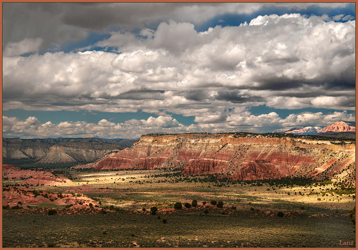
Kodachrome Basin, that is, shot digitally this spring. I was fortunate in that when I went to Vegas on business last spring, and arrived a week early for some photography, I hit a slow moving front which I followed east from Death Valley to Escalante. It provided some nice clouds and conditions for most of the trip, as reflected in prior posts from Death Valley and Escalante. This was shot late afternoon on the way to Esclante. Combination of sun and clouds, with a bit of rain. D600, 24-85 @ 56, cpl, gnd, 1/200, f11, iso 400. Suggestions and other comments welcome. 

Comments

14 comments
Comment posted by scott lanz on December 5, 2016 at 9:20 AM
This is an alternate shot taken a few minutes later. The light, clouds, and shadows were constantly changing, but these comps are pretty similar, and I'd appreciate hearing which you prefer as I go back and forth. @68, 1/80, f13, iso 200, cpl, gnd. 
Registered on November 14, 2003, 840 Posts, 12902 Comments
Comment posted by Preston Birdwell on December 5, 2016 at 9:34 AM
This is real nice landscape, Scott. The conditions were indeed excellent.The detail and processing look great. I love the spots of sunlight. No nits to pick here. I prefer the original image. I think the spots of sunlight in foreground of the first one add a nice dimension that is missing in the second one. Well done!
--P
Registered on November 1, 2003, 471 Posts, 5188 Comments
Comment posted by Ian Wolfenden on December 5, 2016 at 10:32 AM
Love the perspective here, Scott.  I think I prefer the original version - a better balance of light and shade, and that mass of clouds given that much more prominence, with the distant peaks to the R also contributing nicely.  Powerful sense of the wide open spaces of this landscape.
Registered on May 18, 2007, 1108 Posts, 7647 Comments
Comment posted by Igor Doncov on December 5, 2016 at 11:30 AM
Boy, that's a tough one. I like the dappled light in the original more but the 2nd has a stronger composition. I also like the color balance more in the 2nd. But I have to agree with the others, the original is better. I would reduce some of the contrast in the clouds, bring up their darker shadows a bit.
Registered on November 22, 2014, 189 Posts, 2733 Comments
Comment posted by Nick Bristol on December 5, 2016 at 12:23 PM
Scott, What a beautiful scene and you caught some fantastic light. I like the first image the best but like Igor I like the color balance of the second one a little better. I think the first one with a little less contrast might work quite well and especially in the clouds, but it is very nice as it is. Sure is a beautiful looking landscape.

Nick Bristol
Lone Rock, WI.
Registered on February 1, 2004, 752 Posts, 14140 Comments
Comment posted by Lon Overacker on December 5, 2016 at 2:30 PM
Scott,

Not hard to understand why this is called Kodachrome Basin -  If you would have told me this was shot with KR64 or KM35, I would believe you.  Colors/processing look pretty accurate to the old Kodachrome.

This is a terrific, wide-open-spaces landscape.  what makes this one work so well is the dappled light, caused of course by the clouds.  and because of the dappled lighting, I prefer the original - especially with the spots of light in the foreground and throughout the landscape.

If I was to offer a teeny-tiny-teeny-tiny nit/suggestion it would be this.  The very far away sliver of a mountain range, the ones on the left just touching the clouds... I would do a color select range and desaturate the blue.  LIke I said, a majorly minor nit... ;-)

A grand view, well done.

Lon
 
Registered on November 24, 2006, 521 Posts, 19147 Comments
Comment posted by Harley Goldman on December 5, 2016 at 5:38 PM
Beautiful view and sky! What grand luck to have the system along with you on your travels! I am all in on the first version. Lovely light! Real nice work!
Registered on November 19, 2003, 586 Posts, 11271 Comments
Comment posted by Mark Seaver on December 5, 2016 at 5:44 PM
You've got an outstanding sky here, Scott.  It works great with the fine colors in the land and the sweeping vista.  The lighting in the original post is so much better.
Registered on January 23, 2011, 1103 Posts, 17270 Comments
Comment posted by Brian Schrayer on December 5, 2016 at 7:12 PM
Very nice work, Scott.  I like the interplay of light and shadow in this scene, and because it is more pronounced in the original post I think I prefer it.  For my tastes, I would recommend dialing back on the contrast a bit, but otherwise this is nicely done.
Registered on May 28, 2004, 114 Posts, 2890 Comments
Comment posted by Dave Dillemuth on December 5, 2016 at 8:21 PM
Really beautiful image, Scott. I prefer the first as the spot lighting is more compelling. The highlights look a bit hot on my monitor. I would back off slightly on the white point/contrast.
Registered on December 10, 2015, 104 Posts, 1112 Comments
Comment posted by Ed Lowe on December 5, 2016 at 9:39 PM
While both are beautifully done I am leaning toward the original post, Scott. I really love the dappled lighting in that version and I think the colors have a little more punch to them. Of course you can not go wrong with the drama in the sky. Looks like you had a wonderful trip.

Ed
Registered on February 7, 2004, 414 Posts, 7115 Comments
Comment posted by John Williams on December 6, 2016 at 10:04 AM
Interesting how the white balance shifted between these two; were you shooting Auto? Others above have said it; I also prefer the first image, but with a slightly cooler white balance. The clouds at the top of the first image are more interesting, and I like the dappled lighting underneath, with more of the main ridge in sunlight.
Registered on September 6, 2007, 221 Posts, 5985 Comments
Comment posted by Craig Moreau on December 7, 2016 at 3:59 PM
Scott, add another vote for the first. I think the lighting and clouds are both better in that one. I might burn and/or desaturate the bright red rock on the horizon at the right edge. Their brightness pulls my eye there a bit. Beautiful shot of a beautiful place!
Registered on April 21, 2015, 64 Posts, 584 Comments
Comment posted by Harry Lichtman on December 7, 2016 at 7:37 PM
Love the dappled sun and shadows.  The horizon does feel a little too centered - maybe a little crop off the bottom to allow the drama of the clouds to become more dominant.  The wide open space that the image conveys lifts me up.  Dig  the vastness.
Registered on September 17, 2010, 304 Posts, 3507 Comments