Nature Photographers Network
This is the preserved archive of the original Nature Photographers Network. The community continues at naturephotographers.network.
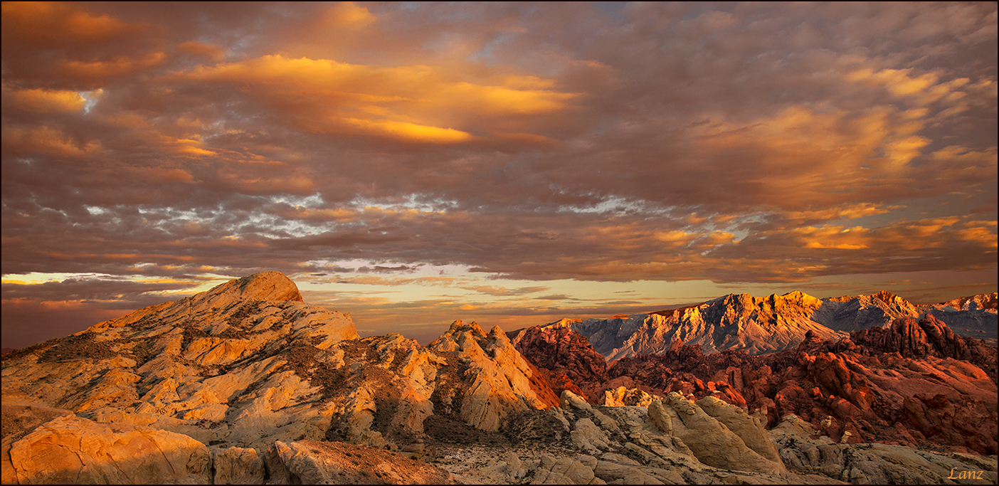
Valley of Fire Pano
‹ PreviousLandscape GalleryNext ›

Valley of Fire Pano

by scott lanz

Gallery: LandscapePosted January 15, 2017323 views11 comments
Thanks for the comments on the previous version of this image. I received several suggestions to crop the image, which had also occurred to me, so here is the same image, reprocessed for a bit more color and cropped. Thoughts on this one? D600, 24-85 @ 32, f16, 1/6, iso 200, gnds (hh), tripod, cropped to 2:1.

Comments

11 comments
Comment posted by Gerald Emery on January 15, 2017 at 2:26 PM
I like both photos, beautiful light. "The West is the Best"
Registered on January 2, 2017, 65 Posts, 25 Comments
Comment posted by Igor Doncov on January 15, 2017 at 5:47 PM
This is a fine image, Scott, but I prefer the original. I think the more encompassing view is superior and the colors in the sky was a bit better before. 
Registered on November 22, 2014, 189 Posts, 2733 Comments
Comment posted by Dan Kearl on January 15, 2017 at 7:30 PM
I like both. I think they both work as far as comp goes and the scenery is gorgeous.
I would back off on the yellow,  personally, on both...
Registered on September 2, 2013, 209 Posts, 1514 Comments
Comment posted by Jim Zablotny on January 16, 2017 at 5:00 PM
Hi Scott,

Nice colors and this is a very pleasing image.  The pano crop helps stretch out the scene with enough clouds present for generating interest.........................Jim
Registered on January 17, 2004, 705 Posts, 3594 Comments
Comment posted by Tony Kuyper on January 16, 2017 at 8:14 PM
Captures the place very nicely.  You got some great clouds.
Registered on November 1, 2003, 364 Posts, 22328 Comments
Comment posted by Genny K. on January 16, 2017 at 8:38 PM
I like this pano better.  To me, it emphasizes the scene better.  Those are lovely clouds, and along with the mountains, it sort of forms 2 lines that the pano outlines nicely.  Sweet clouds, man, and nice depth in here.
One comment, and I know it's super picky, so feel free to disregard!cheeky :  The distant mountains almost seem sharper than the near rocks, and in reality the reverse is usually true, right?  Maybe it's just the light is sharper on those distant mountains?  I'm not sure.  
At any rate, I think it's a great image.  
Registered on June 5, 2006, 132 Posts, 2001 Comments
Comment posted by Brian Schrayer on January 16, 2017 at 9:38 PM
I do like the panoramic crop, Scott.  For my tastes I think I would like the color somewhere in between the two posts.  It feels like you pushed the saturation a bit too much here.
Registered on May 28, 2004, 114 Posts, 2890 Comments
Comment posted by Jeffrey Sipress on January 17, 2017 at 9:06 PM
Great image.  You sure were at the right place at the right time.
Registered on February 17, 2004, 236 Posts, 1197 Comments
Comment posted by Lon Overacker on January 18, 2017 at 1:10 PM
Scott,

Thanks for taking the time to work and produce this alternate.  I also think this is wonderful.  The light is beautiful of course and I think the color/sat is not out of bounds by any stretch (all personal choices,) but I would agree and maybe just in the upper/middle cloud back off the yellow a smidge.

As far as the crop, it works as is.  My choice might be to include a little bit more of the bottom to include much of the big rock formation on the left/bottom. It feels ever so slightly cut off to me.  Of course, the influencing factor is that we know about the original, so my opinion is slightly biased against what I already saw.

All this is nitpicky - a beautiful landscape image.

Lon
Registered on November 24, 2006, 521 Posts, 19147 Comments
Comment posted by Bill Chambers on January 18, 2017 at 2:42 PM
Whoa, I love this Scott.  Can't remember if I saw/commented on your first one but this is excellent.  Great mood with the clouds, saturation looks good on this uncalibrated work monitor, and the distant mountains on the right look great.  I might increase contrast a bit on the FG mountains on the left, but overall, this is wonderful.
Registered on April 10, 2005, 753 Posts, 21216 Comments
Comment posted by Bill Chambers on January 19, 2017 at 10:22 AM
Scott, checked this again when I got home on a calibrated monitor and the saturation appeared just a wee bit string IMHO.  Other than that, a gorgeous image.
Registered on April 10, 2005, 753 Posts, 21216 Comments