Gallery: LandscapePosted January 20, 20173,369 views16 comments
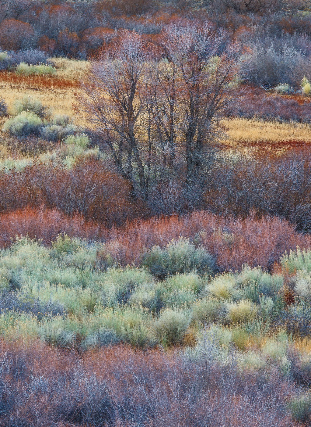
Grasses and sages in the Owens Valley isolated from a hill top vantage point.
5D2, 70-200 f/4 IS L @ 180mm
ISO 100, f/16, .4sec
Comments
16 comments
Comment posted by Igor Doncov on January 20, 2017 at 2:55 PM
One thought I wanted to share, which you may or may not agree with.
The reduction in clarity seems to work better with the brush and sage brush below the tree and not so well for te individual tree. I think that's because the most attractive part of a tree is it's distinct form of network of branches and in this case the main point of focus has been diminished by blurring them. Generally speaking I think this image would be stronger as a layered composition without the central tree. There are some nice colors in those layers and I think they work well with one another. PS I also don't think that having the tree sharp and the rest blurred unnaturally would work either.
Registered on November 22, 2014, 189 Posts, 2733 Comments
Comment posted by gary phillips on January 20, 2017 at 4:06 PM
I think you have been nailing these images from the Owens Valley. I love the layers of colors and textures. Beautiful for my tastes as is. One slight nit would be the tree at the very top right of the frame. For some reason the dark Y of the trunk pulls my eye. I think I would clone that Y to blend in a bit more. Other than that very small and easy fix.....Outstanding.
Registered on October 24, 2013, 185 Posts, 4136 Comments
Comment posted by Ken Smith on January 20, 2017 at 5:32 PM
The color bands and layers of more detail in the foreground (as it should be) to softer in b/g works. I will second Igor's comments. IMO the central trees detract by capturing the focus away from the colorful elements in front and back. Nonetheless this is a feast for the eyes. Well done.
Registered on September 5, 2008, 449 Posts, 2444 Comments
Comment posted by Dave Dillemuth on January 20, 2017 at 5:48 PM
Igor, Gary, Ken,
Thanks for the constructive input. I've removed the slight Orton effect and cloned out the "Y" in this rework.
Registered on December 10, 2015, 104 Posts, 1112 Comments
Comment posted by Harry Lichtman on January 20, 2017 at 5:56 PM
Another beauty from the Owens Valley. The only minor correction I could think of is to crop / clone / burn down the tiny piece of green /bright bush on the top left as it breaks up the uniform top boarder. Nice abstract feel to it.
Registered on September 17, 2010, 304 Posts, 3507 Comments
Comment posted by Richard Sandor on January 20, 2017 at 7:37 PM
Dave: I actually like both . The bands and layers of color and texture are a visual treat. Richard
Registered on January 12, 2014, 453 Posts, 1625 Comments
Comment posted by scott lanz on January 20, 2017 at 8:50 PM
Gorgeous image, Dave. Reminds me of Guy Tal's work. Just love the foreground, but the the centered trees work for me as well as a focal point.
Registered on November 14, 2003, 840 Posts, 12902 Comments
Comment posted by Brian Schrayer on January 20, 2017 at 10:54 PM
I definitely prefer the repost with ought the Orton. Beautiful layers of color with lots of rich detail. This is very nicely done, Dave!
Registered on May 28, 2004, 114 Posts, 2890 Comments
Comment posted by Mattia Oliviero on January 21, 2017 at 6:08 AM
I prefer the version without the Orton effect, Dave. Amazing layering and color. The composition works very well in this intimate landscape. I like this a lot and it reminds of Guy Tal's work as well. Well done.
Mattia
Registered on August 24, 2016, 43 Posts, 254 Comments
Comment posted by Lon Overacker on January 21, 2017 at 3:29 PM
Dave,
This is just simply gorgeous. The layers of color and detail wonderful. I didn't pick up on any Orton effect, but I do like the repost a shade better. Images like this are so good that there is little to be critical of, the ony option being real nit-picky...;-) The little changes you made I might not have noticed. There is one other minor one if you're ever going to print. There is a dark, shade patch near the right edge about 1/3 up from the bottom. Again, no biggie, but it's a little of an eye magnet for me. It also looks on the red side. I think some content aware creative cloning could help there. Other than that, I'll stick with my original comment. This is gorgeous.
Lon
Registered on November 24, 2006, 521 Posts, 19147 Comments
Comment posted by Bill Leggett on January 21, 2017 at 5:34 PM
I'm really liking all the the colorful layers in this piece, Dave. I like inclusion of the tree to give the scene context and scale, although it might work better to frame it out of center a bit.
Registered on July 21, 2004, 706 Posts, 3233 Comments
Comment posted by Jeffrey Sipress on January 21, 2017 at 9:24 PM
Dave, I like how you can see an image of value contained within a mess of confusion. Very nice.
Registered on February 17, 2004, 236 Posts, 1197 Comments
Comment posted by Ken Smith on January 22, 2017 at 12:07 AM
" +++ "
Repost is a winner!
Registered on September 5, 2008, 449 Posts, 2444 Comments
Comment posted by Genny K. on January 22, 2017 at 1:54 AM
What a joy to look at. I hope you are printing some of these!
I like both versions. If you ever get back there in different light it sure would be nice to see what you could get. You have a done a great job with these. They are a treat to look at!
Registered on June 5, 2006, 132 Posts, 2001 Comments
Comment posted by Ian Cameron on January 24, 2017 at 6:29 AM
Not sure what happened to my comment but I came back to have another look and that is such a very wonderful display of alternating bands of colour. Very well done
Registered on August 6, 2004, 1125 Posts, 3318 Comments
Comment posted by Harley Goldman on January 24, 2017 at 7:44 AM
Repost nails it, Dave. Beautiful layers and colors. It has been a real pleasure to see your east side series!!
Registered on November 19, 2003, 586 Posts, 11271 Comments

Comments
16 commentsThe reduction in clarity seems to work better with the brush and sage brush below the tree and not so well for te individual tree. I think that's because the most attractive part of a tree is it's distinct form of network of branches and in this case the main point of focus has been diminished by blurring them. Generally speaking I think this image would be stronger as a layered composition without the central tree. There are some nice colors in those layers and I think they work well with one another. PS I also don't think that having the tree sharp and the rest blurred unnaturally would work either.
Thanks for the constructive input. I've removed the slight Orton effect and cloned out the "Y" in this rework.
Mattia
This is just simply gorgeous. The layers of color and detail wonderful. I didn't pick up on any Orton effect, but I do like the repost a shade better. Images like this are so good that there is little to be critical of, the ony option being real nit-picky...;-) The little changes you made I might not have noticed. There is one other minor one if you're ever going to print. There is a dark, shade patch near the right edge about 1/3 up from the bottom. Again, no biggie, but it's a little of an eye magnet for me. It also looks on the red side. I think some content aware creative cloning could help there. Other than that, I'll stick with my original comment. This is gorgeous.
Lon
Repost is a winner!
I like both versions. If you ever get back there in different light it sure would be nice to see what you could get. You have a done a great job with these. They are a treat to look at!