Nature Photographers Network
This is the preserved archive of the original Nature Photographers Network. The community continues at naturephotographers.network.
Marsh Madness
‹ PreviousLandscape GalleryNext ›

Marsh Madness

by Harry Lichtman

Gallery: LandscapePosted January 27, 2017222 views9 comments
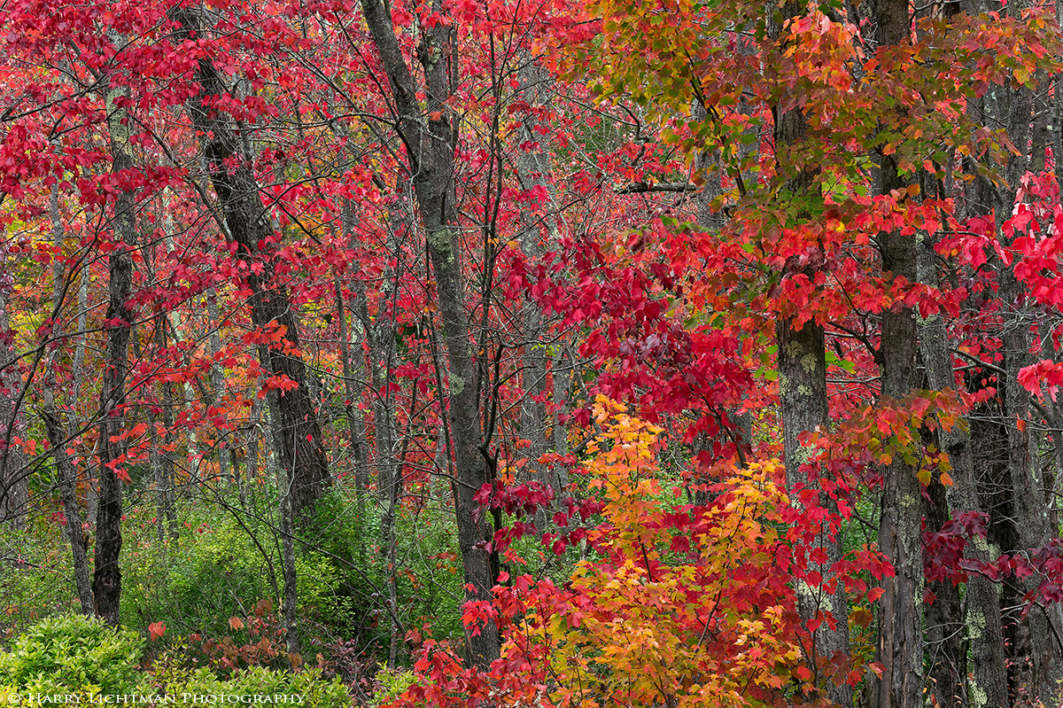
I decided to travel earlier rather than later in the fall foliage season to catch the marsh maples on fire.  While on my way to northern NH, I found this grouping in the swamps of Oxford, ME.  Conditions were perfect for this type of shot - bright overcast and no wind.  I used a 80-400mm zoom at 200mm to isolate and compress the view, avoiding featureless skies.  I focal blended 4 images to keep the leaves and trunks sharp, bu t let the distant foliage go soft to help reduce the business of the scene.

I have considered a slight crop off the far right, but figured I would post the full image.

Nikon D810, ISO 64, 0.3 sec., polarizing filter

Comments

9 comments
Comment posted by Igor Doncov on January 27, 2017 at 6:16 PM
Love the riot of fall colors in this image. I would burn in the greens in the llc to the level of the greens in the shade directly above. Beautiful work.
Registered on November 22, 2014, 189 Posts, 2733 Comments
Comment posted by Brian Schrayer on January 27, 2017 at 7:12 PM
This is beautiful, Harry.  I like the mix of color in this scene.  The comp works for me, but I do see the merit of a slight crop off of the far right.  I find it difficult to compose these kind of scenes so I always admire scenes like this that are done so well.
Registered on May 28, 2004, 114 Posts, 2890 Comments
Comment posted by SandyRichardsBrown on January 28, 2017 at 4:45 AM
Just beautiful. I personally like the different shades of green, and the other colours are spectacular.
Exceptional work!
Sandy
Registered on November 24, 2003, 3937 Posts, 12909 Comments
Comment posted by Jim Zablotny on January 28, 2017 at 8:00 AM
Hi Harry,

 The intersection of  bright red  and yellow leaves  on the Rh side makes this composition successful. I'd leave this one as presentedcrying....................Jim
Registered on January 17, 2004, 705 Posts, 3594 Comments
Comment posted by Harley Goldman on January 28, 2017 at 8:44 AM
That is quite a blast of bold color! I like the comp without the crop, but I might burn down or desaturate the bright red leaves on the right edge. I find it is an eye magnet pulling my attention out of the image. 
Registered on November 19, 2003, 586 Posts, 11271 Comments
Comment posted by Nick Bristol on January 28, 2017 at 10:29 AM
Beautiful fall scene, Harry. Nice job with the composition and those colors are just wonderful. Looks great to me as is.

Nick Bristol
Lone Rock, WI.
Registered on February 1, 2004, 752 Posts, 14140 Comments
Comment posted by Dave Dillemuth on January 29, 2017 at 12:09 PM
Gorgeous riot of fall colors. The comp. works fine as framed but I think some create burning could enhance the image further. To that point, I would darken the bright red leaves along the right frame edge and the bright green foliage in the lower left.
Registered on December 10, 2015, 104 Posts, 1112 Comments
Comment posted by Harry Lichtman on January 29, 2017 at 1:24 PM
Thanks for the dodge and burn ideas.  I will incorporate them into the master file.
Registered on September 17, 2010, 304 Posts, 3507 Comments
Comment posted by Lon Overacker on January 29, 2017 at 1:33 PM
Harry,

Beautiful autumn image; terrific mix of color, even including the greens.  While I think a burn of the right like Harley suggests would certainly work, but I'm also leaning towards a crop; not just because of the bright reds on the right, but also the dark trunks.  Moving in from the right would also bring back the emphasis to the left, where I think there is some nice depth, front to back dimension to this. Of course a scene like this, you've got your options. ;-)

Lon
Registered on November 24, 2006, 521 Posts, 19147 Comments