Nature Photographers Network
This is the preserved archive of the original Nature Photographers Network. The community continues at naturephotographers.network.
Wave Art
‹ PreviousLandscape GalleryNext ›

Wave Art

by Balan Vinod

Gallery: LandscapePosted January 28, 2017169 views7 comments
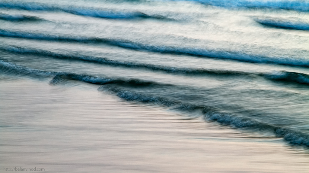
After sunset, there seemed to be more of the smaller waves coming in one after the other. 


7D, 24 105 @ 105, ISO 100, F9, 1/2 sec Pulled up the exposure by about half a stop, and that was when the colors talked to me.

Balan Vinod

Comments

7 comments
Comment posted by Lon Overacker on January 29, 2017 at 1:48 PM
Balan,

Really love what you're going after, just not sure you got there, completely. The difficulty I've always had with these beach/wave images is the angle; at the diagonal in this case you ended up with a lot of negative space.  the smaller waves as you mention are  captured wonderfully; the texture, form and motion are wonderful. I'm wondering if a crop off the bottom would help with the negative space (note, that negative space isn't always a bad thing.)

Only other suggestion would be to back off the cyan in the top two waves.

Lon
Registered on November 24, 2006, 521 Posts, 19147 Comments
Comment posted by Ian Wolfenden on January 29, 2017 at 2:03 PM
I like this a lot, Balan.  The inclusion of so much beach doesn't bother me ( in fact I feel it's a plus ) and the overall softness allows enough detail to be very compelling visually.  I would, like Lon, take down the blue a bit at the top of the frame.
Registered on May 18, 2007, 1108 Posts, 7647 Comments
Comment posted by Jim Zablotny on January 29, 2017 at 3:11 PM
Hi Balan,

Tone down the cyan in the upper parts of the image.  I like the beach area  a lot and you could try to cropping some off the bottom to get a different look at the scene.  i do like the scene as presented ...........................Jim
Registered on January 17, 2004, 705 Posts, 3594 Comments
Comment posted by Brian Schrayer on January 29, 2017 at 3:54 PM
This is an interesting image, Balan.  There is a visual tension between the high energy of the waves and the smoother ripples in the water on the shore.  Finding the right visual balance between the two areas is the key.  For me the right half of the image works well because it seems to be well balanced between the two areas.  Take this with a grain of salt as it is obviously very subjective.  I hope that it is helpful nonetheless.
Registered on May 28, 2004, 114 Posts, 2890 Comments
Comment posted by Mark Seaver on January 29, 2017 at 4:15 PM
Balan, I like the arch of the waves across the frame.  I agree that the large number of waves looks good and adds interest.  There are also lots of nice details in the backwash.  My nit, is in the cutting off of the splash in the middle-top.  Definitely a fun project to keep after.
Registered on January 23, 2011, 1103 Posts, 17270 Comments
Comment posted by Igor Doncov on January 29, 2017 at 8:03 PM
In my view, this is a work in progress. I would try a slower shutter speed and a more overcast day rather than morning/evening light.  I think an overcast day would add a greater variety of color to the water and make it less contrasty. I think this subject would look better with fewer shadows. I agree that the blues in the upper waves are a bit oversaturated.
Registered on November 22, 2014, 189 Posts, 2733 Comments
Comment posted by Genny K. on January 31, 2017 at 10:27 PM
Cool. I do agree with Lon that a crop might make it even better, to get rid of some of that lower left corner.
I do like the effect you got with your shutter speed, and the mix of pinks and cyans.
As Brian said, thoughts on this are going to be very subjective.  There are so many ways you could go with it.
Registered on June 5, 2006, 132 Posts, 2001 Comments