Nature Photographers Network
This is the preserved archive of the original Nature Photographers Network. The community continues at naturephotographers.network.
Palo Blanco + rp
‹ PreviousLandscape GalleryNext ›

Palo Blanco + rp

by Igor Doncov

Gallery: LandscapePosted February 1, 2017295 views17 comments
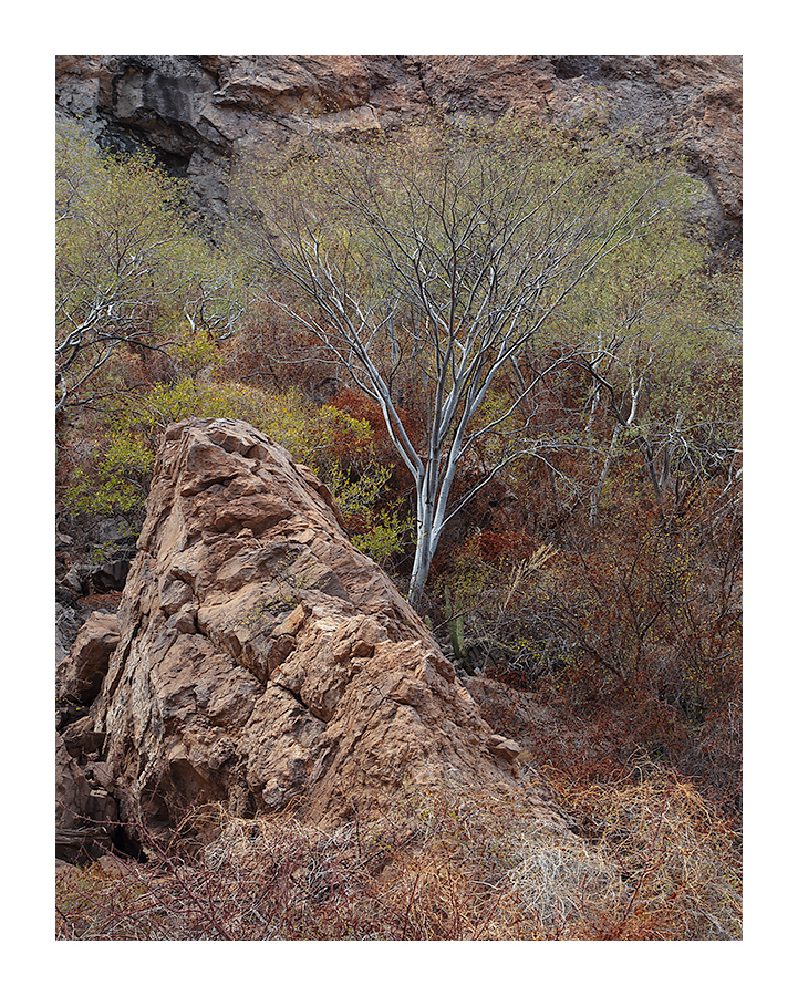
These trees grow in the arroyos of the southern half of Baja. Good light for photography is rare in this part of the world. This was taken one morning to use the warm bounce light from the opposite canyon wall. I took this picture primarily for the colors. My facebook friends aren't too fond of it but I can be stubborn that way.

Canon 6D, 24-105mm@70mm, f/8, 1/20 sec, ISO 100, CPL, tripod, timed shutter release

PS The large version on a dark background seems to look a bit better.

Comments

17 comments
Comment posted by Stephen Stanton on February 1, 2017 at 11:34 PM
Very nice Igor. I like the juxtaposition of the fracturing rock and the slim sleek form of the young tree. Very nice balance of forms and colors also. 
Registered on March 1, 2015, 54 Posts, 453 Comments
Comment posted by gary phillips on February 2, 2017 at 12:28 AM
This is very nice, Igor.  I've been trying to discipline myself to take a harder look at busier comps in my own work, with mixed results.  You have put together a compelling example of how well it can work.  Love the centered bright trunk and mixed colors surrounded by the hardness of the rocks, cliff band, and thorny vegetation.  At first, I thought that the colors might be understated, but the large view with the dark background brings them out nicely.   I'm searching for something that might improve it and the only thing that draws my eye is the dark rock top left. Not sure I have a fix for that, but I might play around with dodging and cloning a bit, if you were so inclined.  Without doing anything it is a very ice image.
Registered on October 24, 2013, 185 Posts, 4136 Comments
Comment posted by Harry Lichtman on February 2, 2017 at 8:46 AM
The tree really pops from the background, it is set off nicely from surrounding tones.The colors are subtle and the image is more about textures, so not surprising that facebook responded that way.  I bet the sunrises go over better there. I might have tried to compose with less off the bottom, to keep the lower portion mostly the rock to match the rock background.  A crop might make this more of a square, but I guess you could take a little off the left to keep it more vertical.  I do like the tree poking in from the left.
Registered on September 17, 2010, 304 Posts, 3507 Comments
Comment posted by Dan Kearl on February 2, 2017 at 9:26 AM
I might have taken a step forward. The Rock is a bit prominent and a bit more emphasis on the tree would look better for me.
Registered on September 2, 2013, 209 Posts, 1514 Comments
Comment posted by scott lanz on February 2, 2017 at 9:51 AM
Excellent, Igor. Really like the color, detail and form of the large rock and main tree, both of which stand out nicely.  The very bottom seems a bit chaotic, but excellent overall.
Registered on November 14, 2003, 840 Posts, 12902 Comments
Comment posted by Igor Doncov on February 2, 2017 at 11:43 AM
I actually liked that brush at the bottom. Here is the suggested crop without it and I like it as well. Maybe that's because it's new and different. 

Harry - it's true that sunsets and sunrises are what people want most on a baja faceook gallery. People are also interested in destinations they can go to or where they've been. Generally, grand landscapes get far more attention than intimate ones. In that respect it's not that different here. I suppose they think ' I can just go to my backyard garden and get a shot like that'. 
 
Registered on November 22, 2014, 189 Posts, 2733 Comments
Comment posted by Bill Chambers on February 2, 2017 at 12:17 PM
A beautiful capture Igor.  I really liked the original but must admit I prefer the repost.  The absence of the brush takes some of the chaos out of the scene and allows the eyes to better absorb the overall scene.
Registered on April 10, 2005, 753 Posts, 21216 Comments
Comment posted by Dave Dillemuth on February 2, 2017 at 12:59 PM
Excellent job composing and making order out of chaos. The subdued colors are beautiful and the graceful lines of the tree work beautifully as a focal point. The repost is a considerable improvement, simplifying and tightening up the composition.
Registered on December 10, 2015, 104 Posts, 1112 Comments
Comment posted by Vance Gese on February 2, 2017 at 4:46 PM
An extraordinary image, Igor, the balance in the design of your composition being superb.  The diagonals of the foreground rock, then the tree, and then those of the far rock face, guide the eye so nicely through the image.  I do like the larger image better with the somewhat darker background which helps to highlight the leaves and tree trunks a bit more.  While I can appreciate the simplified tighter composition of the repost, I do prefer the original post.  The brush in the foreground provides an element across the bottom that for me, helps to tie the entire image together.  Wonderful, natural color throughout.
Exquisite work.
Registered on November 13, 2008, 298 Posts, 6629 Comments
Comment posted by Nick Bristol on February 2, 2017 at 6:25 PM
Igor, You did an excellent job with this. The colors and textures are wonderfully natural and complement one another. I like the original comp (especially in the larger version on darker background) but the cropped repost works great as well. Not quite sure which I like best now but I'll lean towards the original. I kind of like the brush at the bottom and how it helps tie the image together. Also if it was larger like in a print I feel the original would look great. That left tree does such a nice job of framing the big rock along with the center one. Very nice work!

Nick Bristol
Lone Rock, WI.
Registered on February 1, 2004, 752 Posts, 14140 Comments
Comment posted by Craig Moreau on February 3, 2017 at 10:35 AM
Igor, I will echo what others said about creating order from chaos. That is an extremely difficult thing, done very well here. I prefer the original as the brush provides a nice base to the image that is lacking in the crop.
Registered on April 21, 2015, 64 Posts, 584 Comments
Comment posted by Harley Goldman on February 3, 2017 at 10:56 AM
Well seen and executed. I like the original. I like the brush at the bottom. Gives the scene more context and overall interest. Excellent job of making order out of chaos. I like it. 
Registered on November 19, 2003, 586 Posts, 11271 Comments
Comment posted by Lon Overacker on February 3, 2017 at 1:26 PM
Igor,  I love what you've seen here, including the diversity of color, but also how you crafted the image.  

For me, I'm quite torn about the brush at the bottom.  My initial thought was that it just seems unresolved.  Not quite sure how to explain it.  While I agree it works in terms of a base, a layer, contrast in colors, etc., all those things.  On the other hand, it's just a mess dead brush, unresolved as a mentioned, relative to the clear and distinct elements of the rock and tree.

Having said that, I'm not sure the crop is better or not.  I do quite like it actually with the focus now just on the tree, rock and again colors; but now feels cut off.  Tough, I'm not seeing an alternate and of course don't know what other options you had at the scene.

I do like this quite a lot.  I guess my critique is equally unresolved though.angel
Registered on November 24, 2006, 521 Posts, 19147 Comments
Comment posted by Prashant Khapane on February 3, 2017 at 5:30 PM
Igor I'm glad you are stubborn. I like this a lot.
Registered on November 1, 2003, 492 Posts, 4580 Comments
Comment posted by Preston Birdwell on February 4, 2017 at 3:23 PM
Igor, I think I prefer the original because the cropped version looks cut off. You might consider burning down the foreground bushes a bit to put the interest on the boulder and the tree. I love the color and all the fine detail.
--P
Registered on November 1, 2003, 471 Posts, 5188 Comments
Comment posted by Jim Zablotny on February 4, 2017 at 4:13 PM
Hi Igor,
I like the original with the tangled shrubbery on the bottom.  The comp has some nice triangular elements and the tree pops from the surroundings. When I first looked at the tiny version, I was not too thrilled about the rock.  Looking at the the large version, the rock is a dominant, but essential part of the comp.  So, I like the image as presented.  Well done.....................Jim
Registered on January 17, 2004, 705 Posts, 3594 Comments
Comment posted by Genny K. on February 4, 2017 at 11:44 PM
I think this is an image that needs to be appreciated large, and I mean really large, as in at least 20x30 inches. I think you need to really be able to see the details in the small branches on the tree, and in the rock.  Then you'd feel like you were there.....   Nicely seen. I think I like the original image better, with the bushes at the bottom.
Registered on June 5, 2006, 132 Posts, 2001 Comments