Nature Photographers Network
This is the preserved archive of the original Nature Photographers Network. The community continues at naturephotographers.network.
Rustoleum
‹ PreviousLandscape GalleryNext ›

Rustoleum

by Lon Overacker

Gallery: LandscapePosted February 12, 2017350 views21 comments
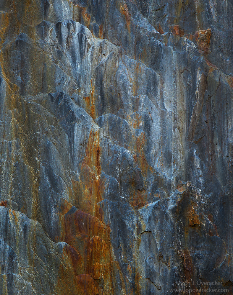
If you've been around for more than 4 years, you may recall my 4x5 rendition. Not exactly the same, but the same area of the rock wall.  The portion of this wall is more gray, which is rendering more blue in the RAW file; however, I've significantly pulled back on that with a goal of more of a "steel" blue or blue/gray.  I like the offset of colors with the rust.

Another 2-image focus stack. The reason is that shooting at a slight upward angle, getting it sharp bottom to top I thought would work with a focus stack.

Very curious your thoughts and reactions to this one.  Still have few more stragglers from that November trip, but the herd is thinning out. ;-)

As always I welcome your comments and honest critiques. Thanks!

Lon

Comments

21 comments
Comment posted by Bill Fach on February 12, 2017 at 4:50 PM
Lon: After seeing your images from this wall I'm not sure I ever want to see it in person because I might never go anywhere else. Wonderful comp and a color junkie's delight. Most excellent.>=))>
Registered on November 1, 2003, 1805 Posts, 26981 Comments
Comment posted by Preston Birdwell on February 12, 2017 at 5:51 PM
This rocks! I remember the 4x5, which was excellent, and I really like this, too. The blue steel and the rust red are a wonderful compliment to the textures and detail. No nits, here. Well done, sir!
--P
Registered on November 1, 2003, 471 Posts, 5188 Comments
Comment posted by Brian Schrayer on February 12, 2017 at 6:02 PM
The repeating diagonal lines work well to guide my eye in the frame.  The color contrast is very interesting and the textures keep my eyes roaming the frame. 
Registered on May 28, 2004, 114 Posts, 2890 Comments
Comment posted by Harley Goldman on February 12, 2017 at 6:08 PM
A most enjoyable rock abstract. I really like the warm and cool tones and great patterns and lines. I like this one a lot,
Registered on November 19, 2003, 586 Posts, 11271 Comments
Comment posted by Rick Turner on February 12, 2017 at 6:27 PM
Nice painting Lon.  Beautiful.
Registered on February 18, 2012, 534 Posts, 2755 Comments
Comment posted by Nick Bristol on February 12, 2017 at 6:46 PM
Lon, This is very impressive and I'm enjoying it so much. The colors and textures in this are fantastic. Great composition and it makes me think of a waterfall in stone. Excellent!

Nick Bristol
Lone Rock, WI.
Registered on February 1, 2004, 752 Posts, 14140 Comments
Comment posted by Alberto Patiño on February 12, 2017 at 7:36 PM
I like it, especially how the blue appears to "cascade down" - though this must be seen in the large version. Only very minor issue is that the ochre-stained patch near the top-right looks a bit too paint-like, somewhat "fake" if you know what I mean. Perhaps too sharp, or perhaps it is a result of the stacking?
Registered on December 2, 2014, 278 Posts, 1736 Comments
Comment posted by Michael Lowe on February 12, 2017 at 10:20 PM
I was gonna say "this rocks", pun intended, but Preston stole my thunder. This is mesmerizing. I could stare at it for hours. Well maybe not hours, but for quite awhile.devildevil
Registered on February 11, 2004, 777 Posts, 5252 Comments
Comment posted by Gary Minish on February 12, 2017 at 11:50 PM
Love this abstract slab of rock, Lon!  It's good that you made the extra effort to make it sharp, top to bottom.  The large version with all the detail is most impressive.  I also love your title! devil
Registered on February 4, 2006, 625 Posts, 3583 Comments
Comment posted by SandyRichardsBrown on February 13, 2017 at 4:51 AM
Marvelous colours and perfect comp. Love the detail and vertical lines here.
Sweet!
Sandy
Registered on November 24, 2003, 3937 Posts, 12909 Comments
Comment posted by Balan Vinod on February 13, 2017 at 5:11 AM
Beautifully Crafted ...love this
Balan Vinod
Registered on March 20, 2006, 889 Posts, 2312 Comments
Comment posted by Aaron Feinberg on February 13, 2017 at 7:22 AM
Simple.  Well done sir. 

aF
Registered on October 26, 2009, 399 Posts, 2789 Comments
Comment posted by Mattia Oliviero on February 13, 2017 at 8:37 AM
I like a lot this abstract rock, Lon. The texture is hypnotic and colors are beautiful. Well done!

Mattia
Registered on August 24, 2016, 43 Posts, 254 Comments
Comment posted by Paul Breitkreuz on February 13, 2017 at 9:20 AM
Lon, geological stuff is always of interest to me when in the field. I really like this and as others have stated no need for change here at all. Very nice indeed.
Edit: Title is perfect too....sad
Registered on February 25, 2006, 525 Posts, 8448 Comments
Comment posted by Igor Doncov on February 13, 2017 at 11:32 AM
This is excellent Lon. I'm sure you'll get a very positive response for this image. I think of this as more of a intimate capture of a rock wall than an abstract. This shade of blue is good for these rust colors. I think the colors are right on. I might try raising the exposure just a tad to see how that compares. Unfortunately that may require readjusting the colors. There is that one slightly bright spot center left? I find the upper half more intriguing. There's a fine horizontal of the upper half with repeating ridges that is also excellent. 
Registered on November 22, 2014, 189 Posts, 2733 Comments
Comment posted by Ryan Shain on February 13, 2017 at 8:19 PM
Dude Lon this is so awesome!!!!

I love everything about this image from the texture and lines in the rock wall, the cool stell blues and how they play with the rusty browns/oranges. I am very much drawn to these kind of colors in my life, especially in my clothing choices, lol, so yeah this image has it all for me, and it has such a soothing effect onmyself.

Just so freaking awesome Lon!!!!!
Registered on February 20, 2007, 226 Posts, 4571 Comments
Comment posted by gary phillips on February 13, 2017 at 10:04 PM
Nature has a way of putting together an incredible tapestry of form, texture, and color.  It doesn't matter if it takes millions of years, or in the case of ice, overnight.  The key is seeing it, and in this case, your vision is extraordinary.  Love the colors, and how the rust just drips over the varying shades of blue.  Nothing I could suggest for improvement, I'm just gonna enjoy it.
Registered on October 24, 2013, 185 Posts, 4136 Comments
Comment posted by Lon Overacker on February 14, 2017 at 12:17 AM
Thank you all for your comments, observations and kind words.

@Alberto.  Honestly, I had to google "ochre." ;-)  but now understand your comment more.  Interstingly, I used TK's saturation painting to reduce saturation on that specific part of the image.  It's was quite orange/red.  Also, interesting because I was conscious of the sharpening here, considering I used both the Nik output sharpener AND TK's sharpen for web, so perhaps that rendered that part a little over the top.

@Igor, good call on the slight boost in exposure.  Bill Fach I think mentioned in the past most of my images come across darker, so there is probably room for an adjustment there.  I also agree there are many, more intimate crops of this, including a horizontal. Lot's of potential for alternatives.  As presented, this was actually cropped maybe 20% from the original.

sounds like the color is good.  I was concerned about that, but I think I'm happy with the steely blues and rusts.

thanks again folks!

 
Registered on November 24, 2006, 521 Posts, 19147 Comments
Comment posted by Harry Lichtman on February 14, 2017 at 10:42 PM
I really like the way the rust colored streaks lend to this vertical presentation.  The warm and cool tones are great together.  I see thin kind of art hanging in offices everywhere - it should be yours!!!  Soothing, thought provoking, creates more questions than answers.  Cool stuff. 
Registered on September 17, 2010, 304 Posts, 3507 Comments
Comment posted by Peter Richter on February 15, 2017 at 1:20 PM
Lon, this is one of my top favorites from your portfolio. There is an exciting color balance and the diversity of shapes playing together makes it outstanding for me.

Peter
Registered on November 10, 2010, 218 Posts, 2723 Comments
Comment posted by Bill Chambers on February 16, 2017 at 12:27 PM
Beautiful abstract Lon.  I really enjoy the great variety of colors and shades of color.  I know you pulled a lot of blue out of this, but IMHO it wouldn't hurt to pull a little more out.
Registered on April 10, 2005, 753 Posts, 21216 Comments