Nature Photographers Network
This is the preserved archive of the original Nature Photographers Network. The community continues at naturephotographers.network.
Long View 3
‹ PreviousLandscape GalleryNext ›

Long View 3

by Bill Fach

Gallery: LandscapePosted February 15, 2017237 views7 comments
Sony A77II
Sony 70-400G @ 140mm
ISO 400, 1/60 @ f8

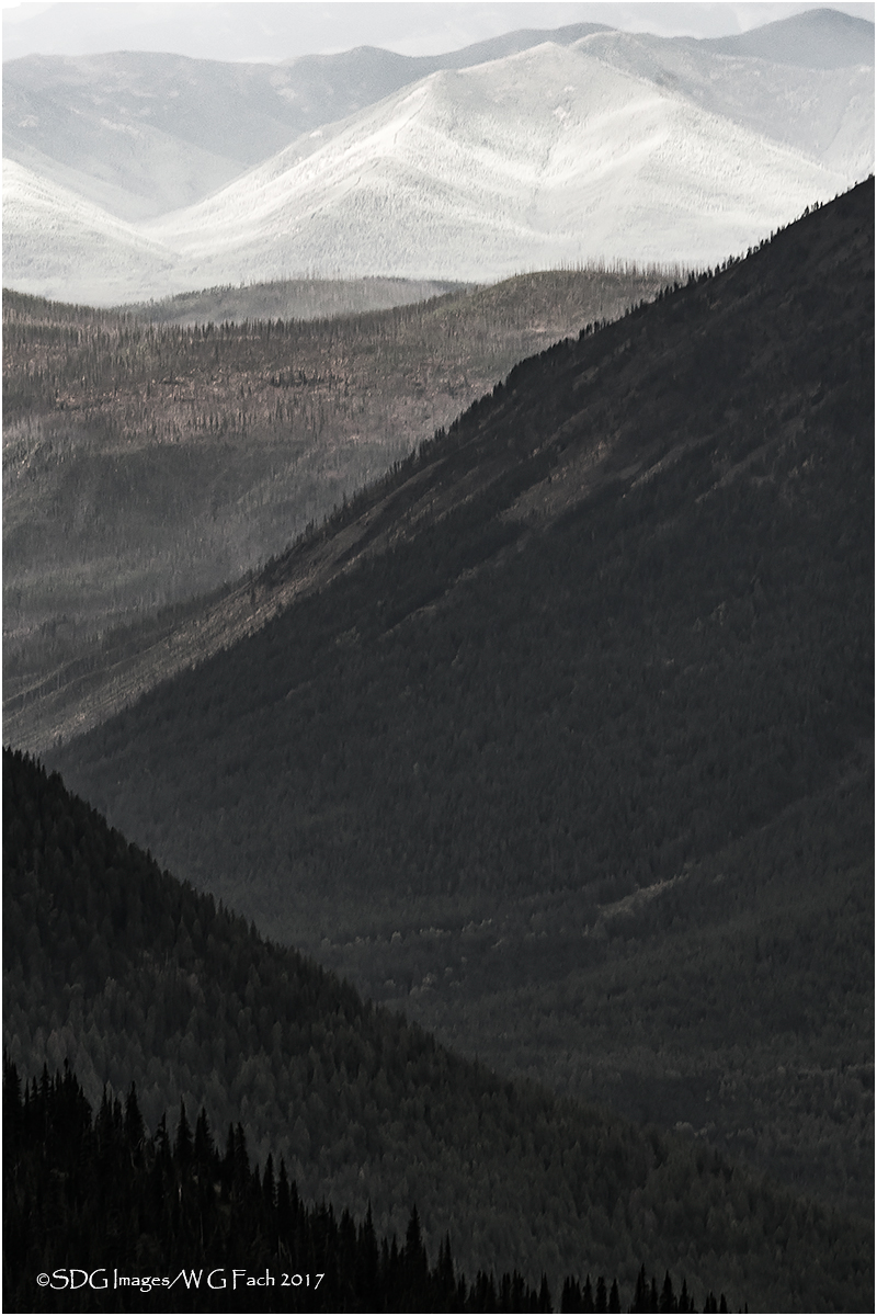
More work with B&W. I was looking for the transition from shadow to light and thought this comp worked reasonably well. At this size it may be hard to discern but the BG up top is not open sky but another ridge line.  All comments and suggestions welcome.>=))>

Comments

7 comments
Comment posted by Stephen Stanton on February 15, 2017 at 11:44 PM
Bill, I am not too much for B&W as I don't process many for the medium, I am sure others will comment;  but I l think the layered tones leading into the brown are very impactful...the gray white background seems a little abrupt though. Very much like the subtle tree shapes and details available throughout.  I think the image is very strong.    
Registered on March 1, 2015, 54 Posts, 453 Comments
Comment posted by Lon Overacker on February 16, 2017 at 11:11 AM
Bill,

Love the graphics of this and the range of tone and contrast.  Are you sure this is b&w?  One of the mid-ground ridges looks brown to me and the trees look green.  No matter, the impact is still there.

If I had a wish it would be for including a little more up top.  You mentioned it's not sky, but another ridge, which makes sense. It just feels a little cramped to me.  Someone had suggested "stretching" the top of one of my images, which I had never done, but it was effective. Not sure if you're up for that. Minor detail anyway.

Love the vision here.  You really took advantage of the landscape in front of  you with your different takes on this scene. Excellent!

Lon
Registered on November 24, 2006, 521 Posts, 19147 Comments
Comment posted by Skip Layman on February 16, 2017 at 12:20 PM
I really like the layer upon layer.  I'd like to see a color version for comparison.
Registered on November 1, 2003, 558 Posts, 1704 Comments
Comment posted by Bill Fach on February 16, 2017 at 1:17 PM
Lon: Indeed this is not completely desaturated but close to 90%. I kind of liked the subtle tones in the midground.
Registered on November 1, 2003, 1805 Posts, 26981 Comments
Comment posted by Harley Goldman on February 16, 2017 at 6:16 PM
I was with Lon, I was trying to figure out the B&W. :)  And his suggestion to add top is exactly my take as well. First thing I thought of when opening it. I really like the intersecting lines and the fade from dark to light on the ridges. Very nice work!
Registered on November 19, 2003, 586 Posts, 11271 Comments
Comment posted by Wayne Jones on February 17, 2017 at 12:25 AM
Wow, this is so powerful!  The strength of the receding layers is obvious.  Just as striking is the strength of the diagonal lines, like the bold brush strokes of a confident master artist. We know you are not the creator of those strokes, but your vision in finding them and showing them to us is so effectively is appreciated.

I think that the tight feeling on top is a minor point that could be addressed to make this image even stronger. I don't think it would take very much to make that little bit of space.  As Lon said, copying and stretching a thin piece of the image a little often works better than content-aware fill.  Easy to try both and see which technique works better if you are inclined to see if you might like that little change.  
Registered on April 18, 2007, 953 Posts, 6435 Comments
Comment posted by Preston Birdwell on February 17, 2017 at 7:25 PM
I like this B&W, but I prefer the color version posted later.
-P
Registered on November 1, 2003, 471 Posts, 5188 Comments