Nature Photographers Network
This is the preserved archive of the original Nature Photographers Network. The community continues at naturephotographers.network.
Front Porch + B&W
‹ PreviousPOP Photos GalleryNext ›

Front Porch + B&W

by Preston Birdwell

Gallery: POP PhotosPosted March 16, 2017281 views7 comments
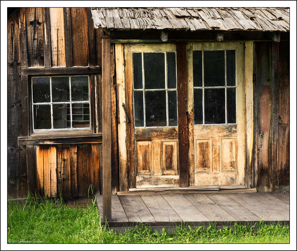
This the south side of same building as my 'No Step' and 'Pickets' images. I liked the color and textures in the weathered wood and paint in contrast with the fresh Spring grass.

Nikon D-7100
18-140mm @ 35mm
ISO 100, 1/6s @f-16
B&W adjustment layer set to Luminosity for some color adjustment
TK's masks.

Please see the large version. Thanks!

Thank you for your comments on my recent posts, and thanks in advance for comments on this image. cool
--P

Comments

7 comments
Comment posted by Harley Goldman on March 17, 2017 at 1:51 PM
Nice old building! Crusty and weathered, like the photographer. sad
Registered on November 19, 2003, 586 Posts, 11271 Comments
Comment posted by Lon Overacker on March 17, 2017 at 6:51 PM
 

Nice old building! Crusty and weathered, like the photographer. sad

I wasn't gonna say anything.... LOL. crying  Right next to your previous Daffodils image if I recall correctly.  A lot going on with the building portrait, but it all works together nicely. From the window and doors, to the patio roof and boardwalk.  Colors are excellent. The only suggestion I have would be a slight burn of the rh door and the grasses at the bottom.

Wouldn't wake to heart too much with what Harley says... he can't even hold a job any more... sad
Registered on November 24, 2006, 521 Posts, 19147 Comments
Comment posted by Preston Birdwell on March 17, 2017 at 7:37 PM

Nice old building! Crusty and weathered, like the photographer. sad

You forgot to mention, "colorful". enlightened

Thanks for your comments, gents! Always appreciated.
--P 
Registered on November 1, 2003, 471 Posts, 5188 Comments
Comment posted by Preston Birdwell on March 19, 2017 at 12:07 PM
Here is the BW version. Which one works best for you?
--P
Registered on November 1, 2003, 471 Posts, 5188 Comments
Comment posted by Harley Goldman on March 19, 2017 at 4:07 PM
I really like both. I might bump the contrast a bit on the B&W, maybe a small S-curve? But it works rather well. You can't go wrong with either version. 
Registered on November 19, 2003, 586 Posts, 11271 Comments
Comment posted by Lon Overacker on March 20, 2017 at 8:11 PM
Preston,

Like Harley, I think both work.  As a "period" piece, the b&w if appropriate, of course. Speaking of which, an alternative might be a Sepia treatment as well. Just a thought.

Also might agree on a slight contrast boost, but I would target the porch and grass a bit more, and reduce the  brightness there as well (just like recommended in color.)

Great, historical portrait from Columbia SP.

Lon
Registered on November 24, 2006, 521 Posts, 19147 Comments
Comment posted by Richard Teller on March 24, 2017 at 2:03 PM
I to like the color and texture of the weathered wood. A neat old building and good composition. I also like the juxtaposition of the building that is showing decay with the green living grass. 
Registered on August 23, 2010, 1162 Posts, 6692 Comments