Nature Photographers Network
This is the preserved archive of the original Nature Photographers Network. The community continues at naturephotographers.network.
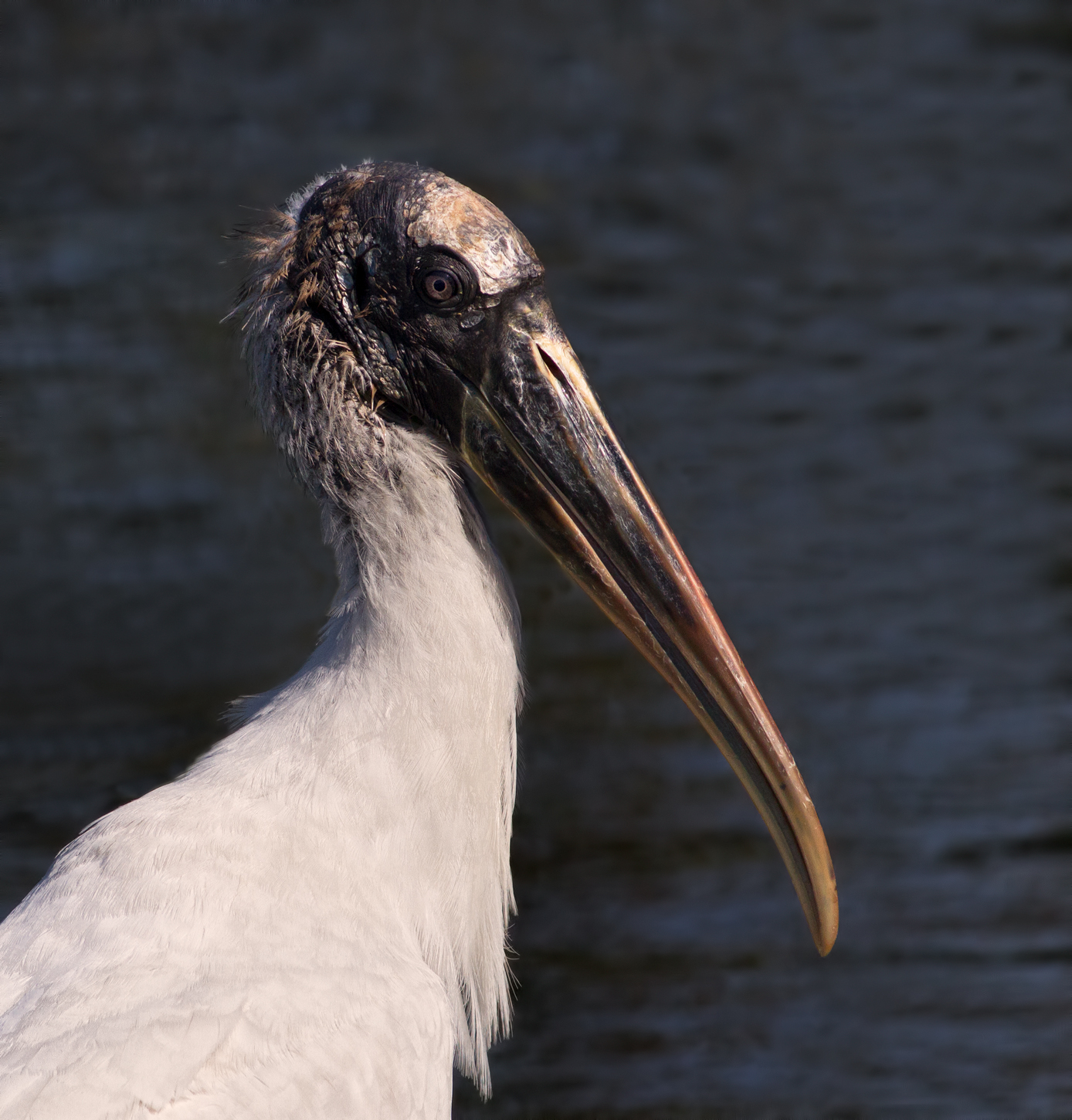
Wood Stork/redo x2
‹ PreviousAvian GalleryNext ›

Wood Stork/redo x2

by Barbara Graham

Gallery: AvianPosted March 19, 2017197 views7 comments
Immature Wood Stork
Gainesville, Florida
3/18/2017 – 10:47:59 AM
Canon EOS 7D EF400mm f/5.6L USM
1/4000 sec;   f/7.1;   ISO 640 (ISO didn't need to be 640, but in this case not sure it mattered)
Manual;   Evaluative metering
LR5, PS6, Topaz DeNoise on background, Smart Sharpen on Wood Stork, brightened the head a little but still not happy that you can't see the neck feathers in more detail because of the dark water background, but if the water is lightened the Wood Stork looks dull

Any feedback would be greatly appreciated.

Thank you!

Comments

7 comments
Comment posted by Ed Williams on March 19, 2017 at 10:45 PM
Good work with the lighting Barbara. Nice detail in the eye and the forehead. Looks like it could take a hit with that helmet. Maybe you could try selective lightening in the neck using a selection tool to separate it from the water?
Registered on December 28, 2010, 636 Posts, 3499 Comments
Comment posted by Keith Bauer on March 19, 2017 at 11:18 PM
Barbara:  Image has potential, but the face is just too dark to show the detail.  Here's a bit of work using some selective work on the head to see what detail was there.  
Registered on November 20, 2003, 458 Posts, 4836 Comments
Comment posted by Barbara Graham on March 19, 2017 at 11:52 PM
Thanks, Ed and Keith.  I added a Curves layer with a layer mask so that only the dark part of the head and the neck feathers were affected by the Curves adjustment.
Registered on July 27, 2010, 1310 Posts, 5035 Comments
Comment posted by Barb Pflaum on March 20, 2017 at 2:47 PM
Very nice portrait of this Wood Stork, Barbara.  I think both reworks are an improvement because they show more detail on the face.
Registered on January 14, 2009, 316 Posts, 2724 Comments
Comment posted by Philip Hodgkins on March 20, 2017 at 3:09 PM
I like the repost much better. To my eye, you have brightened the appropriate areas without losing the yellow color values, which is much to be desired in preserving the tone of the head area. I do think you have further to go with the eye itself, much as Keith has done.
Registered on July 24, 2006, 2741 Posts, 12349 Comments
Comment posted by Steve Thompson on March 20, 2017 at 5:13 PM
Tough subject Barbara. Both reposts are an improvement and I like the lighter eye in Keith's version. Good work!
Registered on August 7, 2014, 125 Posts, 2319 Comments
Comment posted by Barbara Graham on March 20, 2017 at 6:41 PM
Thanks, Barb, Phil and Steve.  Here is another redo with more lightening in the darker areas, including the eye.
Registered on July 27, 2010, 1310 Posts, 5035 Comments