Nature Photographers Network
This is the preserved archive of the original Nature Photographers Network. The community continues at naturephotographers.network.
Time Contrast
‹ PreviousLandscape GalleryNext ›

Time Contrast

by Lon Overacker

Gallery: LandscapePosted March 26, 2017223 views9 comments
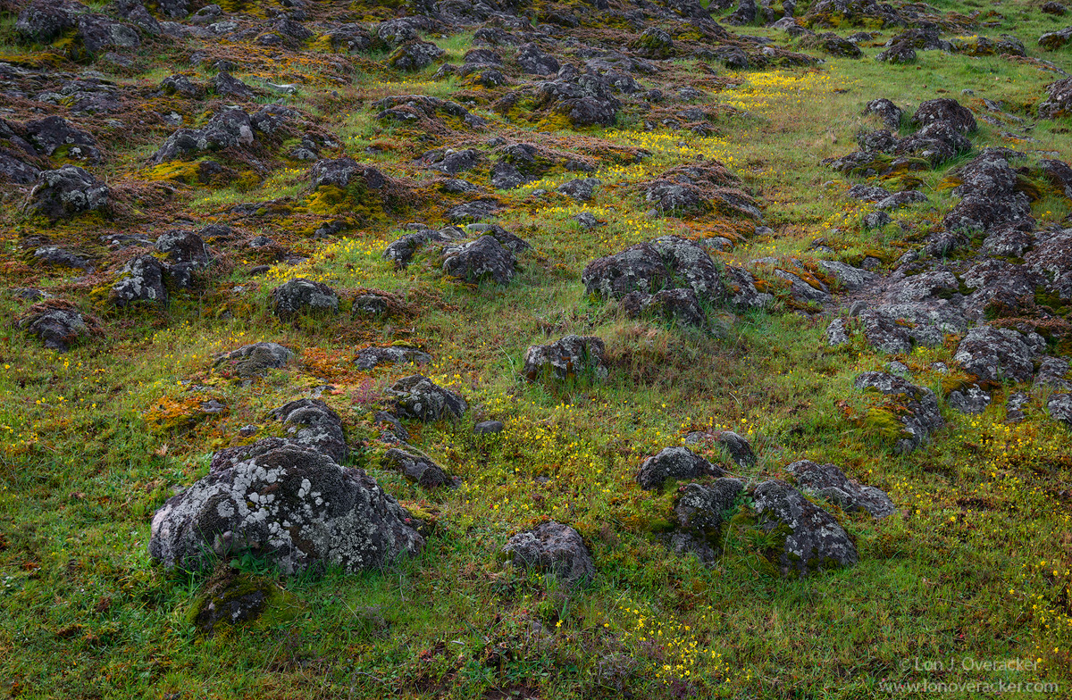
At the risk of being repetitive, I decided to post my version of this scene that Preston and I photographed together.

While thinking for a title for this, the concept of time came to mind.  The rock being old, even ancient and the grasses and flowers, but a blink of an eye as far as time goes.  One fleeting, the other rather permanent.  I suppose the rock (basalt?) could be hundreds of thousands, or millions of years old, but perhaps only exposed thousands of years ago.  The grasses and little wild flowers, perhaps only weeks or months old, that will have a life span of only another couple of months...  A contrast in time.

In processing, I try to keep things believable and natural, yet squeeze all I can from them.  I've significantly reduced the blue/cyan in the rocks/lichen, and boosted the reds a little. All the while keeping the greens from going neon.

Would love your thoughts and critique on this. As always, thanks for your previous comments as well.

This is a 4-image focus stack.

Thanks!
Lon

Comments

9 comments
Comment posted by Preston Birdwell on March 26, 2017 at 5:46 PM
This worked out nicely, Lon. It could be me, but this feels just a tad on the dark side. The color and overall processing look great. I like the boulders and the swaths of flowers.
--P
Registered on November 1, 2003, 471 Posts, 5188 Comments
Comment posted by Floyd Hopper on March 26, 2017 at 6:23 PM
I like composition. On my monitor the scene looks a little dark. Re: Reds. For my personal taste,I would back-off on the reds.  I'm a saturation "nut", so I would boost just little in the greenss-yelows,
Registered on May 1, 2009, 652 Posts, 762 Comments
Comment posted by Harley Goldman on March 26, 2017 at 8:46 PM
This did turn out nice. The saturation looks good to me. Does look a bit dark and maybe could use a slight contrast boost (luminosity)?
Registered on November 19, 2003, 586 Posts, 11271 Comments
Comment posted by scott lanz on March 26, 2017 at 9:25 PM
Another fine take on this rock filled meadow, Lon. Seems like you could almost point your camera anywhere and get a nice shot of this meadow, but I like how you placed the large rock in the LLC to anchor the image, and I like the overall balance. The colors look spot on to me. 
Registered on November 14, 2003, 840 Posts, 12902 Comments
Comment posted by Bill Chambers on March 27, 2017 at 10:19 AM
I like this a lot Lon; much more than your previous version of what I assume is the same rock field.  I like the  horizontal composition and the scattering of the rocks.  I think a little bit of judicious burning and dodging might make it have more impact, but I'm not sure it really needs more impact.  This is very enjoyable to view,  Well done.
Registered on April 10, 2005, 753 Posts, 21216 Comments
Comment posted by David Schoen on March 27, 2017 at 7:48 PM
A nice texture study.  I do agree that it's a little dark.  But there are some very nice tonal qualities between the flowers and the boulders.  Nicely seen.
Registered on November 6, 2006, 1213 Posts, 4587 Comments
Comment posted by Rudy Ruberti on March 28, 2017 at 11:20 PM
The processing looks pretty good to me and I like how the yellow patches of flowers lead me through the scene.  Can't tell the rock type with all the lichen but it's probably more on the order of 10's of millions. 
Registered on October 28, 2008, 179 Posts, 1875 Comments
Comment posted by John Williams on March 29, 2017 at 9:58 AM
I appreciate the borderline abstract this scene has, and the smattering of flowers adds a nice sprinkle. Your title and image together do tell an interesting story. Processing looks like you checked those boxes nicely.
Registered on September 6, 2007, 221 Posts, 5985 Comments
Comment posted by Dave Dillemuth on March 29, 2017 at 11:51 AM
This is excellent, Lon. Nicely framed and has a very rich and intricate look. It is quite saturated but in a beautiful and artistic way. Processing looks good to me.
Registered on December 10, 2015, 104 Posts, 1112 Comments