Nature Photographers Network
This is the preserved archive of the original Nature Photographers Network. The community continues at naturephotographers.network.
Dancers from the Underworld
‹ PreviousLandscape GalleryNext ›

Dancers from the Underworld

by Igor Doncov

Gallery: LandscapePosted April 24, 20179,070 views13 comments
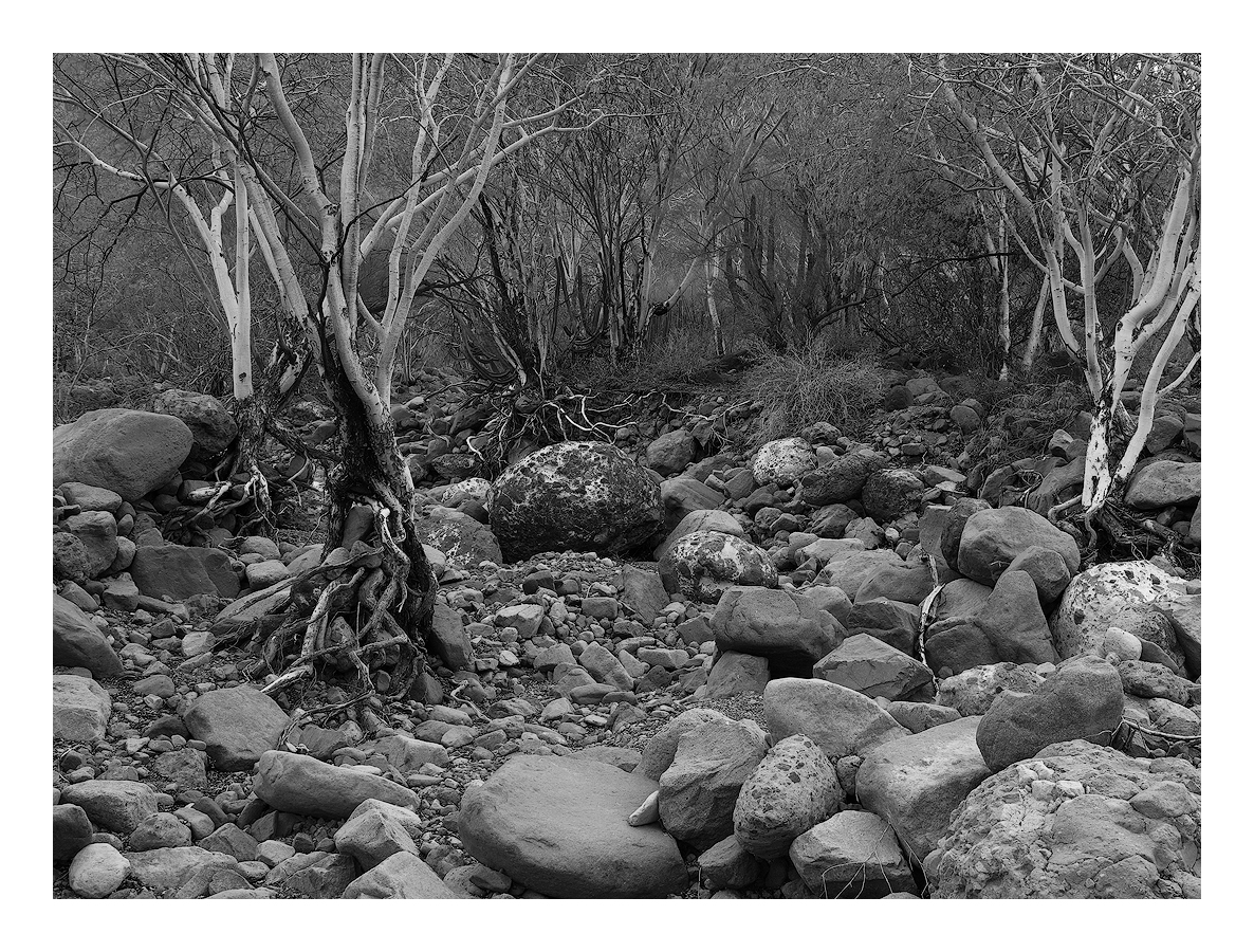
I shot this dry riverbed about a year ago in southern baja california. It drew my attention as I crossed it on a dirt road heading south. I was drawn to it by the lines and shapes of the scene that I found hauntingly attractive. It was shot during low light conditions and the colors seemed meaningless so I just removed them altogether.

Canon 6D, 24-105mm@40mm, f/19, 0.5sec, ISO 100, TK sharpening, tripod

Not very popular with my friends so I haven't posted it here but today I stumbled across it and it suddenly spoke to me as it had that evening. Hope you like it.

Comments

13 comments
Comment posted by Harley Goldman on April 24, 2017 at 1:36 PM
I like this a lot, it is my kind of image. The boulders provide a very appealing foreground and I like the way the creek kind of fades away toward the back. Real nice depth to the image, too.  It would be nice if the trees on the right were not cutoff, but only you know what lurked out there. It is by no means an image killer for me, just a woulda been kinda nice. Very nice work!
Registered on November 19, 2003, 586 Posts, 11271 Comments
Comment posted by Alberto Patiño on April 24, 2017 at 1:40 PM
This is truly beautiful, Igor. The B&W processing "makes" the image - I suspect it wouldn't be this strong in color. I see Harley's point about the trees, but they don't really bother me - you HAVE to cut the image somewhere...enlightened Great work!!!
Registered on December 2, 2014, 278 Posts, 1736 Comments
Comment posted by Dan Kearl on April 24, 2017 at 3:05 PM
You have a lot of depth here, a lot to look at.
my only suggestion might be to burn the bright areas of the boulders a bit to make those
excellent white trunks pop a bit more....
Registered on September 2, 2013, 209 Posts, 1514 Comments
Comment posted by Reno DiTullio on April 24, 2017 at 4:03 PM
The BW conversion is gorgeous, the image has a full range of tones, excellent.
Registered on November 14, 2003, 130 Posts, 1644 Comments
Comment posted by Ed Williams on April 24, 2017 at 8:15 PM
This is great in B&W Igor. It has a kind of eerie feeling to it. The more I look, the deeper it draws me into those trees in the murky BG. I love it! I think where you have cropped it almost creates a hole or canopy leading into the upper right BG. I know this is really weird, but I almost like the smaller version better than the more detailed larger version.
Registered on December 28, 2010, 636 Posts, 3499 Comments
Comment posted by scott lanz on April 24, 2017 at 9:11 PM
I like this a lot, Igor. Very graphic, particularly because of the intricate tree roots and shape of the trees. Processing looks good to me with fine tones. 
Registered on November 14, 2003, 840 Posts, 12902 Comments
Comment posted by Peter Richter on April 25, 2017 at 6:34 AM
A very interesting and appealing mixture of elements to me, Igor. Your composition really invites me to follow into the depth of the scene. The b&w conversion is consistent with the atmosphere to my eye.

Peter
Registered on November 10, 2010, 218 Posts, 2723 Comments
Comment posted by Bill Chambers on April 25, 2017 at 1:33 PM
I love your choice of B&W as well as your actual conversion.  Excellent work there.  I really like the image too, but have a couple of tings that are bothering me.  My issues would be solved had you simply stepped back about 2 steps (may not have been possible).  I would really like to see more room at the bottom of the image; the middle rock being cut off  just jumped out at me for whatever reason, and I also wish there was a bit more room on the right side of the image as well.
Registered on April 10, 2005, 753 Posts, 21216 Comments
Comment posted by Igor Doncov on April 25, 2017 at 5:45 PM
I'm posting the uncropped original to show how I initially saw this image and composed it. I set up the tripod on one of the large fg boulders so there wasn't that much room to maneuver. My initial thought was to get a representation of the gully with all the trees, boulders, and roots. As I worked on this I became more interested with the roots themselves because they seemed to have a personality of their own. I reworked the image to make them more dominant. I also lowered the exposure a tad to fit the mood as I saw it. 
Registered on November 22, 2014, 189 Posts, 2733 Comments
Comment posted by Harry Lichtman on April 25, 2017 at 6:43 PM
Great title, i can see the dancing trees.   The barren roots of the trees definitely set the tone for the image.  looks like some serious erosion took place here.  I can see how the stark shapes caught your eye, and the BW version works very well here.  I was similarly drawn to burned beech trees when in Patagonia. Nice tonal range represented.
Registered on September 17, 2010, 304 Posts, 3507 Comments
Comment posted by gary phillips on April 26, 2017 at 2:37 AM
I'm glad you posted the uncropped version.  I can also see why you were drawn to the roots, my favorite part of the image for sure.  I think I like the uncropped image because of the more open feel.  Developing that version would require some intricate cloning of the bright sky on the right.  I really like how, despite the rugged nature of the wash, the image invites the viewer in for further exploration.  There are also a couple of bright eye grabbers that I would burn. One on the first tree on the left, right where the roots join the trunk and the bright edge of the little rock front and center.  Really well seen.
Registered on October 24, 2013, 185 Posts, 4136 Comments
Comment posted by Lon Overacker on April 30, 2017 at 1:22 PM
Excellent b&w Igor.  The depth here is apparent as it's easy for the viewer to get pulled in to this comp; which allows them to explore the roots you're interested in.

I appreciate seeing the original.  I  prefer the cropped version. Not so much because of the sky, but I think because the cropped version seems to have more purpose. The original just more of a picture. If that makes sense.

Nice job on the processing too (cropped original)

Lon
Registered on November 24, 2006, 521 Posts, 19147 Comments
Comment posted by John Williams on May 7, 2017 at 11:43 PM
Love the title too Igor, and definitely well done on the crop. I too love the roots here, and works well with the BW treatment.
Registered on September 6, 2007, 221 Posts, 5985 Comments