Nature Photographers Network
This is the preserved archive of the original Nature Photographers Network. The community continues at naturephotographers.network.
Celebration + redo
‹ PreviousFlora GalleryNext ›

Celebration + redo

by Barbara Graham

Gallery: FloraPosted May 8, 2017228 views8 comments
My yard
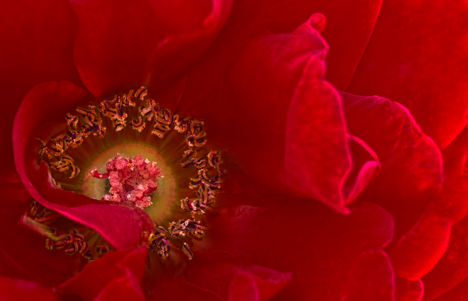
5/8/2017 – 2:24:29 PM (rose was in light shade)
Canon EOS 7D Tamron 90mm macro lens
1/60 sec;   f/14;   ISO 1600
Manual;   Evaluative metering
LR5, PS6.  My main goal was to get all of the center in focus.  Since roses aren't flat, I knew that there would be bits and pieces in focus and parts not in focus.  I used moderate Topaz DeNoise on the flower but not the center, Topaz Details once on everything, again on the center.  I used light Curves on everything and Curves again on the center parts. 

Looking at all the beautiful springtime colors on this page, I know this red is not going to fit in at all.  frown

Any feedback would be greatly appreciated.  Thank you!

Comments

8 comments
Comment posted by scott lanz on May 8, 2017 at 9:41 PM
I like the off center comp, the gem like center, and the beautiful red color, Barbara. I also like the curving petal over part of the center. Dazzling. 
Registered on November 14, 2003, 840 Posts, 12902 Comments
Comment posted by Giuseppe Guadagno on May 10, 2017 at 10:32 AM
Barbara I disagree with you: the red is splendid. I think that your purpose is achieved about the center. I love the photo.
Registered on February 3, 2007, 827 Posts, 5052 Comments
Comment posted by Nathan Buck on May 10, 2017 at 7:59 PM
Hi Barbara.

I love the ruffles, the rich color, and the details in the center.  To me, the photo looks a little bit over-sharpened overall.  That's my only nit though.  Great photo!

Nathan
Registered on November 1, 2003, 1101 Posts, 13589 Comments
Comment posted by Philip Hodgkins on May 11, 2017 at 10:32 AM
The colors are gorgeous! Red and yellow are demons to get right. I think you have made your objective, even exceeded it. This is well composed, with what looks like correct colors. On the downhill side, It does look over sharpened. I attribute this to Topaz Detail. I've found through a LOT of experimentation and critiques that a little bit goes a long way. The same goes for DeNoise. better to put up with some modest noise than to go all the way and wind up looking plastic. I use both quite often, with one hand and eye on the fade button. It's like sailing: let the sail out until it "luffs", then pull it in to the point it finally tautens up.
Registered on July 24, 2006, 2741 Posts, 12349 Comments
Comment posted by Kathy Snead on May 11, 2017 at 11:05 AM
Barbara

This red color is gorgeous.  I like how you have emphasized certain areas of the flower.  Very nice
Registered on April 6, 2017, 104 Posts, 397 Comments
Comment posted by Barbara Graham on May 11, 2017 at 12:49 PM
Thank you for the feedback, everyone.  I am going to do a less sharpened redo, but I won't have time to do anything for a few days.  But I'll post it here when I do.
Registered on July 27, 2010, 1310 Posts, 5035 Comments
Comment posted by Bill Fach on May 11, 2017 at 6:37 PM
Barbara: Terrific rendering of the red and a very fine comp and final result. 2 thumbs up! >=))>
Registered on November 1, 2003, 1805 Posts, 26981 Comments
Comment posted by Barbara Graham on May 11, 2017 at 6:42 PM
Thanks, Bill and everyone.  I decided to take a work break and do this.  A couple of you thought it was oversharpened, and I'm not sure, and I'm not sure which of these I will like the best, but here is a less sharp redo for anyone who likes this better.
Registered on July 27, 2010, 1310 Posts, 5035 Comments