Gallery: FloraPosted May 19, 2017237 views9 comments
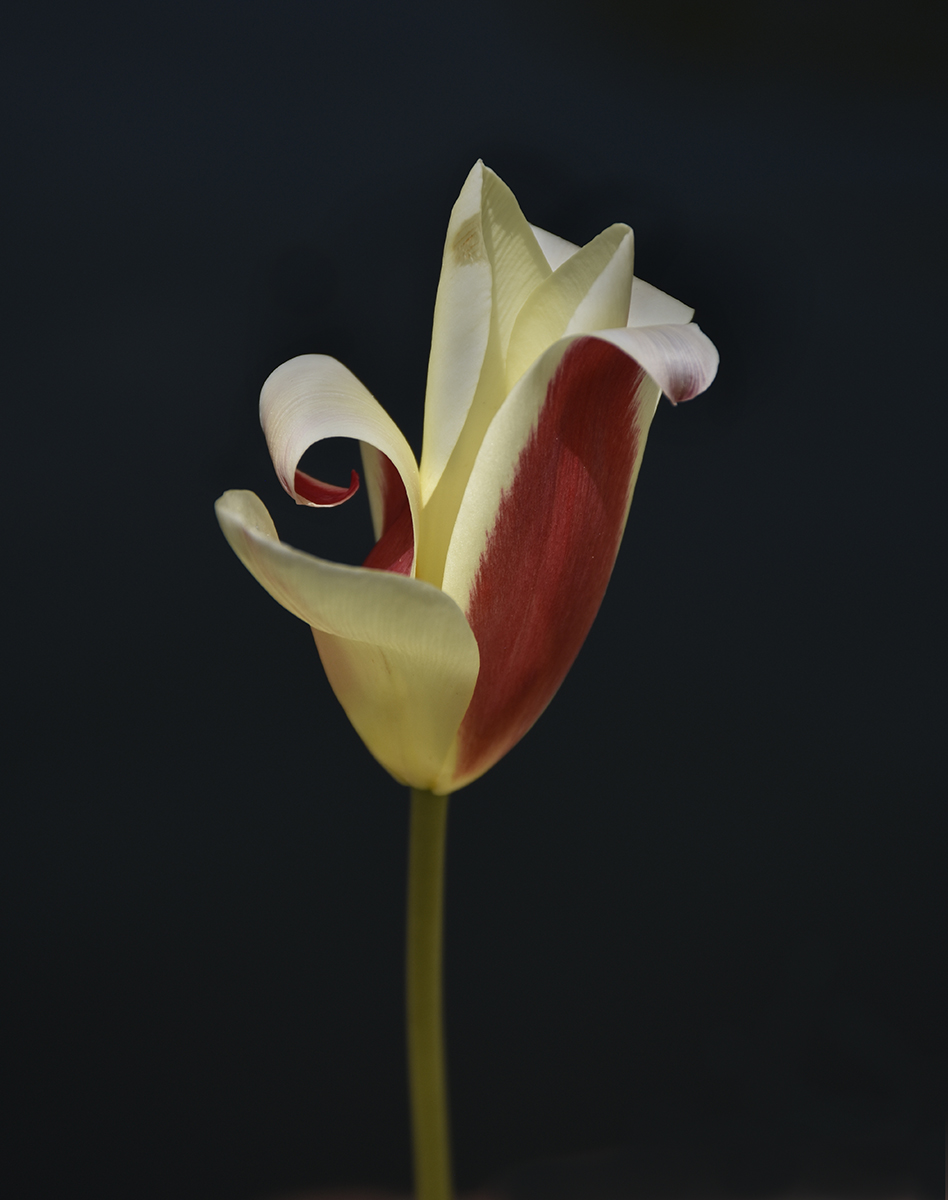
This is a recent photo at Chicago Botanic Garden. bg is the water in the lily pond, cropped container edge.
D7200, 18-140 @ 122, f11, 1/320, ISO 320
All comments and critiques appreciated. I'm here to learn.
Comments
9 comments
Comment posted by Allen Brooks on May 19, 2017 at 11:41 AM
I like the composition with the dark background and various patterns in the flower. I wonder how it would look with the foreground part of the flower a bit brighter?
Registered on July 27, 2011, 262 Posts, 2597 Comments
Comment posted by Lucy VanSwearingen on May 19, 2017 at 6:52 PM
Very nice look at this flower.
Along the lines of Allen's comment, you could brighten just a bit and make the BG deep black to achieve a nice crisp effect. This would, also, get rid of the light pinkish white area at the bottom.
Plus, don't forget to sign your work...it deserves your signature!
Registered on May 23, 2009, 800 Posts, 2042 Comments
Comment posted by Floyd Hopper on May 19, 2017 at 7:53 PM
Very nice and well presented. I do agree with Lucy's comment.
Registered on May 1, 2009, 652 Posts, 762 Comments
Comment posted by Dan Schwartz on May 20, 2017 at 10:44 AM
Thank you for your comments. It's hard to see sometimes in your own images.
How's this one?
Registered on September 29, 2016, 23 Posts, 97 Comments
Comment posted by Barbara Graham on May 20, 2017 at 3:41 PM
Dan I really like the repost. I think it's really nice. One other thing you could try if you want to is to clone out the dark spot (made by water?) at the top left of the flower.
Registered on July 27, 2010, 1310 Posts, 5035 Comments
Comment posted by Dan Schwartz on May 22, 2017 at 9:47 AM
I had looked at that spot and left it.
Here it is a little brighter and without that spot.
Registered on September 29, 2016, 23 Posts, 97 Comments
Comment posted by Philip Hodgkins on May 23, 2017 at 1:57 PM
Dan, I can see adding brightness only to the flower and stem. I can see two alternatives to the BG; either bringing it to total black or dropping the black border. I like the latter; I am fond of the small bit of pink at the bottom. Not only would it lessen the impact of the bottom, but the flower stalk would end at the bottom instead of mid-air.
I looked at your reposts in the midst of writing this. I like the last one best, although I wish you had left the pink.
Registered on July 24, 2006, 2741 Posts, 12349 Comments
Comment posted by Barbara Graham on May 23, 2017 at 7:09 PM
The last repost is wonderful, so elegant.
Registered on July 27, 2010, 1310 Posts, 5035 Comments
Comment posted by Albert Darmo on May 28, 2017 at 8:48 PM
Hi Dan I too like the last version the best. you captured the color and the lines of the lily beautifully
Albert Darmo
Canada
Registered on November 25, 2008, 1386 Posts, 11978 Comments

Comments
9 commentsAlong the lines of Allen's comment, you could brighten just a bit and make the BG deep black to achieve a nice crisp effect. This would, also, get rid of the light pinkish white area at the bottom.
Plus, don't forget to sign your work...it deserves your signature!
How's this one?
Here it is a little brighter and without that spot.
I looked at your reposts in the midst of writing this. I like the last one best, although I wish you had left the pink.
Albert Darmo
Canada