Nature Photographers Network
This is the preserved archive of the original Nature Photographers Network. The community continues at naturephotographers.network.
Morning Kiss
‹ PreviousLandscape GalleryNext ›

Morning Kiss

by gary phillips

Gallery: LandscapePosted June 26, 20176,435 views13 comments
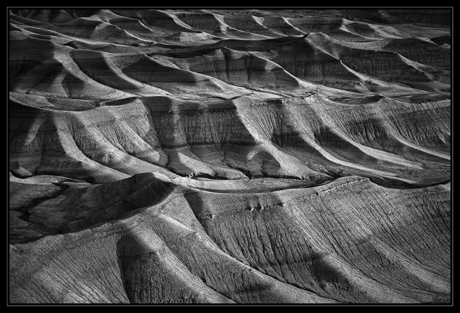
The graphic nature of these badlands is fascinating to me.  This is a tighter shot  of my last post.  It was hard to decide which one to post first.  I like them both.

iso 100, 24-105 @ 80mm, f/11, 1/6s

Better large.

Your comments and critiques are greatly appreciated and very helpful.

Comments

13 comments
Comment posted by Harley Goldman on June 26, 2017 at 10:42 AM
Both work very well. I have no preference between them, different look and feel to each.  Fascinating terrain. 
Registered on November 19, 2003, 586 Posts, 11271 Comments
Comment posted by Craig Moreau on June 26, 2017 at 12:58 PM
Gary, I like them both as well, but I like this one a bit more, because it feels even more abstract and otherworldly.
Registered on April 21, 2015, 64 Posts, 584 Comments
Comment posted by Mark Seaver on June 26, 2017 at 1:30 PM
This is wonderfully graphic and dramatic, Gary.  The two view are very different it terms of the feelings generated in this viewer.  As someone who thoroughly enjoys abstracts, I prefer this view because of the added level of abstraction due to only including the repeating shapes.  This will make a wonderful large print.
Registered on January 23, 2011, 1103 Posts, 17270 Comments
Comment posted by scott lanz on June 26, 2017 at 5:55 PM
I am glad you posted, Gary. I was going to make the comment to your last post that a closer image featuring just these formations would work as a more abstract image, so it's good to be able to go to your gallery and see these side by side.  Having done that, they both have merit, but.contrary to Mark, I think I prefer the less abstraction and more vairety of the previous image. 
Registered on November 14, 2003, 840 Posts, 12902 Comments
Comment posted by Alberto Patiño on June 26, 2017 at 8:22 PM
Gary, I think that I prefer this one, by a small margin, simply because the fine detail is even more striking than in the first one.
Registered on December 2, 2014, 278 Posts, 1736 Comments
Comment posted by John Williams on June 26, 2017 at 11:03 PM
My pick is strongly for this one Gary. I love the loss of scale; it has a more open-ended and timeless feel for me. Well done!
Registered on September 6, 2007, 221 Posts, 5985 Comments
Comment posted by Richard Teller on June 27, 2017 at 11:19 AM
Very interesting repeating patterns, textures and light. I like the image. 
Registered on August 23, 2010, 1162 Posts, 6692 Comments
Comment posted by Bill Leggett on June 27, 2017 at 3:28 PM
Both are quite good, Gary. I suggested a downward crop on the last, and looks like you found a sweet spot. Well done as usual enlightened
Registered on July 21, 2004, 706 Posts, 3233 Comments
Comment posted by Wayne Jones on June 27, 2017 at 4:24 PM
Man, these images really make me want to go there!  Of course, part of that feeling is generated by your mastery of the monochrome, as well as the attraction of the landscape itself.  Both images are outstanding, but for my taste, this one zeros in on the essence of the the earth in this place.  If I had not scene it, I would still enjoy the slightly wider view, but I tend to either want to see the grand landscape, or get into a more intimate view.  This one is just a little more on the intimate end.
Registered on April 18, 2007, 953 Posts, 6435 Comments
Comment posted by Ed Lowe on June 28, 2017 at 6:00 PM
Your B&W's are always exquisite, Gary. While I thoroughly enjoy both, I slightly prefer this one as it is a bit more abstract while still retaining the essence of this otherworldly landscape. Great work.

Ed
Registered on February 7, 2004, 414 Posts, 7115 Comments
Comment posted by Paul Breitkreuz on June 29, 2017 at 11:30 AM
Just super, Gary......love the ongoing "undulation" of the terrain. Reminds me of looking out of a porthole and seeing ocean wave peaks..(effective enough to almost feel the motion)....laugh
Registered on February 25, 2006, 525 Posts, 8448 Comments
Comment posted by Igor Hoveijn on June 30, 2017 at 4:21 PM
Your landscape B+W's always impress me. But if I have to choose between this one and the wider view I prefer this tighter, more abstract version. It has more cohesion (if that is the right word). Beautiful tonal range.
Registered on November 2, 2015, 18 Posts, 192 Comments
Comment posted by Tony Kuyper on June 30, 2017 at 10:42 PM
Definitely some interesting patterns here.  I think I like the wider view a bit better.
Registered on November 1, 2003, 364 Posts, 22328 Comments