Nature Photographers Network
This is the preserved archive of the original Nature Photographers Network. The community continues at naturephotographers.network.
Sandstone Revisited #5
‹ PreviousLandscape GalleryNext ›

Sandstone Revisited #5

by Tony Kuyper

Gallery: LandscapePosted June 30, 20172,571 views13 comments
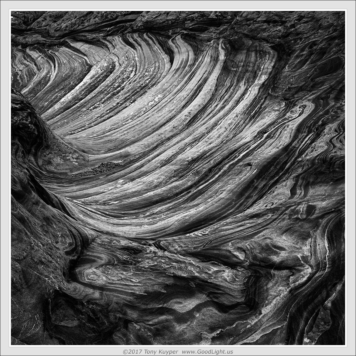
Hang in there.  I'm getting close to done with these sandstone abstracts.  Sort of just experimenting with monochrome here.  The colors weren't quite working for me, but I liked the shapes and textures.  I don't consider this a particularly strong image but it was instructive to see what I could do with burning/dodging.  Please let me know if you have any thoughts.

 

Comments

13 comments
Comment posted by Dan Kearl on June 30, 2017 at 11:15 PM
I am not really an abstract person generally, but this is exceptional...
Just draws me right in.
Registered on September 2, 2013, 209 Posts, 1514 Comments
Comment posted by Igor Doncov on July 1, 2017 at 1:28 AM
This could be the best image I've seen from you. And I've been here for a number of years. I should probably go through your gallery before making that statement. It's hard for me to say what makes a good abstract. But I know one when I see one. This is really exceptional.
Registered on November 22, 2014, 189 Posts, 2733 Comments
Comment posted by gary phillips on July 1, 2017 at 3:25 AM
I like the way your mind works, Tony.  This is excellent.  There is a wave like formation in S. Nevada that is very similar and I have photographed it several times and yet have nothing even approaching this good.  Nice.
Registered on October 24, 2013, 185 Posts, 4136 Comments
Comment posted by Paul Breitkreuz on July 1, 2017 at 11:29 AM
Tony, wonderful work on this one. As you specialize in very colorful sandstone overall this B&W version is exceptional. This abstract works well with regard to drawing ones eyes toward the back of the scene, or visa versa depending upon your eye to brain perspective. The immediate FG has a molten or slight lava flow look too. Nice work.....laugh
Registered on February 25, 2006, 525 Posts, 8448 Comments
Comment posted by Harry Lichtman on July 1, 2017 at 6:25 PM
I like this abstract. Reminds me of some cooled lava images I took in Hawaii years ago. The image has a nice flow to it, looks primarily due to the tones in the color image vs. shadows. A cornucopia look to it. Just feels a little tight on left and top, though I'm sure you have reason for the chosen crop.
Registered on September 17, 2010, 304 Posts, 3507 Comments
Comment posted by scott lanz on July 2, 2017 at 9:42 AM
Fascinating abstract, Tony. Very cool!
Registered on November 14, 2003, 840 Posts, 12902 Comments
Comment posted by Richard Teller on July 2, 2017 at 6:27 PM
This looks very much like an abstract pen and ink drawing. The B&W works well with this image. Nicely seen and photographed. 
Registered on August 23, 2010, 1162 Posts, 6692 Comments
Comment posted by Jim Gavin on July 2, 2017 at 9:32 PM
While you may feel you should be about finished with sandstone abstracts, I think you should just keep them coming. If not for the title I would have thought this to be a lava flow. While this is an excellent image, I like the others better. Not sure why, but it doesn't, for me, carry the same initial impact as the others (especially no. 4). I don't think it is color vs. B/W. Just something I cannot quite explain.
Registered on August 14, 2008, 293 Posts, 1250 Comments
Comment posted by Brian Schrayer on July 2, 2017 at 11:06 PM
I have visited this a few times before posting a comment.  I like the flow of the sandstone flow which sort of arcs from the bottom of the frame to the upper left hand corner.  The repeating patterns and textures work well to add depth to the image as well.  I do think that in general I prefer your color work for the sandstone abstracts although the strong contrast makes this work. 
Registered on May 28, 2004, 114 Posts, 2890 Comments
Comment posted by Michael Lowe on July 3, 2017 at 12:10 PM
Mu initial impression was of a cooled lava flow. Exceptional image. Hangs in there with some of your best color work.
Registered on February 11, 2004, 777 Posts, 5252 Comments
Comment posted by Prashant Khapane on July 3, 2017 at 5:28 PM
Tony - you are known for your color work and the revolution your masks brought to the digital darkroom. However this is one of your best...
Registered on November 1, 2003, 492 Posts, 4580 Comments
Comment posted by Kathy Barnhart on July 4, 2017 at 1:22 PM
Have to add my own appreciation for this abstract. Really dynamic and striking. I'm curious that you did this with burning/dodging, not with TK luminosity masks!
Registered on November 11, 2011, 404 Posts, 1639 Comments
Comment posted by Craig Moreau on July 5, 2017 at 9:29 AM
Tony, this is a very powerful abstract. I love it. Very different from your color work, but equally as impactful, I would say. Great work!
There is a bright spot of rock right on the edge in the ULC that I might clone out, but not a big deal.
Registered on April 21, 2015, 64 Posts, 584 Comments