Gallery: FloraPosted July 6, 20171,013 views8 comments
D200
100 ISO
30th @f 5.6
Printed BG
5 Stacks in CZM
Paint shop pro
Thanks for looking
JohnR
Comments
8 comments
Comment posted by Giuseppe Guadagno on July 6, 2017 at 5:25 PM
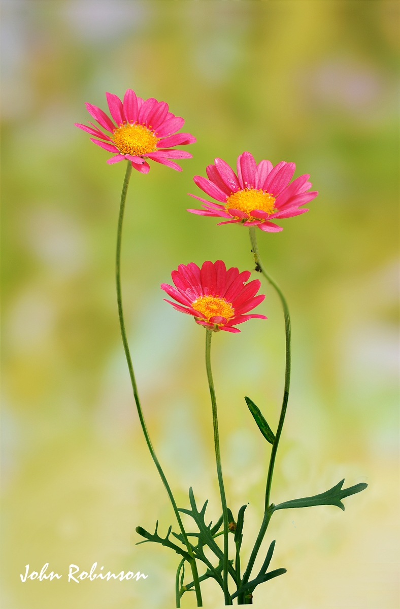
Plenty of light, low contrasts, sharp and soft at the same time: there is all for a pictorial photo with pastel like colors; or almost all: have you tried to low the color saturation? Just for a try John. Anyway I love the photo as it is.
Registered on February 3, 2007, 827 Posts, 5052 Comments
Comment posted by Dennis Plank on July 6, 2017 at 7:44 PM
A lovely composition, John, and you have a sweet bg. Listening to Gigi, I think he may have a good idea with trying a lower saturation, though I'd have to see it. I'm not sure what's going on, but there is one isolated green dot just above a leaf between the center and right flower stems.
Registered on January 28, 2008, 1767 Posts, 23192 Comments
Comment posted by Philip Hodgkins on July 6, 2017 at 8:52 PM
I also think Gigi has a good idea. I had to hunt for Dennis' green dot, though! I would pull back the yellow and green and possibly up the luminance of both, protecting the yellow centers of the flowers. Worth a try.
Registered on July 24, 2006, 2741 Posts, 12349 Comments
Comment posted by Jim Zablotny on July 6, 2017 at 9:37 PM
Hi John,
I agree with everyone's suggestions. Nevertheless, a nice comp............................Jim
Registered on January 17, 2004, 705 Posts, 3594 Comments
Comment posted by John Robinson on July 7, 2017 at 7:47 AM
Thanks people.
Dot removed(no idea what it was) and saturation dropped -10
Thanks for looking
JohnR
Registered on March 2, 2008, 535 Posts, 2453 Comments
Comment posted by Giuseppe Guadagno on July 7, 2017 at 9:59 AM
Hi John, for me flowers and background look better (of course!).
Registered on February 3, 2007, 827 Posts, 5052 Comments
Comment posted by Dennis Plank on July 7, 2017 at 6:49 PM
Hi John: I do think the repost comes across better. Which is truer to life probably depends on the light they're viewed under. Excellent work regardless of which version.
Registered on January 28, 2008, 1767 Posts, 23192 Comments
Comment posted by Albert Darmo on July 7, 2017 at 8:56 PM
Hi John Perfectly composed with beautiful light and color the repost is even better with the lowered saturation
Albert Darmo
Canada
Registered on November 25, 2008, 1386 Posts, 11978 Comments

Comments
8 commentsI agree with everyone's suggestions. Nevertheless, a nice comp............................Jim
Dot removed(no idea what it was) and saturation dropped -10
Thanks for looking
JohnR
Albert Darmo
Canada