I want to start by saying a big "Thank you" to everyone who has commented on my images through the years.

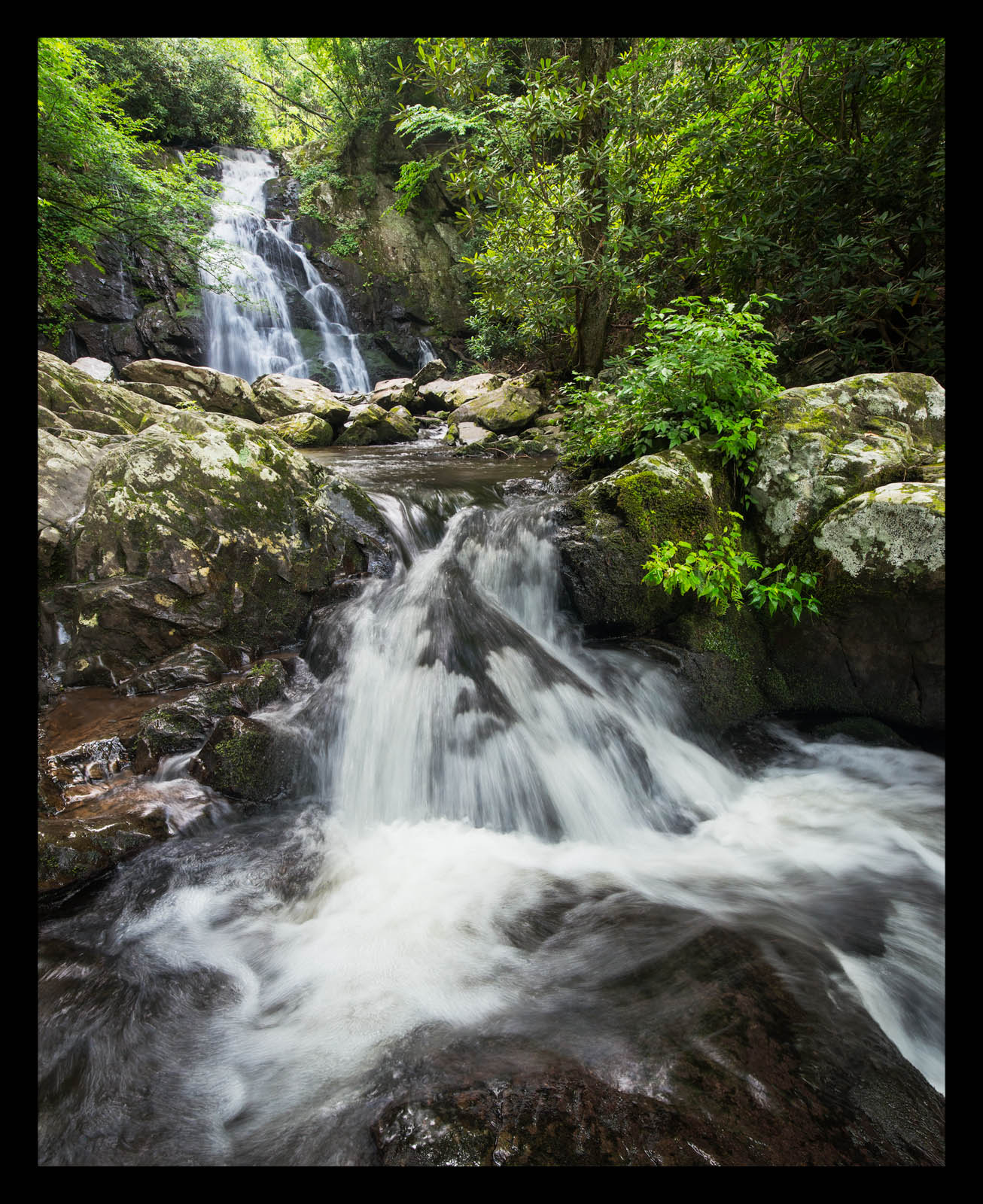
This image is in many ways a testimony to the value of the critiques here on NPN. Some of you may recognize this from a previous version that I took from this location a few years ago.
Here is a link to the previous version:
http://www.naturephotographers.net/imagecritique/ic.cgi?a=vp&pr=222991&CGISESSID=0f2d19b8c27a5ce66aca8a062142a0bf&u=19405&title_action=
I have re-visited this spot a few times since my original post taking the critiques into account from the original version. However, the water flow hasn't been quite what I was looking for in my previous attempts. This time, everything came together. In order to retain texture in the water I had to capture two different exposures and blend them together in Photoshop. This ended up being a lot easier than I expected and I am pleased with the results.
This is one of my favorite places to visit in the Smokies. After I finished shooting I lingered in this spot for several minutes. Sometimes I get caught up in photography that I forget to enjoy the moment. I made sure on this day to take some time to set the camera aside and just enjoy the beauty and the sound of the water. It was also my birthday and it was a fitting birthday present!
As always all comments and critiques are welcome!

Capture Info:
Base Exposure: 15mm, f/16, 1/3 sec, ISO 400 (because I was concerned about movement in the foliage)
Water Exposure: 15 mm, f/16, 1/20 sec., ISO 1250
Processing Info:
Manual blending of the water
Clone layer to remove a few leaves that still ended up moving (I'm amazed at the healing brush tool in PS!)
Levels adjustment to set the black and white points
Adjustments to mid-tone contrast and selective highlight and shadow contrasts using luminosity masks
Vibrance Mask
Cropped to 4 X 5 aspect ratio

Comments
4 commentsEd
- The color of the rock is much warmer and richer in the previous, maybe a bit bright in this one
- I'm just a sucker for fall foliage, and the bits of color in the previous version add a lot
- The shutter speed in the previous gives a texture I like better, except for in the very foreground pool, it's a little bit featureless (I know this one is 100% subjective)
Some things I prefer in this version:- The slightly wider view is nice, and the composition does more to pull you into the focal points of the falls here
- I like the ridge of rock with the water flowing over in the LRC (maybe this could be an even stronger leading line if it came right from the corner?)
Sounds like a great way to spend your birthday!