Gallery: LandscapePosted August 19, 201712,361 views11 comments
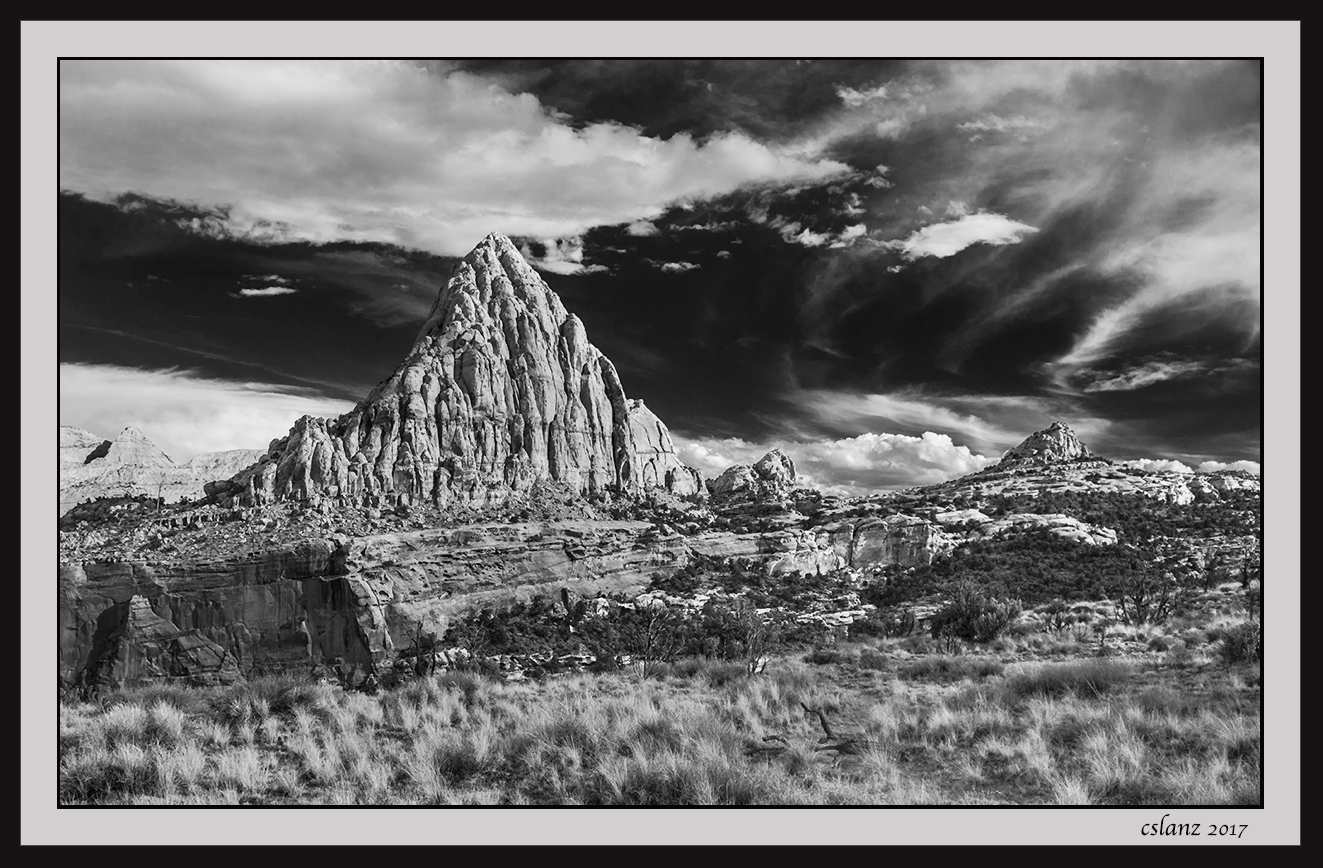
A B&W version of the previous Capitol Reef image. I cropped some off the bottom per suggestions recevied on the color version. Suggestions and other comments welcome, including whether you like the color or BW. Thx.
Comments
11 comments
Comment posted by Preston Birdwell on August 19, 2017 at 6:26 PM
I like both versions, Scott. The B&W has nice drama, and the tones work very well. There is a deep shadow on the peak near the left edge that catches my eye, but other than that minor titem, I thinks this looks great.
--P
Registered on November 1, 2003, 471 Posts, 5188 Comments
Comment posted by Brian Schrayer on August 19, 2017 at 7:56 PM
Scott - I prefer the color version of this scene for the mood. I feel like the B&W is a bit too harsh in contrast. Maybe if you backed off of some of the dark blacks in the blue sky that would help. I would also try to see if you could get more tonal separation betwen the cloud and the background canyon on the left side of the frame.
Registered on May 28, 2004, 114 Posts, 2890 Comments
Comment posted by Jim Zablotny on August 20, 2017 at 7:54 AM
Hi Scott,
Either one works for me. I especially like the sky with detailed clouds in this version......................Jim
Registered on January 17, 2004, 705 Posts, 3594 Comments
Comment posted by Igor Doncov on August 20, 2017 at 12:07 PM
I prefer the b&w version for several reasons. The crop has removed the weakest part of the image, so the composition is stronger. But there is a much stronger sense of emotion in this version than the color, which seemed more literal to me. The color for a travel magazine, the b&w for a gallery. It's likely due to the AA treatment of sky. It's black and the clouds have life. That sky makes everything else stand out and be noticed. I like this quite a bit.
Registered on November 22, 2014, 189 Posts, 2733 Comments
Comment posted by Lon Overacker on August 20, 2017 at 12:29 PM
Scott,
This is interesting because this is one of those images that one can make an argument either way regarding b&w vs. color.
On the one hand, I agree with Igor on the sky/clouds. The AA-like processing of the sky is dramatic and also allows the rocky peak to remain a focal point.
Where I digress and like the color more, is the lower half. The b&w version really doesn't allow for the variety of colors and tones in the landscape; everything runs together and it's hard to distinguish between grass, juniper or soil and rock. For that, I much prefer the color version overall. That "path" that I found inviting in the color version is gone (not only because of the crop, but also for merging of tonalities) and so I don't find the b&w as "inviting" of a landscape.
I'd be curious to see an uncropped b&w version with some of the sliders tweaked to eek out some tonal separation in the landscape. Just my .02
Lon
Registered on November 24, 2006, 521 Posts, 19147 Comments
Comment posted by Igor Doncov on August 20, 2017 at 2:12 PM
P.S. The weakest part of the image are those distant hills behind and left of the large peak. Without color that area is merging tonally with the clouds. I would process it to create separation. It's not a big deal but it's all I can come up with.
Registered on November 22, 2014, 189 Posts, 2733 Comments
Comment posted by Eva McDermott on August 20, 2017 at 6:27 PM
The B&W version is more dramatic for me Scott. The light on the peak / butte is wonderful.
Registered on January 4, 2009, 1015 Posts, 13229 Comments
Comment posted by gary phillips on August 20, 2017 at 6:28 PM
I like this one, Scott. This is a case study for TK's action panel. Massaging each section of the image for tonal separation and dodging/burning the weaker portions. I think you've brought out the drama in the sky, the background peaks, as Igor suggested could use some tweaking. I would also dink around with the grasses in the fore to bring some separation there. Not an easy scene to convert because of the amount of middle grey in the image. Always fun to play around with however.
Registered on October 24, 2013, 185 Posts, 4136 Comments
Comment posted by scott lanz on August 20, 2017 at 7:21 PM
Thank you for comments and suggestions. I agree about the sunlit mountains in the background on the left. I did selective darken them to separate them from the sky, but I will tweak that area more.
Registered on November 14, 2003, 840 Posts, 12902 Comments
Comment posted by Ed Lowe on August 20, 2017 at 10:03 PM
Hard to choose which rendition I like better as both are beautifully done, Scott. I think i will give the color version a slight nod as the FG landscape with the brush resonates better with me. I am not sure why as the large version does seem to have a wide range of tones; more so than the smaller version. Anyway, you can not go wrong with either version.
Ed
Registered on February 7, 2004, 414 Posts, 7115 Comments
Comment posted by Paul Breitkreuz on August 22, 2017 at 8:40 AM
Scott, the crop does make for a very fine change to this scene. The B&W also adds a bit more starkness to the remote area in CRNP. This is quite a formidable structure and works well as the main subject too. I've enjoyed your series from this entire area......nice work.
Registered on February 25, 2006, 525 Posts, 8448 Comments

Comments
11 comments--P
Either one works for me. I especially like the sky with detailed clouds in this version......................Jim
This is interesting because this is one of those images that one can make an argument either way regarding b&w vs. color.
On the one hand, I agree with Igor on the sky/clouds. The AA-like processing of the sky is dramatic and also allows the rocky peak to remain a focal point.
Where I digress and like the color more, is the lower half. The b&w version really doesn't allow for the variety of colors and tones in the landscape; everything runs together and it's hard to distinguish between grass, juniper or soil and rock. For that, I much prefer the color version overall. That "path" that I found inviting in the color version is gone (not only because of the crop, but also for merging of tonalities) and so I don't find the b&w as "inviting" of a landscape.
I'd be curious to see an uncropped b&w version with some of the sliders tweaked to eek out some tonal separation in the landscape. Just my .02
Lon
Ed