Nature Photographers Network
This is the preserved archive of the original Nature Photographers Network. The community continues at naturephotographers.network.
Sliding Seaward #2
‹ PreviousLandscape GalleryNext ›

Sliding Seaward #2

by Preston Birdwell

Gallery: LandscapePosted September 1, 2017208 views9 comments
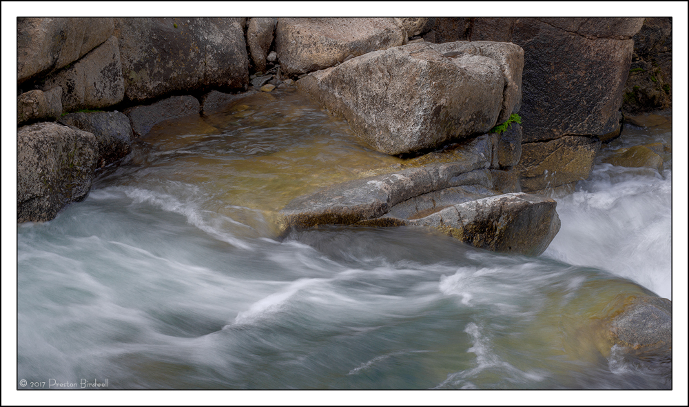
In response to Bill Legget's suggestion for wider view of this section of Deadman's Creek, I found one in my archive and worked it up. This is cropped from the top and the left side.

I would be interested to know which image you prefer. The tighter cropped version is Here.

Nikon D7100
Nikkor 18-140mm @ 55mm
f-22 @ 1/10, ISO 100
TK's V4 Masks

Please see the large version. Thank you!

Your thoughts are always appreciated. cool
--P

Comments

9 comments
Comment posted by Igor Doncov on September 1, 2017 at 3:24 PM
I like this one almost as much as it's predecessor. It has strong compositional elements. It gives us a great sense of the creek as opposed to the nature of the water. The small bit of green adds to it as well. Very nicely done.
Registered on November 22, 2014, 189 Posts, 2733 Comments
Comment posted by Ana on September 1, 2017 at 4:22 PM
It's a tough call.  At first I thought the tighter image is a lot more focused but now I'm changing my mind.  This is an interesting image for me to think about because it's very appealing but it's not so obvious what makes it appealing.  So far the closest guess I have is that it's very harmonious -- the soft tone and color is very consistent between the water and the rock (which I feel is frequently tricky) and the amount that the water is blurred definitely fits in with that.  I can't pinpoint any particular element but the whole hangs together really well.
Registered on February 10, 2004, 191 Posts, 1446 Comments
Comment posted by Lon Overacker on September 1, 2017 at 10:19 PM
Preston,

Loved the simplicity of the previous, the water flow/motion and it's translucence.  This is that, and more!  Perhaps I like the context of the stream - maybe because I was there and this image brings that experience of the location back home?  But I really like the combination of elements as Ana tried to convey; there's just a real comfortable balance all the way around.  And I just noticed the gentle curve of the creek as it flows in from one side and out the other.

Processing is terrfici.  No nits or suggestions.  Kudos - I didn't get nuttin' from here. :-(

Well done sir!

Lon
Registered on November 24, 2006, 521 Posts, 19147 Comments
Comment posted by Bill Leggett on September 2, 2017 at 1:40 PM
Thanks for posting an alternate, Preston. I like the contextual aspect here. Either one works for me.
Registered on July 21, 2004, 706 Posts, 3233 Comments
Comment posted by Harley Goldman on September 2, 2017 at 6:15 PM
I am much preferring this one.  The comp is more coherent to my eye and the processing is far more neutral. Nothing wrong with the other one, just like this one a lot more. 
Registered on November 19, 2003, 586 Posts, 11271 Comments
Comment posted by gary phillips on September 3, 2017 at 3:34 PM
I really liked the first one, but this is an upgrade for sure.   Just enough of the surrounding boulders to add additional context.  Nicely done.
Registered on October 24, 2013, 185 Posts, 4136 Comments
Comment posted by Brian Schrayer on September 3, 2017 at 7:08 PM
I would say that both versions of this image are very strong.  The wide view obviously adds more context to the scene, but I think if I had to choose my preference would be for the more intimate comp because I like the abstract nature of the comp.  I also like the color in the water in that version as well. 
Registered on May 28, 2004, 114 Posts, 2890 Comments
Comment posted by Anil Rao on September 4, 2017 at 1:37 PM
A very delicate and lovely intimate landscape. The soft hues in the flowing water perfectly complement the granite.

You do these so well, Preston.
Registered on November 15, 2003, 234 Posts, 4923 Comments
Comment posted by John Williams on September 4, 2017 at 11:01 PM
Contextually nice Preston, but I miss the colors in the prior version. Maybe they can be brought out a bit more here? A close-up of the water without the granite is a nice abstract too.
Registered on September 6, 2007, 221 Posts, 5985 Comments