Nature Photographers Network
This is the preserved archive of the original Nature Photographers Network. The community continues at naturephotographers.network.
Standing out in a Crowd
‹ PreviousFlora GalleryNext ›

Standing out in a Crowd

by Lon Overacker

Gallery: FloraPosted September 2, 2017842 views13 comments
Greetings Flora!  It's been a long, long while since I posted here and I recently promised I would.

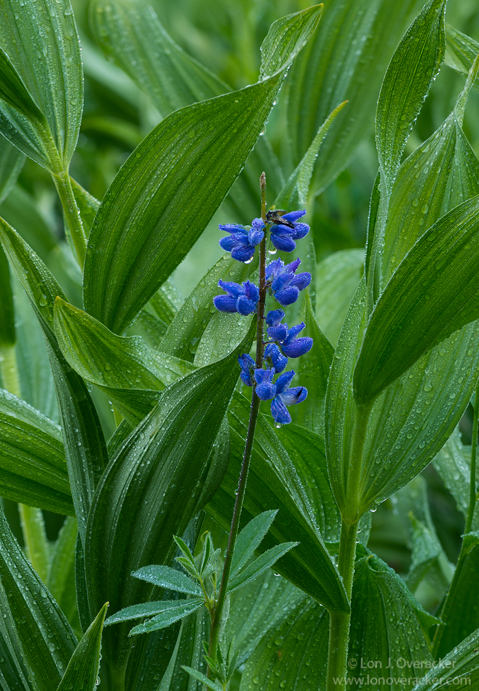
Would love to get your take on these two versions.  I'm posting two because I used two different approaches. Both of course focused on my primary subject, the lone Lupine. 

The first image posted here is a 4-image stack, each at f/11. I was going for detail and depth throughout.  The second image is also a focus stack, but at f/6.3 - one for the top of the lupine pedals and the second for the upper part of the flower. I wanted the flower sharp, but go soft as you go deeper in to the corn lillies.

What do you  think?  Which one do you prefer? works better?  Your thoughts and comments appreciated.

Great images here!

Lon

Comments

13 comments
Comment posted by Lon Overacker on September 2, 2017 at 3:24 PM
Here's the second version, softer bg.  Thanks for any comments!
Registered on November 24, 2006, 521 Posts, 19147 Comments
Comment posted by Barbara Graham on September 2, 2017 at 10:31 PM
Hi, Lon.  For the second image I needed to click on it to get the "smaller larger" version (I still don't know why that is) so that I could get the impact of the full image, so then I went back up and did the same again with the first image.  Having done that, I prefer the second image, because I personally love the sharpness against the softness, and I think the impact of the Lupine is stronger against that softness.  It's a beautiful image either way.
Registered on July 27, 2010, 1310 Posts, 5035 Comments
Comment posted by Paula LeVay on September 2, 2017 at 11:08 PM
Lon, I definitely prefer the first image although the second one is also very nice. To me, the first one seems more three-dimensional and the strong color of the single lupine holds its own against the rich green tones of the corn lilies.
Registered on July 29, 2016, 66 Posts, 270 Comments
Comment posted by Philip Hodgkins on September 2, 2017 at 11:37 PM
One of the main thoughts in planning out stacks is DOF and where to stop and how many images to take. I prefer the first post, in that background is not all that important, but overlap of images is important. With so many curved surfaces, there is greater chance of missed focus with shooting wide open. And in my choice of the first image, you still have an adequate blurred, if miniscule, background. Admittedly you have broadened the subject, but the lupine still commands the primary position.

Anyway, I like both, but I prefer the first as having better balance and maximized detail. The second is just too "loosey goosey".
Registered on July 24, 2006, 2741 Posts, 12349 Comments
Comment posted by Albert Darmo on September 3, 2017 at 12:16 PM
HI  Loncrying  I too prefer  the   first  version.          the soft  BG in the second  version  does not  work   for  me.as  well  as  the first  version..   love  the lines  and color

Albert Darmo
Canada
Registered on November 25, 2008, 1386 Posts, 11978 Comments
Comment posted by Preston Birdwell on September 3, 2017 at 12:20 PM
Lon, I prefer the increased detail and depth in the corn lilies in the first version. I do like the second version because lupine is more front and center. That said, I still vote for the first version because the it shows more detail of the lupine's environment, and the sharp dew drops on the corn lily. The processing and color look very nice, and I like the framing. Well done!
--P
Registered on November 1, 2003, 471 Posts, 5188 Comments
Comment posted by Kathy Snead on September 3, 2017 at 1:13 PM
Lon

This is gorgeous!  I prefer the first one, just nicer overall.

Great Photo!

Kathy
Registered on April 6, 2017, 104 Posts, 397 Comments
Comment posted by Barb Pflaum on September 3, 2017 at 3:00 PM
Both images are lovely, but I prefer the first one because I like the sharpness in the leaves surrounding the lupine and in the water drops.
Registered on January 14, 2009, 316 Posts, 2724 Comments
Comment posted by Jim Zablotny on September 4, 2017 at 5:44 PM
Hi Lon,

I like the first one.  The sharp BG elements funnel my eyes to the flowers.  Colors are nice and rich......................Jim
Registered on January 17, 2004, 705 Posts, 3594 Comments
Comment posted by Paul Breitkreuz on September 10, 2017 at 8:09 PM
WOW, very nice indeed, Lon. I sure missed this one being in the flora gallery. Although both are very fine renditions of this scene and will make very impressive prints, I too would select the first one. Partly could be just being able to take in the full size does help. But again both are super. The water droplets as in many cases add another dimension of the weather conditions at the time of the field photograph process. The scene also has that feeling of freshness as a result of the wetness. The presents of the droplets indicates a bit of where the lush greenery is coming from too.

Congrats on the WP here....... very nice work.......laugh
Registered on February 25, 2006, 525 Posts, 8448 Comments
Comment posted by Giuseppe Guadagno on September 11, 2017 at 5:00 AM
I missed this photo but Jim has told me that I have to look at it. It's true, is a splendid photo. I am out of the row as I prefer the second version. In the first the very nice flower is lost among the sharp leaves that are a lot and deep. For me are the real subject. Well deserved Lon.
Registered on February 3, 2007, 827 Posts, 5052 Comments
Comment posted by Ed Cordes on September 11, 2017 at 8:06 AM
Congratulations on the WP!  I, too, like the first version better.
Registered on November 1, 2003, 451 Posts, 3366 Comments
Comment posted by Lon Overacker on September 11, 2017 at 11:29 AM
Thank  you for the WP!  I should post here more often! cool
Registered on November 24, 2006, 521 Posts, 19147 Comments