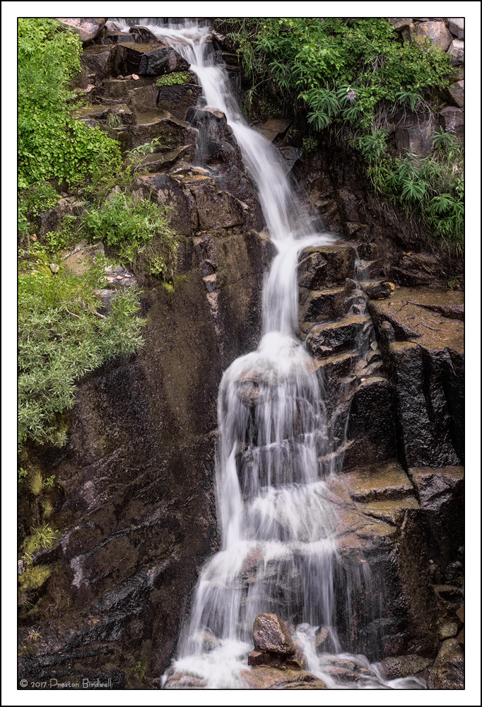
This is a wider view of these falls that Lon and I visited in August. This version is cropped from the original frame.
I had a little trouble taming the high values in the falls, so I would like to know how they look to you.
Nikon D7100
Nikkor 18-140mm @ 30mm
F-16 @1/8, ISO 100
Photo Shop-CC and TK's Masks.
Please see the large version. Thank you!
Thank you for your comments on my recent image! Your thoughts on this one will be appreciated.

--P

Comments
10 commentsAs far as composition I don't feel it's necessary to show the top of the falls. I would crop into it. I might crop the top off just below the big rocks in urc. It would be an improvement but it's not a big deal.
I think you did a great job capturing this top to bottom (actually there's more up top and bottom...) You've also managed the difficult lighting and the time of day was just not right; but fortunately we waited things out a bit and had some puffy clouds roll on by, at least long enough for some exposures like this.
We've chatted about this one, but I'll also agree with Harley that I think you could do some soft cloning techniques to bring back some detail to some of the hot spots in the cascade. Not a huge deal though. Color and detail look great throughout.
And even this, or any of our images from here don't do this spot justice. When you brought me here I was like a little kid in a candy shop. Can't wait to get back there again!
Lon
http://www.naturephotographers.net/imagecritique/ic.cgi?a=vp&pr=245538&CGISESSID=2cbfbb2ef1b42e436fd8a6d99de4c4eb&u=23280&title_action=
The rocks have been darkened and the browns have been enriched. The composition has been chosen in a way that converts the falls into a shrine, an altar. The use of darkness with brighter falls gives a sense of a place of worship. That tells us how the shooter feels about it and how it's qualities impress him. Even if you come up with a different interpretation it still beckons for one because the image is not a literal representation.
I never know when I'm overstepping boundaries and embarrassing a photographer with such comments. I don't know what people think about them because they are never referred to except in this instance. But for me personally, I would welcome such comments, and prefer to give them, more than technical advice (exceeds dynamic range, crop, clone, etc.).
Sometimes an image doesn't have to be manipulated in order to convey a man's feelings.
I liked Igor's crop suggestion, so I cropped a bit from the top. I also made some minor adjustments...
- Used a TK Lights-2 mask to re-work the cascades, deepening the lower values and reducing the high values.
- Used Harley's 15% cloning technique on the hot spot in the water near center to add a little texture.
- Burned down a couple of rocks at the top.
- Adjusted saturation in the blues, yellows, and reds.
- Used a TK Saturation Painting layer on the rocks at center-bottom.
@Igor: I am not offended by your comments, so do not worry about that. I am, however, in the process of formulating a response to your initial comment on this image.I would appreciate your thoughts on this adjusted version, everyone. Thanks!
--P
Great job on working the texture of the water and mitigating those hot spots. The greens really pop and the side walls look good. I like the crop.
BUT, I'm not sure what happened with the saturation and colors down the middle, mostly in the water. I see purple, some green a little red in the water, mostly towards the bottom. But also some weird purple on the rock face left of the cascade in the upper left quadrant.
I think if it weren't for the odd color in the cascade, this image would really sing.
Lon
--P