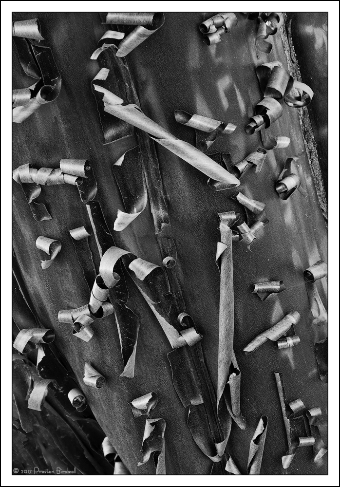
In the comments on the color version of this image, Tony Kuyper wondered if there might be some monochrome potential. His was a great idea, so here is the B&W version.
i used a Black White adjustment layer and a couple of TK's lights and mid tones masks.
The color version is
Here.
Which version do you prefer, and why?
Nikon D7100
Nikkor 18-40mm @ 100mm
F-8 @ 1/2s, ISO 100 (6 images stacked for depth of field)
Cropped from both sides and the top.
Please see the large version. Thank you.
I appreciated your thoughts on my recent images, and I would appreciate your comments on this one.

--P

Comments
10 commentsOf course I really like both of them. If I had to choose, I pick this one, the b&w. Why? I'll tell you why and it's very similar to Igor's reason or response. In the color version, there is a strip of rough bark in the URC; almost looks like there is some moss on it. Anyway, it wasn't worth mentioning in the color version, but the two corners are not as relevant - meaning they are not detracting from the shapes and interest of the peeling bark.
The b&w as presented seems spot on to me. But there are seemingly countless options on where you could take this. I have a love/hate thing with Silver Efex Pro2 that I use on occasion for conversions. There's no art in it per se - you get a whole bunch or pre-determined options and I just never feel like I using any creativity when using the app. Sure, there are sliders and such, but I'm certainly not adding any artistic value. Having said that, I'll just repeat that you have many avenues to travel with processing this one. As processed, this works quite beautifully.
Lon