Nature Photographers Network
This is the preserved archive of the original Nature Photographers Network. The community continues at naturephotographers.network.
Rojo Grande +2
‹ PreviousLandscape GalleryNext ›

Rojo Grande +2

by Igor Doncov

Gallery: LandscapePosted September 29, 201710,553 views14 comments
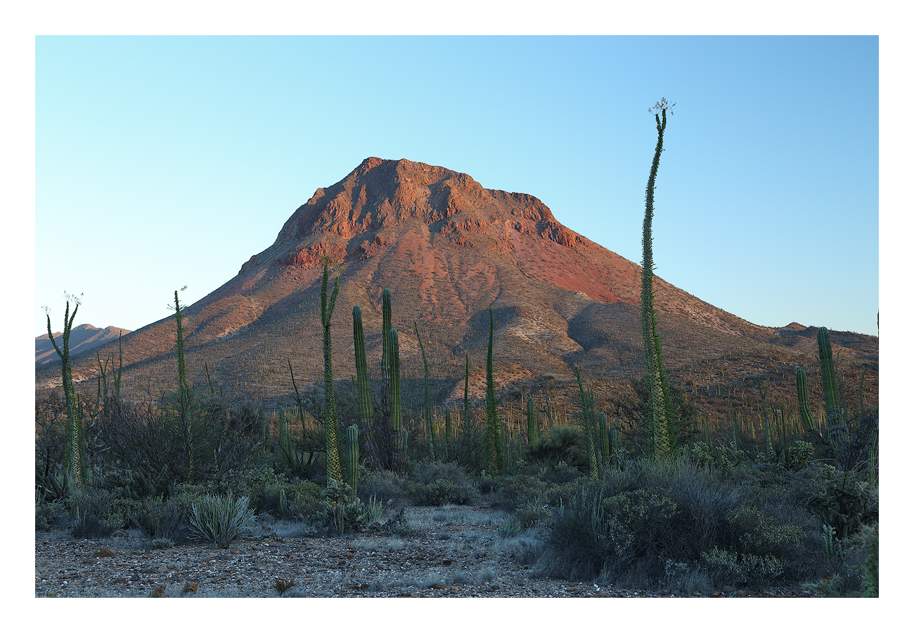
Back to grand landscapes. Several months ago I posted Big Red (aka Where's Waldo) so this is the same mountain near Bahia de Los Angeles with a Spanish name. Unlike the other one this hasn't been cropped and there is little processing. Those long cacti are called Cirios and they really define the landscape in that area. The problem is that most are not that photogenic. I'm always on the lookout for one with graceful curves rising upwards.

Canon 6D, 24-105mm@55mm, f/11, 0.4sec, ISO 100, CPL, tripod, TK sharpening

Comments

14 comments
Comment posted by Harley Goldman on September 29, 2017 at 5:44 PM
This is a very nice composed desert scene that works quite well. I would be inclined to mask the shadowed area and pull way back on the cyan, but that is very much a personal preference. I find there is plenty of warm/cool contrast between the sky and the mountain to work well in the image. 
Registered on November 19, 2003, 586 Posts, 11271 Comments
Comment posted by Dan Kearl on September 29, 2017 at 7:46 PM
Stark and burned out...
The sky cast as Harley pointed out could be tweaked, but it is harder than it would appear so I think you did the best.
Clear skies are hard to pull off with interest and the Fg scene and mountain look so stark and dry (even though the foliage is green)
that is works for me.
Registered on September 2, 2013, 209 Posts, 1514 Comments
Comment posted by Eva McDermott on September 29, 2017 at 11:35 PM
Wonderful red glow on the peak Igor.  I agree with Harley on reducing the cyan in the foreground.  I really like this despite the bird blue sky.
Registered on January 4, 2009, 1015 Posts, 13229 Comments
Comment posted by Igor Doncov on September 30, 2017 at 12:02 AM
I'm sorry. I'm going for more color here. Here is another version where I have pushed the colors in most areas except the blues in the shadows. Click on this for better version.
Registered on November 22, 2014, 189 Posts, 2733 Comments
Comment posted by Daniel Rappaport on September 30, 2017 at 11:26 AM
Captures the feel of a red/angry stark desert well.  
Registered on September 9, 2009, 294 Posts, 2006 Comments
Comment posted by gary phillips on September 30, 2017 at 1:29 PM
I really like the tall cactus and I think you did an admirable job with this composition.  The repost looks good to me.  I can imagine the continuing quest to find the perfect specimen will continue and to me it's all about the hunt.  Very nice.
Registered on October 24, 2013, 185 Posts, 4136 Comments
Comment posted by Igor Doncov on September 30, 2017 at 1:34 PM
This morning I'm looking at the repost and I don't like it. Recently I have been looking at videos of the Impressionists. I guess they influenced me. But I don't like what I'm seeing now.
Registered on November 22, 2014, 189 Posts, 2733 Comments
Comment posted by Mark Seaver on September 30, 2017 at 1:40 PM
Paul, a fine look at this isolated peak and the Cirio cacti.  I like the extra color in the mountain in your repost.  I'm a bit surprised about how strong the color shift in the sky is at least partly due to the use of the CPL  Some subtle dodging of the sky on the left would improve the balance, but I know from experience how challenging that is with a clean blue sky like this.  If you try this, go for a large very soft brush and use small increments (5% or even less) using a brights luminosity mask.
Registered on January 23, 2011, 1103 Posts, 17270 Comments
Comment posted by Igor Doncov on September 30, 2017 at 2:16 PM
Well, Mark, if you notice the sky is more varied in the repost than in the original. The reason is because I boosted the blues and those are mostly the right half of the sky. The left half is mostly cyan which I omitted because "skies are blue", right. But by this late time the sky had started to warm up and that introduced cyan into the sky. I could post the modified version but I think I got it right from the start so I'm leaving things as they are.
Registered on November 22, 2014, 189 Posts, 2733 Comments
Comment posted by Lon Overacker on September 30, 2017 at 5:03 PM
Igor,

I'm really enjoying the delicate light and colors of and on the mountain. And the composition is excellent, despite the difficulty and challenge of shooting horizontal landscapes with skinny vertical subjects like the Cirios (had not heard of them  previously.)

Before reading any comments, I too noticed the cyan in the foreground, earth and vegetation.  I'm not sure what you are sorry about in your repost; shouldn't need to apologize for your personal choice of pushing the color.  Wondering though, since you didn't make mention of the cyan in foreground.  Personall, I like your processing in the original. The sky went too far in the repost.

I have no idea your processing methods, but I also noticed in your last AK highway post that when you made some adjustments that it was done globally?  In both this image and in the previous one, the blue and cyan respectively can be easily "painted" to adjust without affecting other areas of the image.  I'm sure you know this, but again, don't know your process.

Another fine image.

Lon
Registered on November 24, 2006, 521 Posts, 19147 Comments
Comment posted by Igor Doncov on September 30, 2017 at 7:12 PM
Lon,

The AK image was processed a long time ago when my photoshop abilities were much more primitive. The blues were not applied globally but the color demarcation was not done skillfully. This image was not done globally either. I had 2 local selections (1) the sky and (2) everything but the sky. The blues and cyan was applied to the sky. The oranges, reds, yellows, and greens were applied to rest of image. The shadows are blue because the WB used was for daylight. As you stated it's a matter of choice and I don't like a color image to be without it. I am including an image of the same mountain taken earlier that has far less color but greater tonal range. There are no blue shadows but at that time of day the shadows aren't blue. I don't think adding more color would help here.

I often agonize over my images for days. Usually I'll make several versions, each processed a bit differently and then go back and forth over and over until their is some internal satisfaction. Unfortunately I can't do that quickly in the comment section and if this works it's way down the NPN page too far nobody will both to look.

Recently I have been going through the Impressionists on u-tube which is making me rethink about color. I am now of the opinion that rendering color faithfully as in the subject is rarely a good thing. So the question is when and how should color be 'enhanced'. I don't know the answer to that but if you make an image in color it stands to reason that consideration should be made to how the color impacts the viewer. From looking at peoples images I can see when it works and when it doesn't but I don't know why. Nick Bristol's last image is one where color was used effectively. Actually, I would like to have a discussion about color on the forum.
Registered on November 22, 2014, 189 Posts, 2733 Comments
Comment posted by Craig Moreau on October 1, 2017 at 11:48 AM
Igor, this is a very nice composition, and I feel you used the blue sky well here. It's a nice RGB palette. I prefer the color in the original, with a little cyan taken out of the foreground. There is a very tiny sliver of cactus on the right edge just above the horizon that I would crop or clone.
Registered on April 21, 2015, 64 Posts, 584 Comments
Comment posted by Rudy Ruberti on October 2, 2017 at 11:13 PM
This is a really nice desert scene and I like the detail in the fg and mountains.  I would crop a bit off the right and I like the color in the repost. 
Registered on October 28, 2008, 179 Posts, 1875 Comments
Comment posted by Nick Bristol on October 4, 2017 at 7:12 PM
Igor, I like this image very much, and I do prefer the original post of it, although both are nice. The first post has such a nice balance of color and gives me the feeling of a true fine art image. I 'm not having a problem with the cyan in the foreground at all and actually like the feel it brings to the image. The larger version was a pleasure for me to view.

Nick Bristol
Lone Rock, WI.
Registered on February 1, 2004, 752 Posts, 14140 Comments