Nature Photographers Network
This is the preserved archive of the original Nature Photographers Network. The community continues at naturephotographers.network.
Mellifluous + (color)
‹ PreviousLandscape GalleryNext ›

Mellifluous + (color)

by gary phillips

Gallery: LandscapePosted October 10, 20177,423 views18 comments
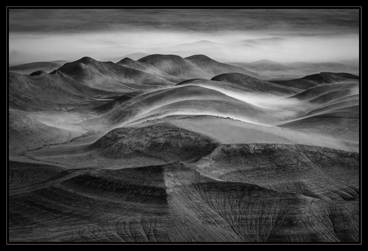
Central Utah on an incredible morning of fog and soft light.  I was torn between the B/W and color versions of this image...so I'll post the color version too.  I'd like to know your preferences between the two. The crops are slightly different and were processed independently.  I was struck by the pillow soft hills topped with the moving fog.  Still brings a smile to my face.

iso 100, 280mm. f/8, 1/20

Your comments and critiques are greatly appreciated.

Better large. (click color version for larger image)

 

Comments

18 comments
Comment posted by gary phillips on October 10, 2017 at 12:33 AM
Registered on October 24, 2013, 185 Posts, 4136 Comments
Comment posted by Lon Overacker on October 10, 2017 at 1:06 AM
You're making this really hard Gary.  What are you doing to us... having these recurring epic dreams... did you really see all these, or were you just dreaming?  angel  Seriously, you saying this was an incredible morning is an understatement... yet  you've had more than a few of these outings.

And then you toss out an impossible choice....  The b&w stands out to me because of the thin veil of rolling fog in the middle of the frame.  I like that the fog has a slight elevated brightness - really bringing attention.  I dunno, a Perfect, b&w landscape painting.

The color version is making it tough.  I love the subtle colors are simply exquisite.  The veil of fog is still present, but no longer the primary element.  The color version also allows the top of the frame and the never-ending landscape to create nice depth here. For some reason a little hint of the Palouse is coming through in the color version.

Both outstanding in my book.  Can't get enough of these.  Wish Utah was closer.... 

Lon
Registered on November 24, 2006, 521 Posts, 19147 Comments
Comment posted by Balan Vinod on October 10, 2017 at 2:12 AM
Gary ...you are making this very difficult for the viewer, as much as yourself. Speechless

Balan Vinod
Registered on March 20, 2006, 889 Posts, 2312 Comments
Comment posted by Mattia Oliviero on October 10, 2017 at 5:22 AM
No preferences here, Gary. I think that I would like to see the two versions side by side on a wall to fully appreciate the stunning shapes and colors. Incredible conditions you captured. Now I have to look something like this in the Alps. cool
Registered on August 24, 2016, 43 Posts, 254 Comments
Comment posted by Nick Bristol on October 10, 2017 at 11:19 AM
Gary, What a great shot. An amazing view and processed beautifully. Both versions are wonderful so I'm just going to enjoy both. Excellent work!

Nick Bristol
Lone Rock, WI.
Registered on February 1, 2004, 752 Posts, 14140 Comments
Comment posted by Dave Dillemuth on October 10, 2017 at 11:43 AM
This is superb, Gary. As with others, difficult to choose between the color and B&W rendering. The BW has a clean and classic look but the subtle, delicate tones in the color version are beautiful. Composition and processing look good. I think I slightly prefer the B&W crop.
Registered on December 10, 2015, 104 Posts, 1112 Comments
Comment posted by Marylynne Diggs on October 10, 2017 at 12:54 PM
Both of these are well composed and stunning, Gary.  The B/W stopped me in my tracks from the index page, and I really enjoy it, but the color one held my attention longer and, at least in my mind, made the fog more clearly fog and not potentially just lighter grass and soil. I'm not sure whether that makes sense.  I almost always agree totally with Lon, but the fog seemed a more significant element in the color version because of its lack of color.

The good thing is that you don't have to choose.  You have two great images here. 
ML
Registered on December 14, 2010, 122 Posts, 1034 Comments
Comment posted by Igor Doncov on October 10, 2017 at 1:02 PM
The choice is easy for me: color. The b&w is a marvelous image but the colored one is really unique. It's really a b&w with hints of color in the right places. It's both b&w and color. A really interesting image.
Registered on November 22, 2014, 189 Posts, 2733 Comments
Comment posted by Bill Chambers on October 10, 2017 at 2:54 PM
I like this a lot, Gary.  I enjoy both, and you did a very nice job on the B&W conversion, but I prefer the color because of it's wonderful muted earth tone colors.  Having said that, I believe your processing on the B&W is better than the processing on the color, ie, the FG rivelet gullies are sharper/clearer in the B&W than the color version.  Like I say, both are beautiful, but those muted colors just blow me away.  Great work!
Registered on April 10, 2005, 753 Posts, 21216 Comments
Comment posted by Eva McDermott on October 10, 2017 at 8:21 PM
Most certainlt the B&W for me Gary.  A classic Gary Phillips B&W with a lot of drama of the fog and excellent tonal range.
 
Registered on January 4, 2009, 1015 Posts, 13229 Comments
Comment posted by Ed Lowe on October 10, 2017 at 10:08 PM
I am always amazed with your B&W work, Gary. Everything is superbly done in both versions. I like the range of tones in the B&W along with the muted earth tones in the color version. They are both winners in my book although I slightly prefer the B&W because it has your signature classic look.

Ed
Registered on February 7, 2004, 414 Posts, 7115 Comments
Comment posted by Harry Lichtman on October 11, 2017 at 8:29 AM
Really hard to choose, they are both fantastic.  I like the way the textures are brought out a little more in the BW, but the muted colors are fun to look at as well.  I keep going back and forth.  What a great time you had!
Registered on September 17, 2010, 304 Posts, 3507 Comments
Comment posted by Brian Schrayer on October 11, 2017 at 11:30 AM
As usual, the B&W is great with all of the lines and textures, but I really like the color.  It has such a dreamy ethereal feel with the mist and soft tones.  Beautiful work!
Registered on May 28, 2004, 114 Posts, 2890 Comments
Comment posted by scott lanz on October 11, 2017 at 3:57 PM
Very nice, Gary. Very unusual conditions and a moody desert image. I prefer the B&W, FWIW.   
Registered on November 14, 2003, 840 Posts, 12902 Comments
Comment posted by Preston Birdwell on October 11, 2017 at 6:59 PM
Tough call, Gary. I love both. I do give my nod to the B&W. It has a dynamism that I really like. The color version has a more gentle mood. Heck, I don't know--both are stunning!
--P
Registered on November 1, 2003, 471 Posts, 5188 Comments
Comment posted by Paul Breitkreuz on October 13, 2017 at 3:30 PM
Sweeeeet one(s), Gary. You've got the B&W conversions down pat, so, the color version here gives yet another dimension to look at of the scene. Normally, being a V-50 only guy, I always prefer color images. But you've got these conversions looking so nice it's a really a tough call for me. Obviously, the composition works well for both......nice indeed.

btw: just made a "U-turn" up there in Utah this week. Long story short the room I booked did not work out for me at all. So missed out on taking any images....cheeky
I did spend one good night there with an old coworker buddy who lives in Koosharem....laugh
Registered on February 25, 2006, 525 Posts, 8448 Comments
Comment posted by Harley Goldman on October 14, 2017 at 7:24 PM
This is an absolute beauty!!! Both look outstanding, but I am going with the color version. I find it entices the subtleties from the amazing landscape. Can't go wrong with either. Love them both. 
Registered on November 19, 2003, 586 Posts, 11271 Comments
Comment posted by John Williams on October 24, 2017 at 2:03 PM
I missed this when posted Gary, which is too bad. This is over-the-top good. I prefer the BW, but not by much.
Registered on September 6, 2007, 221 Posts, 5985 Comments