Nature Photographers Network
This is the preserved archive of the original Nature Photographers Network. The community continues at naturephotographers.network.
Sierra Autumn Classic +2
‹ PreviousLandscape GalleryNext ›

Sierra Autumn Classic +2

by Lon Overacker

Gallery: LandscapePosted October 22, 201710,450 views19 comments
Thanks to all those who commented and offered suggestions and critique on my previous post. Much appreciated. It helps make our images better.

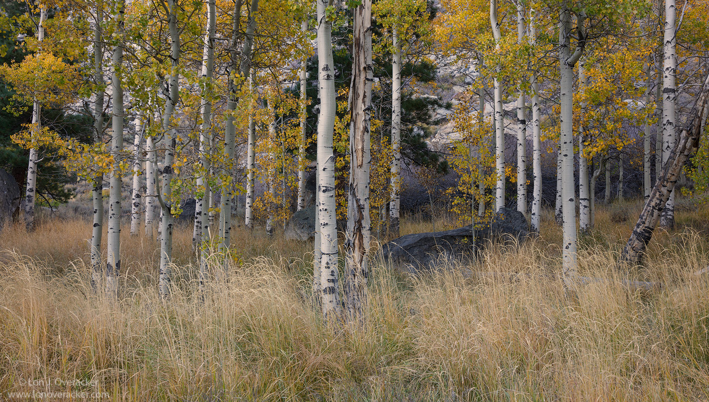
This one is a bit more traditional, not much innovation going on here.  I just can't help not passing up scenes like this though.  It's just not that common to see such pretty, straight, Colorado like aspens.  I've wondered by these for years and finally stopped to try and make something here.  These aspens as located right next to the Aspen campground in Lee Vining Canyon.

So, a couple of questions.  Does the leaning aspen on the right bother you? Take your eye out of the frame? Or does it add a little dynamic to an otherwise static scene.  Also, wondering if you think a crop left/right to a standard format would be better?

Thanks for any comments, critiques and suggestions.

Lon

almost forgot, this is a 3-image stack for depth of focus.

Comments

19 comments
Comment posted by Harley Goldman on October 23, 2017 at 8:26 AM
A sweet classic scene indeed. When I first opened it, I thought it might be Aspen campground area. I think cropping out the leaner would ruin the balance and depth of the comp. I might burn the brighter areas of that snag around the exiting edge of it, but I don't advocate a crop. Processing looks spot on, too. Surprised there have not been more comments, but that happens around here sometimes. Real nice image. 
Registered on November 19, 2003, 586 Posts, 11271 Comments
Comment posted by Bo Chen on October 23, 2017 at 9:39 AM
I intended to not read comments or your description before viewing the image and have my own thoughts.

It's a frequently photographed scene in autumn. We just can not have enough aspen tree pictures, whether or not it's wide angle or telephoto. The picture is overall pleasing. One thing I think it can be made better is the dark tree on the right can be cropped out - it adds a bit distraction.

Thanks
Registered on February 14, 2017, 42 Posts, 74 Comments
Comment posted by Bill Chambers on October 23, 2017 at 11:53 AM
SWEET!  I love this. The trees are gorgeous, both in color and detail.  The leaves look a bit depressed in their color but I wasn't there; I was just expecting them to be brighter and perhaps a wee bit more saturated.  I like the leaning tree on the right as it brings a sense of reality to an otherwise "perfect" scene, which we all know doesn't really exist; the dead tree in the grass does the same.  Love the grass.  Actually, I like the grass as much as the trees, and I also love the big boulder. 

As much as I love this, I do have two small nits.  One, I think I would boost the overall brightness and saturation just a bit to add some "spark" to it.  Two, the main point of focus is the tree in the center, which perhaps :centered" the composition a little too much.  Again, I wasn't there, and I know how careful you usually are with your compositions so there may not have been another alternative, but I would rather have that main tree either to the right or left somewhat.  My choice would be left since the leaning tree and boulder would become more prevalent in the scene.  I'm being pretty nitty here because it's a beautiful image as is.
Registered on April 10, 2005, 753 Posts, 21216 Comments
Comment posted by Richard Teller on October 23, 2017 at 1:51 PM
Another great image. I try and make this kind of image and it never works. I like the way the tree in the middle is the apex of a triangle and the trees on each side are the sides and lead the eye back into the image. The tree doesn't bother me because that is part of the scene in this kind of country. I like the crop and composition.
Registered on August 23, 2010, 1162 Posts, 6692 Comments
Comment posted by Lon Overacker on October 23, 2017 at 4:02 PM
Thanks for the comments and feedback so far!  I can't speak for everyone, but I know I appreciate the chance to improve one of my images.  We don't always have to agree on suggestions, but all suggestions and feedback we can learn from.

Personally, I like the centered bole, as Richard's description of a triangle, helps.  But I see Bill point and so I'll see how a slight crop from the left works.  It still has the narrow format that I'm after here and I wasn't sure about the aspen on the far left that was leaning. Almost like I needed to do some distortion adjustments.

I also brightened the scene overall a little and boosted the fall color - hopefully not too far.  Lastly, did took care of a few bright areas on the right edge as well as some general burning and also dodging of some trunks and areas that didn't look right.

Hopefully this is an improvement!

Thanks again!

You know this by now, but click the image for a larger view and then you can go back and forth with the original.
Registered on November 24, 2006, 521 Posts, 19147 Comments
Comment posted by Harley Goldman on October 23, 2017 at 4:11 PM
I like the processing changes, but prefer the original crop. That left side adds a lot of depth to my viewing. Nothing wrong with the new crop, just prefer the original. 
Registered on November 19, 2003, 586 Posts, 11271 Comments
Comment posted by Preston Birdwell on October 23, 2017 at 4:41 PM
Lon, I know this spot! You did a fine job on the original and with the adjustments to the re-post. I am in the Harley camp as far as the crop--I like the balance of the uncropped version more. The leaning tree on the left adds a nice dynamic.
--P
Registered on November 1, 2003, 471 Posts, 5188 Comments
Comment posted by Igor Doncov on October 23, 2017 at 4:56 PM
The color and brightness boost were an improvement. The original composition was stronger without the new crop. The original has almost perfect balance of elements. I can't see a crop that would improve it.
Registered on November 22, 2014, 189 Posts, 2733 Comments
Comment posted by Kathy Barnhart on October 23, 2017 at 7:59 PM
This is beautiful and a very typical scene for the fall in the eastern Sierra. I like the comp of the original and the brightness of the second one. I love the fine grasses in the foreground and the big rock on the right. I am a little undecided about the center tree trunk, but I could get used to it. Lovely work.
Registered on November 11, 2011, 404 Posts, 1639 Comments
Comment posted by Eva McDermott on October 23, 2017 at 8:01 PM
I love your repost Lon.  I has more pizzazz the the original.
Registered on January 4, 2009, 1015 Posts, 13229 Comments
Comment posted by Lon Overacker on October 23, 2017 at 8:55 PM
Thanks folks!  The jury may be still be deliberating, but the consensus is in: crop out, processing change in.  Here's the final repost. Unfortunately I made a few changes AFTER I cropped and re-saved.  But I repeated the same changes in the original crop. (BTW, this is a crop of the original frame as well, which had a log more background granite and brightness.  Right above and beyond this image is the roadway scree from 120/Tioga pass, above and out of frame.)

Thanks again for the comments and suggestions!
 
Registered on November 24, 2006, 521 Posts, 19147 Comments
Comment posted by Doug Koepsel on October 23, 2017 at 9:24 PM
It looks like #3 has lost some of the preferable brightness and saturation of #2. The leaning tree on the right was never a bother to me.  Preference to the cropping in #1,3
Registered on April 1, 2010, 196 Posts, 1592 Comments
Comment posted by Lon Overacker on October 23, 2017 at 9:35 PM
Dang. Thanks Doug, I agree and can see it.  Not sure what happened. Close enough for government work, don't want to suck up any more bandwidth.

I appreciate the help with tweaking this one!
Registered on November 24, 2006, 521 Posts, 19147 Comments
Comment posted by Bill Chambers on October 23, 2017 at 11:24 PM
I like the brightness and color level adjustment much better in the 2nd image, and I like the crop better as well, but I am very obviously in the minority there.  The 3rd image actually appears to be identical to the original with the decreased brightness and color.
Registered on April 10, 2005, 753 Posts, 21216 Comments
Comment posted by Brian Schrayer on October 24, 2017 at 10:53 AM
I like the second post the best, Lon.  I like the brighter feel to this post.  I don't find the leaning Aspen bole to be distracting.  The composition works well and I like the mix of green and gold in the leaves.  Nicely done!
Registered on May 28, 2004, 114 Posts, 2890 Comments
Comment posted by Nick Bristol on October 24, 2017 at 12:32 PM
Lon, I'm really enjoying this and the second image is my favorite here. I really like this composition and it is just a wonderful scene. Great looking light and I love the color. The first image crop also works very well and with the bit brighter processing of the second one it would be just as good. The fine detail in this is wonderful and it looks like it would make a beautiful print.

Nick Bristol
Lone Rock, WI.
Registered on February 1, 2004, 752 Posts, 14140 Comments
Comment posted by Lon Overacker on October 24, 2017 at 12:51 PM
Thanks again for the comments.  Not sure what's going on with the pop in the last repost.  I do see that the third is not quite as vibrant as the second, but I believe better than the first.  One thing, unless you're clicking on the image and comparing all the larger views.. the posts in the thread continue to display differently than the larger views, IMHO.

Anyway, much appreciated. Time for another image.

Lon
Registered on November 24, 2006, 521 Posts, 19147 Comments
Comment posted by John Williams on October 24, 2017 at 1:49 PM
I just love aspen. The way the trees line up reminds me of some of the tree farms around here; great eye Lon.

To answer your questions not much, a little, not really. I do think your crop is better balanced, I'd love to compare a version with the right side trimmed off too. Regardless, I don't think you can go wrong with this one.
Registered on September 6, 2007, 221 Posts, 5985 Comments
Comment posted by Dave Dillemuth on October 26, 2017 at 10:30 PM
Beautiful, Lon. Never tire of aspen images! Wonderfully composed (that leaning tree does not bother me a bit) but I could also see a 2x3 format cropping it out as another version. Those golden wispy grasses make a wonderful anchor. Personal preference but I could see raising the vibrance in the leaves a touch. 
Registered on December 10, 2015, 104 Posts, 1112 Comments